{"vars":{"gtag_id":"UA-146156281-1","config":{"UA-146156281-1":{"groups":"default"}}},"triggers":{"storyOpen":{"on":"visible","request":"event","vars":{"event_name":"web_story_open","event_action":"story_open","event_category":"${title}","event_label":"${storyPageCount}","send_to":"UA-146156281-1"}},"storyProgress":{"on":"story-page-visible","request":"event","vars":{"event_name":"slide_view","event_action":"story_progress","event_category":"${title}","event_label":"${storyPageIndex}","send_to":"UA-146156281-1"}},"storyEnd":{"on":"story-last-page-visible","request":"event","vars":{"event_name":"story_complete","event_action":"story_end","event_category":"${title}","event_label":"${storyPageIndex}","send_to":"UA-146156281-1"}},"tapLeft":{"on":"click","selector":".i-amphtml-story-back-prev","request":"event","vars":{"event_name":"interaction","event_action":"tap_left","event_category":"${title}","event_label":"${storyPageIndex}","send_to":"UA-146156281-1"}},"tapRight":{"on":"click","selector":".i-amphtml-story-fwd-next","request":"event","vars":{"event_name":"interaction","event_action":"tap_right","event_category":"${title}","event_label":"${storyPageIndex}","send_to":"UA-146156281-1"}},"openAttachment":{"on":"story-open","tagName":"amp-story-page-attachment","request":"event","vars":{"event_name":"interaction","event_action":"open_attachment","event_category":"${title}","event_label":"${storyPageIndex}","send_to":"UA-146156281-1"}},"muteStory":{"on":"story-audio-muted","request":"event","vars":{"event_name":"interaction","event_action":"mute","event_category":"${title}","event_label":"${storyPageIndex}","send_to":"UA-146156281-1"}},"unmuteStory":{"on":"story-audio-unmuted","request":"event","vars":{"event_name":"interaction","event_action":"unmute","event_category":"${title}","event_label":"${storyPageIndex}","send_to":"UA-146156281-1"}}}} {"requests":{"reportEvents":"https://pi.story.domains/events/amp"},"transport":{"xhrpost":true,"useBody":true},"extraUrlParams":{"eventName":"${eventName}","device":"${device}","platform":"${platform}","languageId":"${languageId}","deviceLanguage":"${deviceLanguage}","appVersion":"${appVersion}","storyId":"${storyId}","channelId":"${channelId}","companyId":"${companyId}","userId":"${userId}","slideId":"${slideId}"},"triggers":{"openStory":{"on":"visible","request":"reportEvents","vars":{"eventName":"story_open","device":"desktop","platform":"amp","languageId":"2","deviceLanguage":"${browserLanguage}","appVersion":"2","storyId":"E9QlL","channelId":"3424","companyId":"2213","userId":"${clientId(msuser)}","slideId":"${storyPageIndex}"}},"slideView":{"on":"story-page-visible","request":"reportEvents","vars":{"eventName":"slide_view","device":"desktop","platform":"amp","languageId":"2","deviceLanguage":"${browserLanguage}","appVersion":"2","storyId":"E9QlL","channelId":"3424","companyId":"2213","userId":"${clientId(msuser)}","slideId":"${storyPageIndex}"}},"tapLeft":{"on":"click","selector":".i-amphtml-story-back-prev","request":"reportEvents","vars":{"eventName":"slide_tap_left","device":"desktop","platform":"amp","languageId":"2","deviceLanguage":"${browserLanguage}","appVersion":"2","storyId":"E9QlL","channelId":"3424","companyId":"2213","userId":"${clientId(msuser)}","slideId":"${storyPageIndex}"}},"tapRight":{"on":"click","selector":".i-amphtml-story-fwd-next","request":"reportEvents","vars":{"eventName":"slide_tap_right","device":"desktop","platform":"amp","languageId":"2","deviceLanguage":"${browserLanguage}","appVersion":"2","storyId":"E9QlL","channelId":"3424","companyId":"2213","userId":"${clientId(msuser)}","slideId":"${storyPageIndex}"}}}} Seasonal Changes: Autumn’s New Paint Shades

Seasonal Changes: Autumn’s New Paint Shades

Even more so than January, autumn—time of new notebooks and wardrobe sort-outs—often feels like the right time to start afresh. In the UK, paint manufacturers have tapped into this urge with a spectrum of new colors that reflect the palette appearing outside our windows.
It’s been four years since Farrow & Ball updated their signature palette, so this is a much anticipated launch of eleven new shades—all of which take their lead from the existing hues.
Farrow & Ball
“I’ve developed a soft spot for many of the new colors,” says Cosby.
Hopper Head: “Sitting between Railings and Down Pipe, this color is inspired by the iron containers used to catch rainwater at the top of a down pipe.”
The walls in this kitchen are Whirlybird, “a lively and playful green named after the papery winged tree seeds that fall from maple trees.” The cabinet is done in Beverly.
Launched in August, this six-color paint palette is designed by Laura Jackson, tastemaker, broadcaster, columnist, and founder of online homeware marketplace Glassette.
Coat x Laura Jackson Edit
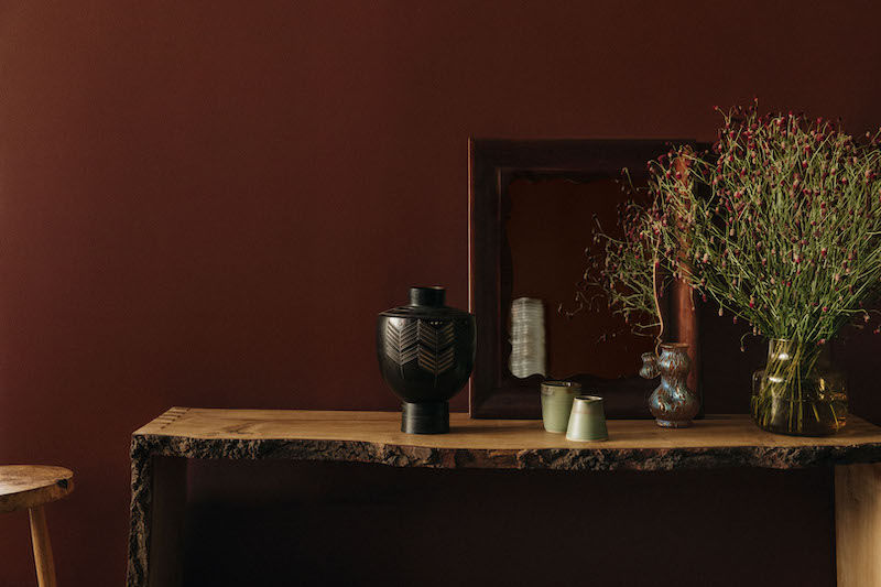
Brasserie Brown is “a deep brown with purple undertones, according to the company.
The Tobacconist: “An effortlessly stylish, addictive deep green with a warming yellowness.”
Atelier Ellis
The name of Cassandra Ellis’s latest collection—Waving & Smiling—is enough to have us ordering a clutch of sample pots.
Photograph by Kalina Krawczyk via Atelier Ellis.
Cass, “a use-everywhere neutral tone” from the new collection.
Paint & Paper Library
Big news for designers architects and remodelers seeking confident color The new palette from Paint & Paper Library established authority on color includes nine brand new hues eight shades revived from the Paint & Paper Library
archive and three new Architectural families of color in which each color is provided in varying strengths of the same pigment
Caravan, “a deep orange revived from the Paint & Paper Library archive, contrasted here with Tablecloth on the ceiling.”
Mchanga, “a red-earth shade found in the river sands of Tanzania.”
Nori, “a blackened teal.”
Plain English
Plain English has just announced its fourth color collection, in celebration of their 30th anniversary this year.
A succinct assortment of six new shades, the collection has been “influenced by some of the more practical colors used in the vast working kitchens found in great houses and estates, which continue to influence the thoughtful details we are known for,” according to the company.
A glimpse of the soft new palette.
Rose Uniacke
Interior designer Rose Uniacke launched her debut collection of neutral-hued paints a year ago.
Hickory, “an intense, true earthy brown.”
Moor, “a deep mossy green, warm and calming.”
Toffee, “an energetic oxide red, rich and caramelly.”