Photography by Ellie Lillstrom for Remodelista.
Yesterday we featured Seattle chef Matt Dillon’s cookhouse on his Vashon Island farm, which also supplies his restaurants (see the story at Cookhouse at Old Chaser Farm).
Meanwhile Dillon looked around his restaurants and realized I had these really amazing people working for me who needed an outlet for their talents beyond what they were doing Among them Emily Crawford of the Corson...
...Building now head chef at the London Plane Sarah Ellsworth of Sitka Spruce now pastry chef and baker Michael Sanders who now runs the bread program for Dillon s restaurants through a separate business called Plane Bread
Here are nine takeaways from their design.
For the storefront, Dillon took a page from the playbook of London shops, which he admires for their “dark green, super-glossy, thick oil-painted facades.” The London Plane achieves a similar vibe with a deep blue.
1. Maintain historical elements for maximum charm.
The ceiling of the London Plane is painted in sky blue Argent from Pratt & Lambert.
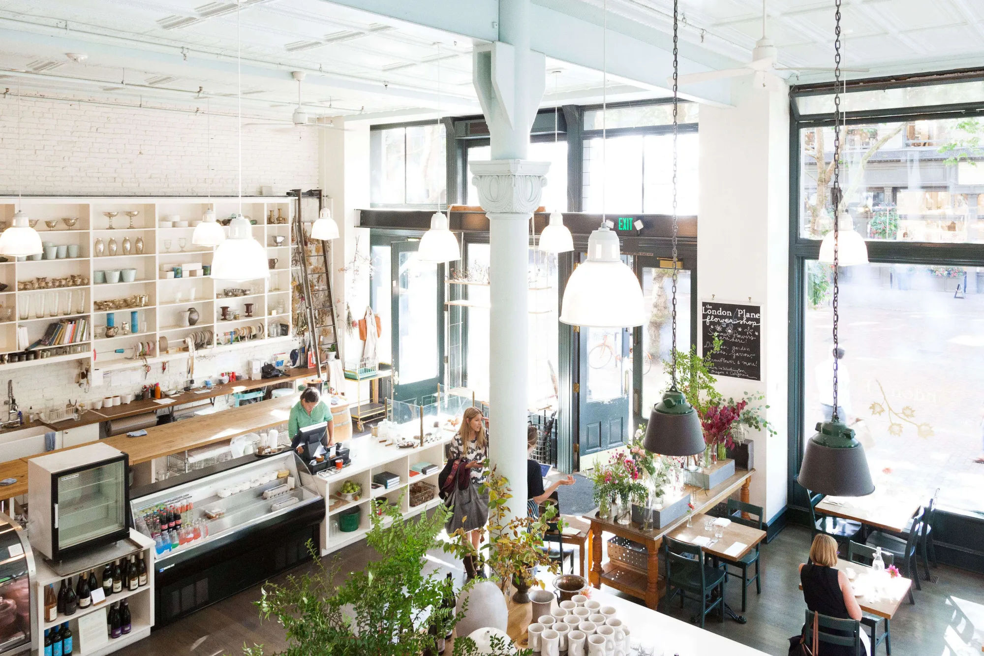
The entrance to the London Plane is flanked by a flower bar on one side and a pastry counter opposite.
2. Create a dramatic entryway.
I love that our space is a mood elevator on a rainy day.”
Next to the flower bar is the main dining room (there’s another dining area in the balcony upstairs).
3. Customize off-the-shelf fixtures.
4. Take color inspiration from your travels.
The deep green is Pratt & Lambert’s Essex Deep Green, and the ceiling and stools are painted in Argent from the same maker.
The dining chairs are also painted in Essex Deep Green.
“There’s always this sense of timelessness in their use of color,” Dillon says of his favorite European spaces.
5. Practice economy when necessary.
Perched near the entrance, bottles of cava and rosé give guests subtle pairing suggestions.
They moved the units but kept the wood counter, and Anderson repurposed the last Mia & Finn tablecloth from the restaurant’s retail section and used it as a curtain that conceals the space under the counter, which is now used for storage.
Three Italian stainless steel fustis, whose original purpose is to store olive oil, evoke Mediterranean climates.
6. Bring in the light.
Plus, said Dillon, the restaurant’s food is highlighted by flavors from North Africa, the Middle East, and the Mediterranean—”places where it’s sunny a lot. We wanted to pay homage to that and make it feel cohesive for the diners.”
7. Use classic, time-tested neutrals.
A hallway on the other side of the bar leads to the stair to the upstairs dining balcony. The bull’s head above the bar is an antique that Dillon found in Sumner, Washington, while shopping with his stepmother—who is an expert in country folk Americana.
A small retail section offers books, ceramics, linens, and locally made larder goods such as honey and jam.
8. Be creative with every inch of space.
Hanging opposite the retail wall: white linen aprons by Studiopatro and a pair of hanging ceramic planters.
The London Plane is a multifaceted place: a sit-down restaurant plus flower studio with bar, takeaway, retail, and choose-your-own bouquet stand.
9. Create a beautiful environment for your staff.
In his restaurants, Dillon likes the staff to be a visible part of the show: “I want people to know it’s not just me or Katherine here—there’s a whole group of people working very hard to do we do,” he said.