Icon - Arrow LeftAn icon we use to indicate a rightwards action. Icon - Arrow RightAn icon we use to indicate a leftwards action. Icon - External LinkAn icon we use to indicate a button link is external. Icon - MessageThe icon we use to represent an email action. Icon - Down ChevronUsed to indicate a dropdown. Icon - CloseUsed to indicate a close action. Icon - Dropdown ArrowUsed to indicate a dropdown. Icon - Location PinUsed to showcase a location on a map. Icon - Zoom OutUsed to indicate a zoom out action on a map. Icon - Zoom InUsed to indicate a zoom in action on a map. Icon - SearchUsed to indicate a search action. Icon - EmailUsed to indicate an emai action. Icon - FacebookFacebooks brand mark for use in social sharing icons. flipboard Icon - InstagramInstagrams brand mark for use in social sharing icons. Icon - PinterestPinterests brand mark for use in social sharing icons. Icon - TwitterTwitters brand mark for use in social sharing icons. Icon - Check MarkA check mark for checkbox buttons.
You are reading

Room to Play: The Ultimate Urban Bunk Room by Workstead

Search

Room to Play: The Ultimate Urban Bunk Room by Workstead

March 9, 2017

Most kids’ rooms are stopgap affairs: basic-at-best overrun by toys and stuffed animals. After all, childhood is brief. Or is it? The parents of the siblings who occupy this compact suite in a 1905 NYC building (a converted sewing factory) decided it was worth investing in quarters their kids, now ages three and five, can share for years to come.

A while back, the team at Workstead had overhauled the family’s living room and master bedroom. When the couple had their second child, they called back the firm to upgrade the 450-square-foot kids’ bedroom and bath. The mandate: ample storage, a desk to grow into, and room to play.

Photography by Matthew Williams, courtesy of Workstead.

&#8\2\20;our concept was to put the kids in the closet,&#8\2\2\1; says  17
Above: “Our concept was to put the kids in the closet,” says Nadine Lynch, Workstead’s project designer. Translation: They turned what had been a walk-in closet into a built-in bunkbed complete with cupboards and drawers.

Cherry plywood was selected to work with the existing wooden elements including the door and frame with a fluted glass transom.

for privacy, the beds have curtains of rebecca atwood printed linen. 18
Above: For privacy, the beds have curtains of Rebecca Atwood printed linen.
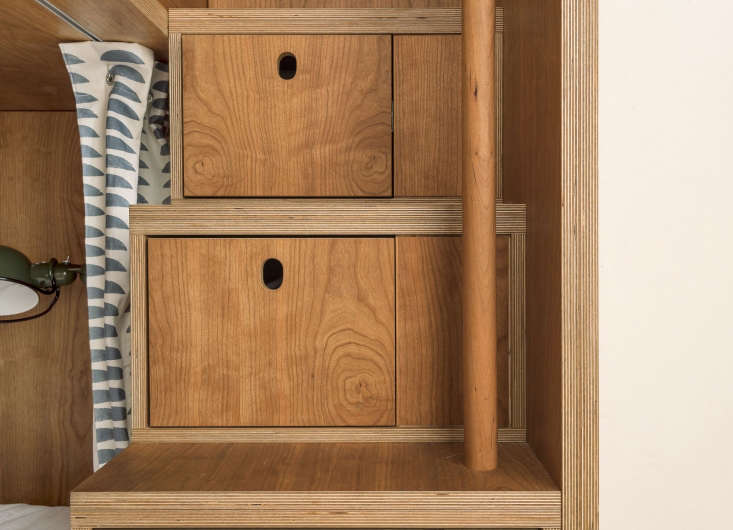
in addition to storage under and next to the beds, the steps to the top bunk&#x 19
Above: In addition to storage under and next to the beds, the steps to the top bunk contain drawers with child-friendly cutouts. Note the exposed plywood edges: “since there’s so much wood in the space, the edges make it feel more casual and playful,” says Lynch.
along the window wall, a built in desk turns a corner, where it becomes an  20
Above: Along the window wall, a built-in desk turns a corner, where it becomes an armoire. All of the millwork was done by Brooklyn-based master carpenter Markus Bartenschlager (see The Artful Shoebox Apartment, Workstead Edition).

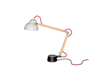
The lighting is both playful and classic: that’s the Studioilse W084t2 Task Light on the desk and the bunks have olive Jielde Wall Sconces.

the doors are detailed with &#8\2\20;pill shaped&#8\2\2\1; router pulls 21
Above: The doors are detailed with “pill-shaped” router pulls. See a range of options at Remodeling 101: Cutout Cabinet Pulls.

the desk is fitted with a range of storage, including toy bins. the pair of ben 22
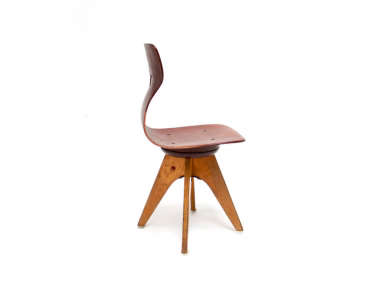
Above: The desk is fitted with a range of storage, including toy bins. The pair of bentwood  Pagholz Chairs are from the sixties and were sourced from Kinder Modern.
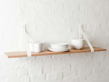
The wood-framed windows and (cord-free) wood blinds were in place. The wall shelves are cherry plywood suspended by Etsy seller Vaughan Designs’ Steel Sling Brackets ($46.83 each, plus shipping from Australia).

an architect was here. the formerly cramped bathroom—&#8\2\2\1;the p 23
Above: An architect was here. The formerly cramped bathroom—”the plumbing was oversized and outdated; our clients wanted to make it all easy for kids to use”—is now a seamless gridwork of two-by-four white tiles: Earthenware Elements Field Tile in Winter Chill from Ann Sacks with off-white grout.

“We decided to go with no cut tiles, which means every tile had to be meticulously laid out to fit perfectly within the layout,” Lynch tells us. “We moved the sink to line up with the tub, which allowed for deeper storage for the medicine cabinet and toiletry drawers below.” A trio of niches on the tub wall also provide valuable storage.

a custom towel and drying rack hangs on a wall. requested as a solution for tig 24
Above: A custom towel and drying rack hangs on a wall. Requested as a solution for tight quarters, it folds out to offer more rods for layering with laundry.
an anteroom outside the bath is now a linen and utility closet. the tall c 25
Above: An anteroom outside the bath is now a linen and utility closet. The tall cabinet is fitted to hold the broom, mop, and vacuum. On the immediate other side stands the bunkbed cupboard.

Before

prior to renovation, in addition to being gloomy, both rooms offered little in  26
Above: Prior to renovation, in addition to being gloomy, both rooms offered little in the way of floor space. The bedroom was taken up by a bed, a crib, and an explosion of Legos.

After

custom cabinetry and a reorganized and updated bathroom completely transfo 27
Above: Custom cabinetry and a reorganized and updated bathroom completely transform the suite.

Go to Children’s Rooms to explore more, including:

(Visited 1,032 times, 1 visits today)
You need to login or register to view and manage your bookmarks.

Product summary  

Have a Question or Comment About This Post?

Join the conversation

v5.0