Icon - Arrow LeftAn icon we use to indicate a rightwards action. Icon - Arrow RightAn icon we use to indicate a leftwards action. Icon - External LinkAn icon we use to indicate a button link is external. Icon - MessageThe icon we use to represent an email action. Icon - Down ChevronUsed to indicate a dropdown. Icon - CloseUsed to indicate a close action. Icon - Dropdown ArrowUsed to indicate a dropdown. Icon - Location PinUsed to showcase a location on a map. Icon - Zoom OutUsed to indicate a zoom out action on a map. Icon - Zoom InUsed to indicate a zoom in action on a map. Icon - SearchUsed to indicate a search action. Icon - EmailUsed to indicate an emai action. Icon - FacebookFacebooks brand mark for use in social sharing icons. flipboard Icon - InstagramInstagrams brand mark for use in social sharing icons. Icon - PinterestPinterests brand mark for use in social sharing icons. Icon - TwitterTwitters brand mark for use in social sharing icons. Icon - Check MarkA check mark for checkbox buttons.
You are reading

Midcentury Modernized: A Superior Spec House in West Hollywood

Search

Midcentury Modernized: A Superior Spec House in West Hollywood

September 10, 2018

We met Leigh Herzig two years ago when she unveiled her first ground-up project: A Hollywood Spec House with Uncommon Style. A self-taught designer-builder, Herzig is one of the rare women in her field and says she’s out to redefine the role of the developer: “There are so many people throwing up cookie-cutter houses, but there’s also a huge demand for design that is thoughtful and beautiful. Rather than trying to squeeze every dime out of a project, I’m a designer first and want to create the best house that I can.”

Herzig got her start remodeling apartments in New York City; when she relocated to LA 11 years ago, she moved on to flipping houses. Living in West Hollywood with her husband and two kids has enabled her to keep close tabs on the neighborhood, which is where she’s done most of her work. Her latest is a property that she bought with the idea of replacing the existing rundown duplex with her first midcentury-inspired house. On past projects, Herzig did all the designing herself, but in this case, she enlisted architects Silvia Kuhle and Jeffrey Allsbrook of Standard to step in with her as their client. “I knew their work from the Jenni Kayne house and James Perse stores and mustered the courage to meet them,” she says. Herzig herself stepped in as the interior designer and stager. Recently put on the market, the house sold to a young buyer who appreciated all the attention to detail. Join us for a look.

Photography by Benny Chan/Fotoworks, courtesy of Standard and by Shade Degges, courtesy of Leigh Herzig.

herzig was drawn to the property because it&#8\2\17;s one of the biggest lo 17
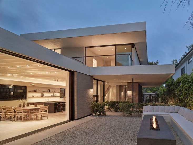
Above: Herzig was drawn to the property because it’s one of the biggest lots in the neighborhood—6,000 versus the standard 4,800 square feet— “so it allowed not only a slightly bigger house but much more flexibility in using the outdoor space creatively.”

Herzig adds that she wanted the design to fit aesthetically within the fabric of the neighborhood and asked Standard to take inspiration from the work of the early European modernists who came to southern California in the 1920s, such as Richard Neutra and Kem Weber. “But modern architecture,” she notes, “is so easy to do poorly: Every detail and every line need to be spot-on for the overall to flow with ease. I knew I needed partners who would elevate my game. Silvia and Jeffrey were my dream team.” Photograph by Benny Chan.

&#8\2\20;at the front of the house a low brick base projects out from under 18
Above: “At the front of the house a low brick base projects out from under the cantilevered second story and guides the visitor toward the entry,” explain the architects. The upper level is clad with smooth-troweled white stucco and the windows and doors are set into the facade creating a geometry that Standard says “breaks down the scale of the house and relates it to the scale of its surroundings.” Wax leaf privet hedges serve as screens in the front and back. Photograph by Benny Chan.
&#8\2\20;i love the way jeff and silvia designed the brick to flow right in 19
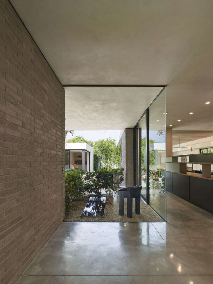
Above: “I love the way Jeff and Silvia designed the brick to flow right into the front entrance, inviting the outside in from the moment you walk through the door,” says Herzig. Known as Norman brick, the blocks are longer and thinner than the standard and create a linear pattern. The plan had been to paint these bricks white, “but once the walls were up, I fell in love with the natural color,” says Herzig.

The house is defined by a series of outdoor areas, including a “quiet space” with a rectangular pond visible through the entry. Photograph by Shade Degges.

this is la living. &#8\2\20;the house was conceived around the idea of crea 20
Above: This is LA living. “The house was conceived around the idea of creating a large indoor-outdoor living space that covers the entire rear half of the property,” explain the architects. The living room has a 10-foot-high tongue-and-groove ceiling with exposed beams and glass window walls; framed with bronze-anodized aluminum, the glass slides into wall pockets and disappears from view. Photograph by Benny Chan.

The pool house opposite the living room is furnished with a pair of 1970s canvas-and-wood Hoop Lounge Chairs by Werther Toffoloni and Piero Palange on loan from Orange.
herzig surrounded the blackened steel fireplace with period pieces, including a 21
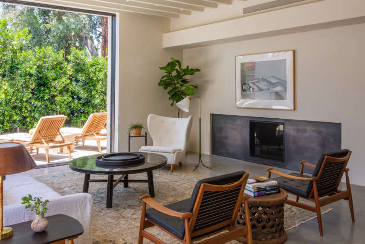
Above: Herzig surrounded the blackened steel fireplace with period pieces, including a Paul Boman wingback lounge chair and Josef Frank floor lamp. She borrowed most of the furnishings from Scandinavian design specialists Lief in West Hollywood. Photograph by Shade Degges.
frameless floor t0 ceiling windows provide views through to the back of the hou 22
Above: Frameless floor-t0-ceiling windows provide views through to the back of the house. The kitchen is alongside the quiet courtyard—with a Faye Toogood Roly -Poly Chair from Garde that Herzig envisioned as a place for morning coffee. She worked with landscape designer Scott Shrader on the outdoor spaces—he’s the one who suggested the pond set flush on the gravel. Herzig fell in love with Shrader’s work by seeing it in progress while she was on dog walks in West Hollywood.

Note the concrete floor: “The project splurges were the brick, plasterwork, and, of course, the architects,” says Herzig. “One way we saved was by polishing the concrete foundation and using it throughout the ground floor.” Photograph by Benny Chan.

walnut kitchen cabinets flank an island of honed black absolute granite that &a 23
Above: Walnut kitchen cabinets flank an island of honed black absolute granite that “waterfalls” down the ends.

Note the elevated shelves on the window wall: “The kitchen is just beyond the entry, and I didn’t want it to be seen from the front door, but I also didn’t want to cut it off from all the natural light coming in through the glass in the foyer,” Herzig tells us. “So we created a storage unit inspired by Charlotte Perriand. It blocks off the room from view and really almost doubles as an art piece.” See its black and taupe front in the previous photo. Photograph by Benny Chan.

the counter and integrated sink are made of honed quartz from eurostone, select 24
The counter and integrated sink are made of honed quartz from Eurostone, selected, says Herzig, because “it closely resembles limestone but has the durability and low-maintenance of manmade stone.

Open shelves are an element Herzig introduces in most of her kitchens: “They offer the opportunity to bring in interesting objects and art that doesn’t feel so kitchen-y.” She borrowed the Keith Haring drawing from her mother-in-law. Photograph by Shade Degges.

a baroque portrait of a swedish count—on loan from lief—adds dram 25
Above: A Baroque portrait of a Swedish count—on loan from Lief—adds drama to the dining area. Herzig commissioned the light over the antique French table: “Because I couldn’t afford one of the Italian midcentury architectural pendants we all love—like the Stillnovo and Arredoluce lights—I found someone who specializes in restoring and constructing lights and had it made.” The lights over the island are from Restoration Hardware. Photograph by Shade Degges.
a sheltered outdoor eating area: lief&#8\2\17;s teak berg table and sk 26
Above: A sheltered outdoor eating area: Lief’s teak Berg table and Skog chairs. Photograph by Benny Chan.
a built in stucco bench surrounds a fire pit finished in leathered black a 27
Above: A built-in stucco bench surrounds a fire pit finished in leathered black absolute granite and designed to double as a table: Its surface perimeter is just wide enough to hold plates. Photograph by Benny Chan.
the walls are all finished in a warm white plaster, including the stair, which, 28
Above: The walls are all finished in a warm white plaster, including the stair, which, the architects note, gets “washed in sunlight by a skylight.” The oak railing and treads lead to oak floors upstairs. Photograph by Shade Degges.
on the second floor, a wood framed pivot door opens to the front balcony. photo 29
Above: On the second floor, a wood-framed pivot door opens to the front balcony. Photograph by Shade Degges.
a skylight and clerestory windows light the master bath, which is almost entire 30
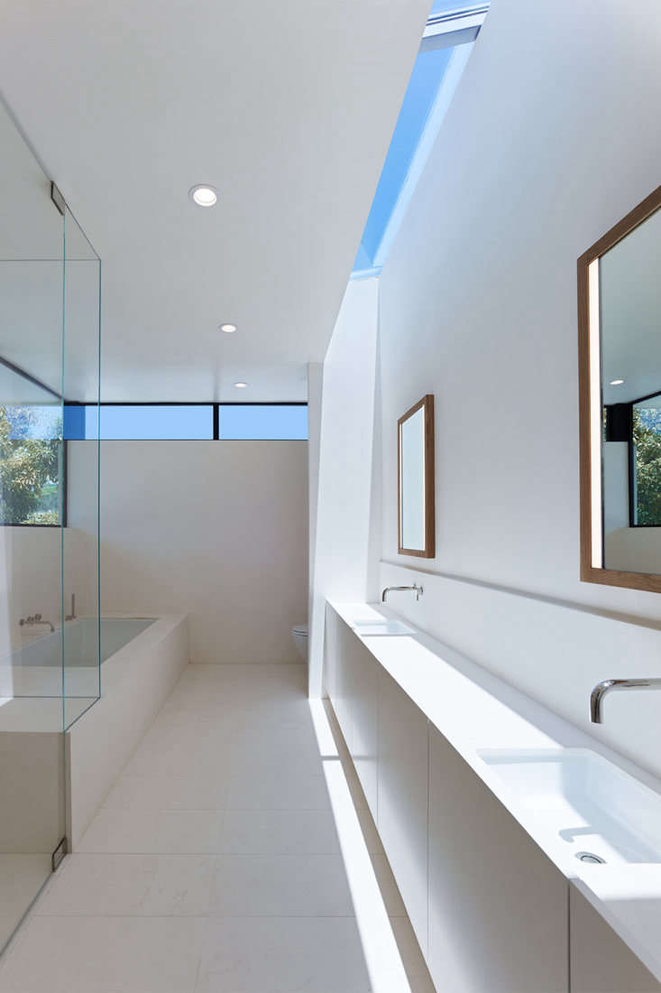
Above: A skylight and clerestory windows light the master bath, which is almost entirely lined in Perla Bianca limestone: “The design is about simplicity, warmth, and stillness,” says Herzig. The wall-mounted polished nickel faucets are from Phylrich’s Basic collection. Photograph by Benny Chan/Fotoworks.
the house has three bedrooms upstairs and one down (none of them were staged, s 31
Above: The house has three bedrooms upstairs and one down (none of them were staged, so this is the lone view). It highlights the clean lines between the walls and floor: “I wanted to go without base moldings, and that requires a lot of  craftsmanship to get right,” says Herzig. “When you eschew the molding, the joint where the floor meets the drywall needs to be perfect.” Photograph by Shade Degges.
the saltwater pool has a concrete deck that runs right up to the waterline, wit 32
Above: The saltwater pool has a concrete deck that runs right up to the waterline, without coping. And its west side abuts the pool house—”its foundation needed to be extremely deep and required extra engineering to accomplish this,” says Herzig. “And the width of the pool matches exactly the width of the  pool house wall, which I think looks really cool.” Photograph by Benny Chan.
the first floor has a guest bedroom, laundry, and powder room tucked into the f 33
Above: The first floor has a guest bedroom, laundry, and powder room tucked into the front. The house is 3,500 square feet in total.
there are three bedrooms and three baths on the second floor, plus a front balc 34
Above: There are three bedrooms and three baths on the second floor, plus a front balcony and back terrace.

Herzig thinks big but she’s also cost-conscious: Go to Build It for Less for her five favorite materials and finishes.

Looking for an architect or designer? Consult the Remodelista directory—and take a look at Trend Alert: 13 Up-and-Coming Architects/Designers on Our Watch List.

(Visited 2,107 times, 1 visits today)
You need to login or register to view and manage your bookmarks.

Frequently asked questions

Who designed the West Hollywood Modernist Spec House?

The West Hollywood Modernist Spec House was designed by Standard Architecture and Leigh Herzig.

What is a 'spec house'?

A 'spec house' is a house that is built by a developer without a specific buyer in mind. The developer will often sell the house before it is completed.

What style is the West Hollywood Modernist Spec House?

The West Hollywood Modernist Spec House is designed in a modernist style with clean lines and a minimalist aesthetic.

Where is the West Hollywood Modernist Spec House located?

The West Hollywood Modernist Spec House is located in West Hollywood, California.

What are the key features of the West Hollywood Modernist Spec House?

The West Hollywood Modernist Spec House features an open plan living area, a large rooftop deck with city views, a pool and spa, and high-end finishes throughout.

Is the West Hollywood Modernist Spec House for sale?

It is unclear if the West Hollywood Modernist Spec House is currently for sale. Interested buyers should contact the developers directly.

Can I tour the West Hollywood Modernist Spec House?

It is unclear if the West Hollywood Modernist Spec House is open for tours. Interested parties should contact the developers directly.

Have a Question or Comment About This Post?

Join the conversation

v5.0