Icon - Arrow LeftAn icon we use to indicate a rightwards action. Icon - Arrow RightAn icon we use to indicate a leftwards action. Icon - External LinkAn icon we use to indicate a button link is external. Icon - MessageThe icon we use to represent an email action. Icon - Down ChevronUsed to indicate a dropdown. Icon - CloseUsed to indicate a close action. Icon - Dropdown ArrowUsed to indicate a dropdown. Icon - Location PinUsed to showcase a location on a map. Icon - Zoom OutUsed to indicate a zoom out action on a map. Icon - Zoom InUsed to indicate a zoom in action on a map. Icon - SearchUsed to indicate a search action. Icon - EmailUsed to indicate an emai action. Icon - FacebookFacebooks brand mark for use in social sharing icons. flipboard Icon - InstagramInstagrams brand mark for use in social sharing icons. Icon - PinterestPinterests brand mark for use in social sharing icons. Icon - TwitterTwitters brand mark for use in social sharing icons. Icon - Check MarkA check mark for checkbox buttons.
You are reading

The Sentimental Minimalist: A Young Architect’s Bed-Stuy Townhouse Makeover

Search

The Sentimental Minimalist: A Young Architect’s Bed-Stuy Townhouse Makeover

October 3, 2017

Like so many architects, Jess Thomas prefers a clean-lined, clutter-free look. But she also welcomes in warmth and more than a touch of sentiment. That was especially the case in the gut renovation she and her husband, Hagan Hinshaw, a director-producer, recently completed of a formerly crumbling brownstone in Brooklyn’s Bedford-Stuyvesant.

A founding partner of Brooklyn’s Shapeless Studio, Thomas received her master’s degree in architecture from Columbia and is an alum of design-build firm Made, a longstanding member of the Remodelista Architect-Designer Directory. She and her partner at Shapeless, Andrea Fisk, were launching their new firm while the Putnam Townhouse, as it’s called, was still under way. The project presented Thomas with the opportunity to act for the first time as her own client, indulge her fondness for interesting lighting and tiles, and to show what her work is all about.

Photography by and courtesy of Kate Sears; styling by Kate S. Jordan.
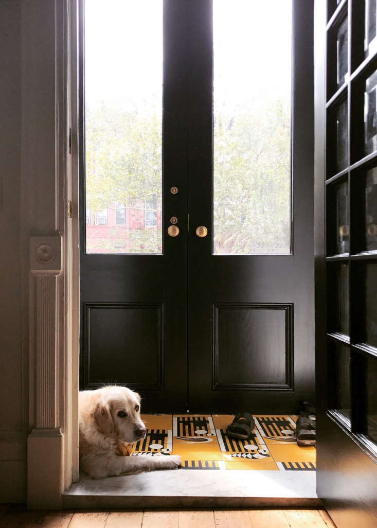
just about everything in the \1884 structure demanded attention and, in most ca 17
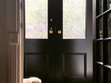
Above: Just about everything in the 1884 structure demanded attention and, in most cases, replacement. That included the double front doors: Thomas found them online from a salvage dealer in New Jersey and painted them Midnight Dream from Benjamin Moore. (Scroll to the bottom for a glimpse of the Before photos.)
&#8\2\20;while we were designing the house, we were also planning our weddi 18
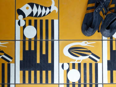
Above: “While we were designing the house, we were also planning our wedding,” says Thomas, a Florida native. Fittingly, the couple held their matrimonial ceremony at Ernest Hemingway’s Key West house, and as a souvenir, they replicated a favorite detail: Hemingway’s Cuban cement tiles in a bright yellow Art Deco pattern of egrets and fish. “We thought it would be a lovely reminder each day as we came and went.”

Research led them to Villa Lagoon Tile of Gulf Shores, Alabama: “Apparently, they had been contacted about the pattern in the past but no one had wanted to commit to the mold fees necessary for remaking this tile,” says Thomas. “They offered to help with these fees if they could then sell the tile. You can now find it on their site as Key West Cement Tile.” Added bonus: Because the couple had to order a minimum amount, they ended up with leftovers that now line the entry of Thomas’s brother’s house.

the townhouse had been divided into three apartments. thomas and hinshaw now oc 19
Above: The townhouse had been divided into three apartments. Thomas and Hinshaw now occupy the top two floors, which are restored to roughly their original layouts, and they rent the garden-level apartment on Airbnb (with plumbing in place to some day return the structure to a single-family house).

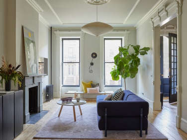
The construction was done by a best-of-Brooklyn team: contractor M Square Builders and millworker James Harmon of Workshop Brooklyn. In the living room the work involved, among other things, restoring the parlor opening to its original size and removing the tin ceiling that covered plaster remains. The ceiling now has a re-creation of the original plaster crown and “a large new medallion to give a sense of a center in an asymmetrical room.”

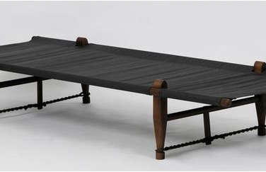
The sofa is Hem Design Studio’s modular Palo Corner Sofa and the coffee table is the Tablo Table by Normann Copenhagen. On the front wall, the OGK Safari Daybed, a Danish classic, stands under a Workstead Wall Lamp. The hanging light is a Noguchi Akari.

the living room opens to the dining room, which thomas set in the existing kitc 20
Above: The living room opens to the dining room, which Thomas set in the existing kitchen and designed around a maple and blackened steel table that she and her husband built with help from a friend.

The French door to the back garden and all the windows are new. The parquet floor was removed throughout—”it was in terrifying shape,” says Thomas—and the exposed pine subfloor was finished with water-based Bona Naturale.

the overhead light is the folded aluminum bounce large shade from roll & hi 21
Above: The overhead light is the folded aluminum Bounce Large Shade from Roll & Hill, which Thomas says was a splurge: “Hagan uses studio lighting in his work and we loved the connection.” The fireplace, like the one in the living room, was stripped of many layers of paint to reveal a green slate mantel, “one of our favorite surprises,” says Thomas. The photograph on the mantle is by her photojournalist brother, Bryan Thomas.
butterfly joints mend a crack in the \2.5 inch thick maple tabletop. 22
Above: Butterfly joints mend a crack in the 2.5-inch-thick maple tabletop.

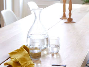
The fringed Linen Napkin, recycled glass Decanter, Short Glasses, and wooden Georgian Candlesticks are all by Sir/Madam (see Kitchen Icons).

a wide archway was built to connect the dining room to the new kitchen, which o 23
Above: A wide archway was built to connect the dining room to the new kitchen, which occupies what had been a bathroom. Thomas’s artist grandfather’s worktable—which he used to build picture frames—serves as the island.

The cabinetry is all the work of James Harmon, who collaborated with Thomas to come up with an integrated pull that “both feels good and achieves a subtle elegance,” she says. The stove is a Bertazzoni, as is the four-burner cooktop.

the kitchen cabinet fronts are painted white oak: &#8\2\20;we tested about  24
Above: The kitchen cabinet fronts are painted white oak: “We tested about fifteen colors before deciding on Benjamin Moore’s Midnight Dream, which we love because it changes throughout the day—sometimes it looks nearly black and other times it is so blue.” For durability, they used Benjamin Moore Arborcoat, a matte exterior stain, and added an additional clear coat.
The counter and backsplash are Bianco Carrara marble and the wall lights are Bernard Schottlander’s Mantis Sconces. The stainless steel sink is the Blanco Quatrus and the pullout faucet is Kohler’s Purist in matte black.

the kitchen received a second arched entryway and the &#8\2\20;massively sa 25
Above: The kitchen received a second arched entryway and the “massively sagging” stair was rebuilt on site.

thomas and hinshaw both work from home—hinshaw is co owner of production 26
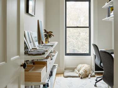
Above: Thomas and Hinshaw both work from home—Hinshaw is co-owner of production company Blurry & Hinge. Their shared office is furnished with side-by-side Alex Desks and Langfjall Chairs from Ikea and West Elm’s Dusen Dusen Slash Rug. After much research (and with a tight budget), they settled on Ikea’s wall-hung Algot Shelving over the desks and along the wall for Thomas’s materials library.
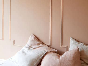
the guest room, with restored window shutters and new mouldings to match the or 27
Above: The guest room, with restored window shutters and new mouldings to match the originals, is painted Odessa Pink from Benjamin Moore: “We wanted to create a monochromatic pink room,” says Thomas.
 the blush linen duvet and linen pillowcases are from new us bedding compa 28
Above: The Blush Linen Duvet and Linen Pillowcases are from new US bedding company Two Dawson, which produces its small line in India.

in the guest bath, which has a painted salvaged tub, the aim was &#8\2\20;a 29
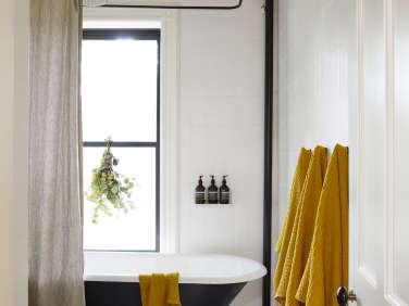
Above: In the guest bath, which has a painted salvaged tub, the aim was “a very light and airy space that could one day be a kid-friendly bathroom.” Thomas splurged on Mano a Mano Komon tiles for the floor and paired them with more affordable Nemo Metro Tiles (measuring 4.25 by 8.5 inches) on the walls.

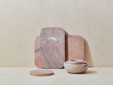
The matte black showerhead is the Fantini Mare. The Simple Waffle Towels and marble Mara Serving Board are from Hawkins New York.

the modern pedestal sink is the piazza from lacava: &#8\2\20;it looks  30
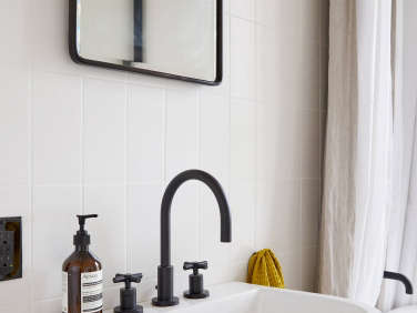
Above: The modern pedestal sink is the Piazza from Lacava: “It looks very happy and has good deck space compared to others,” notes Thomas. The faucet is the East Linear in flat black from Newport Brass.
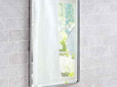
The Vintage Recessed Medicine Cabinet is from Pottery Barn. Note Thomas’s use of a vertical stacked bond for her wall tile—”it accentuates the height of the room.” (See Remodeling 101: White Tile Pattern Glossary for more ideas.)

a detail of the mano a mano komon tiles. 31
Above: A detail of the Mano a Mano Komon tiles.
lit by a large skylight, the master bath is what thomas describes as &#8\2\ 32
Above: Lit by a large skylight, the master bath is what Thomas describes as “a playful inversion of the guest bath—but with a very different feeling.” It has Made a Mano Komon Natura tiles and Nemo outsized Metro Tiles (measuring 4.25 by 12.5 inches).

knowing that they wanted to go dark in their bedroom, the couple tried out seve 33
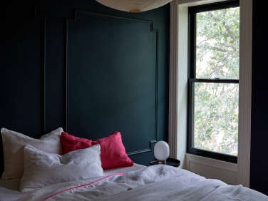
Above: Knowing that they wanted to go dark in their bedroom, the couple tried out several options before choosing Narragansett Green from Benjamin Moore: “It appears more blue than green, depending on the time of day.”
The hot-pink-edged bedding is the Linen Duvet with Piping with a Bright Pink Linen Pillowcase and White Linen Pillowcase Set with Piping, all from Two Dawson.

james harmon fitted the adjoining closet with maple drawers, shelves, and close 34
Above: James Harmon fitted the adjoining closet with maple drawers, shelves, and closets that have the same integrated pulls as the kitchen cabinets.

The cotton Kaftan is a Sir/Madam design that comes in five colors.

floor to ceiling closets line one wall. 35
Above: Floor-to-ceiling closets line one wall.
the plan for the parlor level restored the formerly divided up townhouse to its 36
Above: The plan for the parlor level restored the formerly divided-up townhouse to its original proportions and introduced a new kitchen in place of what had been a bath. This was Phase One of the remodel; work on the brownstone facade and landscaping is next.
the second floor has two bedrooms, two baths, and the couple&#8\2\17;s offi 37
Above: The second floor has two bedrooms, two baths, and the couple’s office.

Before

the multi paned entry door and stair remain in place. 38
Above: The multi-paned entry door and stair remain in place.
a glimpse of the living room&#8\2\17;s previous parquet floor and the slate 39
Above: A glimpse of the living room’s previous parquet floor and the slate mantel, hidden behind layers of paint.
the former kitchen was in what became the dining room. 40
Above: The former kitchen was in what became the dining room.
the downstairs bath is now the kitchen. 41
Above: The downstairs bath is now the kitchen.

See more of the townhouse and rental apartment at Shapeless Studio.

Here are three more architects’ house overhauls:

(Visited 5,167 times, 2 visits today)
You need to login or register to view and manage your bookmarks.

Frequently asked questions

What is the article about?

The article is about a gut renovation of a Brooklyn townhouse by architect Jess Thomas of Shapeless Studio. It focuses on the warm minimalist design of the renovated space.

Who is the architect of the renovated space?

Architect Jess Thomas of Shapeless Studio is responsible for the gut renovation of the Brooklyn townhouse featured in the article.

What is the design style of the renovated space?

The design style of the renovated space is warm minimalist.

What were the major changes made to the townhouse during the renovation?

The major changes made during the renovation of the Brooklyn townhouse featured in the article include opening up the space, creating a central courtyard, and incorporating natural materials such as wood and stone.

What was the inspiration for the design of the space?

The inspiration for the warm minimalist design of the renovated Brooklyn townhouse was the natural environment surrounding the space.

What materials were used in the renovation?

Natural materials such as wood and stone were used in the renovation of the Brooklyn townhouse featured in the article.

What is the overall aesthetic of the renovated space?

The overall aesthetic of the renovated space is warm and inviting, with a focus on natural elements and minimalism.

What challenges did the architect face during the renovation?

The architect faced challenges such as working with an irregularly-shaped space and finding ways to incorporate natural light into the design.

What is the end result of the renovation?

The end result of the renovation of the Brooklyn townhouse featured in the article is a warm, minimalist space that allows for ample natural light and a connection to the surrounding environment.

Product summary  Item 6 206Item 7 207

jess hagen brooklyn townhouse remodel kate sears photo 3
Normann Copenhagen

Tablo Table

$605.00 USD from Normann Copenhagen
jess hagen brooklyn townhouse remodel dining room kate sears photo 6a
Glassware, Cups, & Mugs

Short Glasses

$58.00 USD from Sir/Madam
jess hagen brooklyn townhouse remodel dining room kate sears photo 6a
Bar & Wine Accessories

Decanter

$100.00 USD from Sir/Madam

Have a Question or Comment About This Post?

Join the conversation

v5.0