The judges have selected the finalists; it’s now up to you to choose the winners. Vote for the five finalists in each of the 17 Considered Design Awards categories, on both
In the Best Bath/Amateur category, our five finalists are Eight Inch Rule, Deborah Bowman, Thayer + Todd, Anne-Sophie C., and Pia Mechler.
Project 1
Eight Inch Rule | Victoria, BC, Canada | Cabinet of Curiosities
Design Statement: “This design was modeled on the Old World cabinet of curiosities and Wunderkammer. All of the contents are vintage and selected from my scientific and natural history collections. They include European beveled glass mirrors, medical cabinetry from the 1920s, embossed aqua glass ‘quack’ medicinal bottles (1880-1910), anatomical models, surgical implements, and authentic Victorian-era medical specimens (human brain, skull, etc). Color was matched from a found robin’s egg. All fixtures are original to a heritage mansion built in 1896 and first remodeled in 1926.”
Chosen by: Guest judge and furniture designer Gesa Hansen, who said, “The wall color is picked perfectly and echoes in the tiles on the wall and floor. You can imagine this room being in one of those cure hotels in the twenties and thirties–I could imagine this one being the bathroom of the hotel in Thomas Mann’s The Magic Mountain. The ceramic faucets in the shower and on the wash basin are amazing. There are so many nice details–for example, the toilet paper integrated in the wall. It’s a project that could simply be cheesy, but everything is so well made that it seems authentic.”

Above: “Anatomical model by Denoyer-Geppert (1947), vintage subway tiles with a green inlay, wall color matched from a robin’s egg. The beveled mirrors are from Europe. Also on view: medical cabinetry, a Victorian-era medical specimen of a human skull, and a teaching map of Tasmania.”

Above: “A look at the anatomical model and old medicine bottles.”
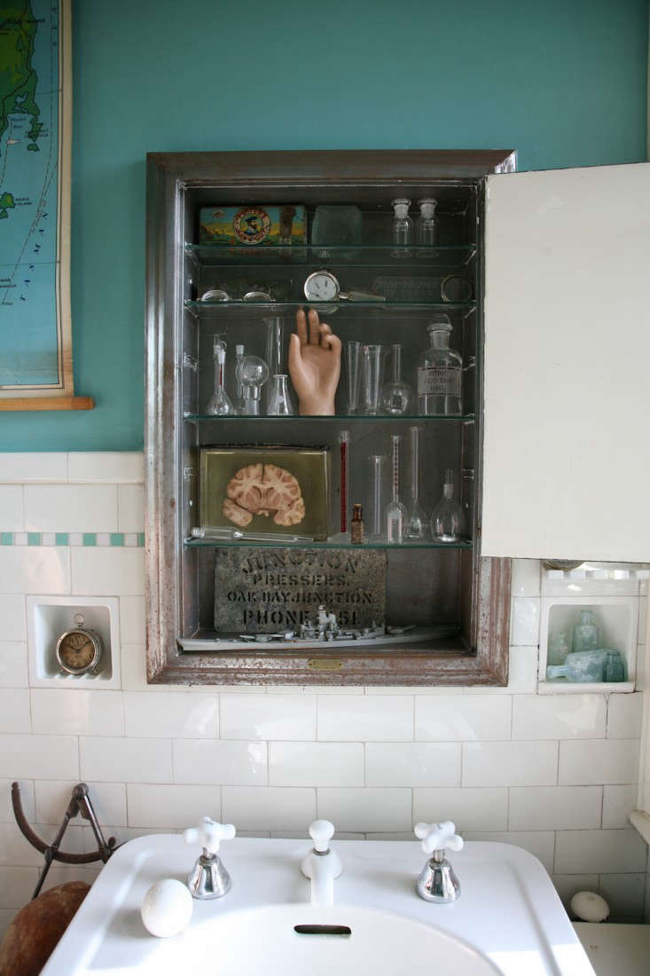
Above: “The medicine cabinet of curiosities includes: vintage chemistry glassware, surgical implements, a flask of mercury and arsenic tablets, a Victorian-era preserved section of a human brain from an anatomy lab, a zinc stencil, and a USS Iowa ship recognition model from 1942.”

Above: “A closer look at the medicine cabinet of curiosities.”

Above: “Another look at the vintage subway tiles with green inlay and robin’s egg blue walls. The beveled mirrors are set in nickel frames.”

Above: “Assorted distressed antique mirrors, a glove form and 1880s silver railroad watch, scientific instruments, and an argon gas flask.”
Project 2
Deborah Bowman | Calistoga, CA | Master Bath
Design Statement: “Two years ago my husband and I completed a total remodel of our 1960s weekend house outside of Calistoga, California. This included a 500-square-foot master suite addition. Having a background in graphic design, I drew the preliminary plans for the house in Adobe Illustrator, and although an architect drew the final plans, I specified and ordered all finishes, materials, cabinetry, and fixtures. I wanted a generously sized bathroom, and that’s what I got. It’s almost too big in relation to the master bedroom. The ceilings are very high and one whole side of the room opens to the outdoors. It’s my favorite room in the house! In the morning it’s flooded with light from the southeast-facing windows. And at night I can pull down the hidden window screens and feel like I’m bathing outside. I chose natural materials that are classic and practical: fumed white oak floors, a honed Carrera marble tub deck, a carved basalt stone surround that mimics corrugated metal, and ceramic shower wall tiles that look like stone and don’t show any rust stains from our well water. I also played with pattern and texture: the hexagon tiles on the shower floor, the veins in the marble, the carved basalt, the striped rug, and the Turkish towels all help to create visual interest.”
Chosen by: Gesa Hansen, who said: “It’s a real masculine design without being cold. I love the bathtub’s mix of materials. The gray linen curtain also adds so much cosiness, and I love the tile pattern on the shower floor. Good choice of wall lamps next to the mirror–that is something so hard to find!”

Above: “Sink with midcentury mirror, and a reflection of the police target that hangs above the bathtub.”

Above: “Shower with classic hexagonal tile floor and modern ‘stone’ tile walls.”

Above: “The semiprivate toilet area.”

Above: “A close-up of a midcentury side table with the basalt tub surround behind.”

Above: “The bathtub with the police target hanging above it.”

Above: “Awning windows with pull-down screens and a door that opens to a private garden area.”
Project 3
Thayer + Todd | Centerport, NY | Beach Bath
Design Statement: “We decided to convert a small bedroom into a guest bathroom. The plan was to keep things simple by paying homage to the bungalow’s original character. We used salvaged window from the bungalow, white classic penny tiles, and white subway tiles.”
Chosen by: Remodelista editor in chief Julie Carlson, who said, “The owners did a nice job keeping this space simple and serene. I like the contrast between the slate-colored walls and the glossy, white subway tiles, the white bulkhead sconces, and the oval mirror.”
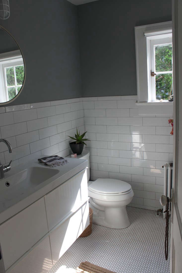
Above: “A look at the bathroom’s refurbished square window, subway and penny tiles, and walls painted in a slate gray by Benjamin Moore.”

Above: “Nautical-inspired bulkhead sconces and an oval mirror from West Elm.”

Above: “Simple white towels collected from travels.”

Above: “An aloe plant adds a touch of green.”
Project 4
Anne-Sophie C | Stamford, CT | White Bathroom on a Budget
Design Statement: “This is a completely new bathroom built in a small space in a hallway on a tight budget. We were going for a minimalist, Moroccan-inspired look. It has a corner shower, suspended toilets, and an Ikea hack vanity. We bought an inexpensive white vanity base from Ikea and put one of their kitchen butcher blocks on top. The vessel sink from Decolav was only about $150, so we splurged on nice tiles from Porcelanosa during their Thanksgiving sale. I tormented my contractor by insisting he build a tiled box inside the shower, and every morning I’m very happy to have a space for my shampoo bottles. We put gray cork tiles on the floor because cork doesn’t feel cold underfoot in the winter and is not slippery for our toddler. I keep a rotating display of jewelry from my brand, the Bijou Factory, under a globe, and my husband likes to pick a different scent everyday from his shelf. As for the dog, he loves napping on the sheepskin bath mat when the sun hits the bathroom in the morning.”
Chosen by: Remodelista editor in chief Julie Carlson, who said, “It’s always fascinating to see what can be achieved on a tight budget. This is a nice example of judicious financial planning: Spend less on some items, splurge on others.”

Above: “Ikea hack vanity. We had the Ikea butcher block counter sealed before installing it.”

Above: “The shower’s tiled soap niche.”
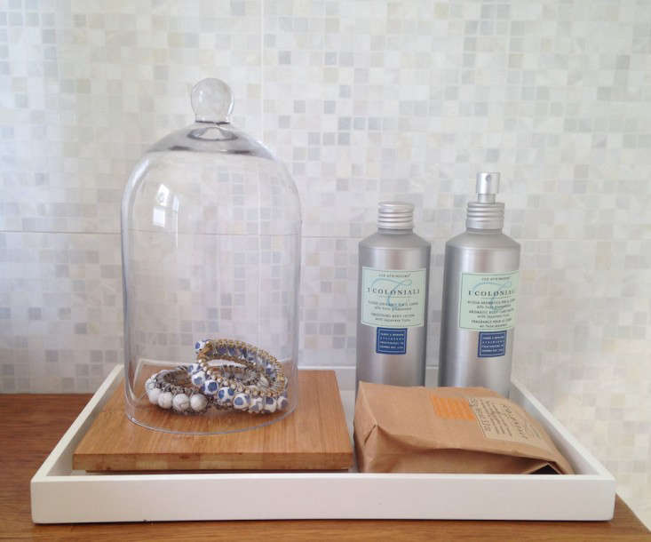
Above: “A close-up of bath accessories.”

Above: “The cork floor with sheepskin bath mat and Vitra cork stool.”
Project 5
Pia Mechler | Brooklyn, NY | Remodeling of Small Bathroom
Design Statement: “During the renovations of our Brooklyn apartment, the redesign of the very small master bathroom became crucial. We wanted clean lines to make the space look bigger, but a rich and warm ambience. Satin gold finishes, white subway tiles, black hex tiles, and an Ikea hack for the vanity were the result.”
Chosen by: Guest judge Gesa Hansen, who said: “I love the hexagonal tiles on the floor and the rise around the bathtub. Details like the wall lamp above the mirror give the design a hotel-room ambiance. I have to say, I love wall-mounted faucets; sinks always looks so much nicer when you don’t see a lot of tubes.”

Above: “Antique bird studies are the only decoration.”

Above: “A view of the bath tub/shower combo. We chose to also use the hex matte black floor tiles to cover the tub.”

Above: “A view of the Ikea hack kitchen vanity with a customized mirror, countertop sink, and wall-mounted Newport Brass faucet in satin gold.”

Above: “The white subway wall tiles are only used where necessary.”

Above: “Another view of the Ikea hack kitchen vanity.”

NOTE: The polls close August 8, but until then you can vote once a day for your favorite bath space and all the other categories on Remodelista and Gardenista. Vote daily now through Saturday, August 8. Winners will be announced on August 9.

Have a Question or Comment About This Post?
Join the conversation