Our judges have selected the finalists, now you choose the winners. Vote for the finalists in each of 12 Considered Design Awards categories, on both
In the Best Professional Bath Space category, our five finalists are DISC Interiors, Imperfect Interiors, Ensemble Architecture, DPC/Elizabeth Roberts Design, Daleet Spector Design, and Kirsten Grove.
Project 1
Kirsten Grove | Boise, ID | Farmhouse Bathroom Reno
Design Statement: “This 1920s farmhouse bathroom got a major renovation. Subway tiles and black hexagon tiles on the floor create a fresh, modern look in a timeless country space.”
Chosen by: Guest judge and Bright Bazaar blogger Will Taylor, who said, “I loved this space because it feels like a story of contrasts: The walnut vanity stands out beautifully against the white metro tile and walls, which, in turn, pop against the black hexagonal floor tile. The exposed wooden roof is a nice introduction of rough texture, and the bare wood ladder adds a gentle organic touch.”

Above: “This walnut vanity by Kohler was the perfect juxtaposition for the rest of the space.”

Above: “The large window gives off the most beautiful natural light.”
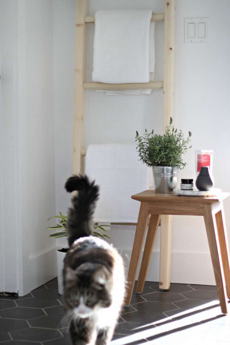
Above: “Every farm bathroom needs a farm cat.”

Above: “A barn style light hangs over the large soaker tub.”

Above: “The wood ceiling is a nice natural detail in the space.”

Above: “Take a bath here.”
Project 2
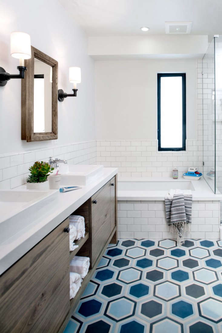
Daleet Spector Design | Los Angeles, CA | Jeffery Residence Children’s Bath
Design Statement: “This remodel transformed a bathroom shared by two young boys. Space was taken from neighboring bedrooms to create room for a separate shower and tub, and double sinks. Located near the water, the style is beachy yet modern and age–appropriate, but will withstand the test of time.”
Chosen by: Will Taylor, who had this to say about the project: “Given my love of graphic color, I couldn’t help but be delighted by the floor tile. I like that it’s colorful but not juvenile, despite being designed for kids. The wooden vanity adds warmth to the blue-and-white scheme.”

Above: “Double vanity and tub.”
Project 3
Ensemble Architecture, DPC / Elizabeth Roberts Design | Brooklyn, NY | Fort Greene Townhouse
Design Statement: “The townhouse is located on a park block in Fort Greene, Brooklyn. The building was in a dilapidated state when the owners purchased it. The house was completely transformed by a full gut renovation, plus a new addition at the rear.”
Chosen by: Remodelista editor in chief Julie Carlson, who said: “This ensemble is the ideal refuge for city dwellers. I love the fact that the sink/shower/toilet are separate from the bathroom and dressing area. There’s an airy orderliness to each space, and there’s plenty of built-in storage, but it doesn’t feel at all intrusive.”

Above: “A frameless glass shower panel with dark marble hex tiles.”
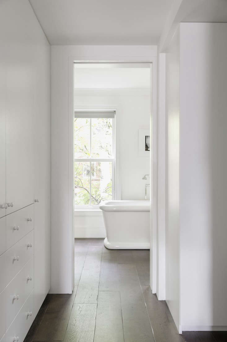
Above: “A view from the dressing room to the tub room.”

Above: “The tub room.”

Above: “The tub room vanity and built-in storage.”

Above: “A view to the sink and shower from the tub room.”

Above: “Porcelain tub, soft wood floors, and window to street beyond.”
Project 4
Imperfect Interiors | London, UK | Victorian Family House London
Design Statement: “This four-bedroom Victorian house had been last fitted in the eighties and needed updating. Encaustic and crackle glaze tiles were used to add texture and color and to prevent the spaces from looking too clinical, as was bespoke wooden paneling. Reclaimed Victorian sinks, a claw foot bath, and a marble ledge added luxury.”
Chosen by: Julie Carlson, who said: “A nicely restrained evocation of Victorian splendor. I’m charmed by the idea of a bathroom as art gallery (that big window must help chase away the dampness), and the paneling and palette are details I’d like to copy.”

Above: “Claw-foot bath, encaustic tiles, and custom wooden paneling make this an inviting retreat.”

Above: “A rich dark gray tone was used in here to make the space feel cozy.”

Above: “Frosted double doors allow light to flood into the shower room, painted a rich gray.”
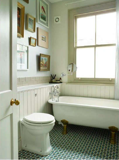
Above: “A gallery of French oil paintings and antique photographs picked up from European flea markets.”
Project 5
DISC Interiors | Los Angeles, CA | Manhattan Beach Master Bathroom
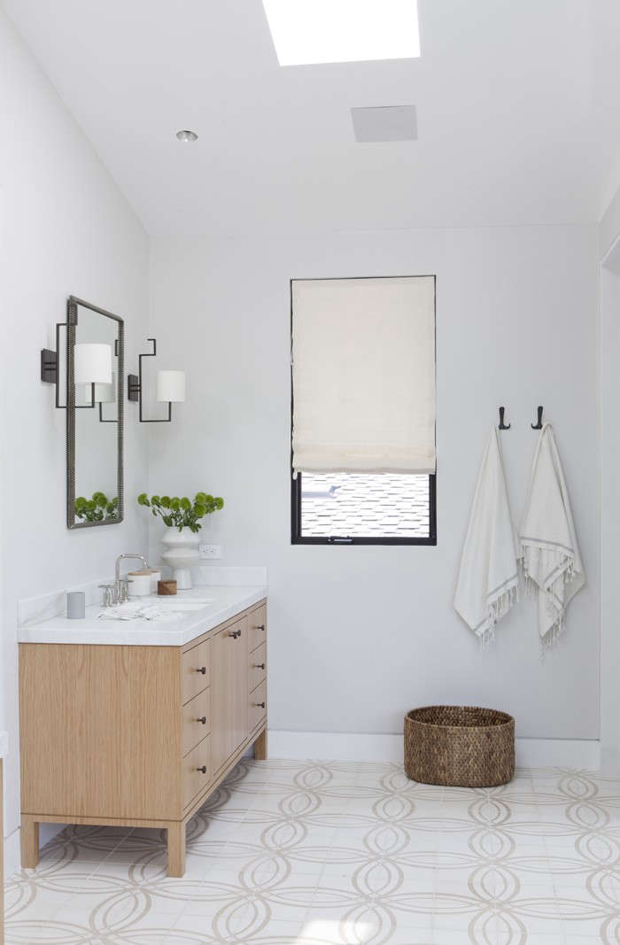
Design Statement: “This master bathroom was designed for a beach house that is casual, rustic, and modern. We incorporated concrete tile that evokes beach sand and a neutral palette for the finishes. It has a freestanding tub, oversized shower, custom cabinetry in oak, and white barn door.”
Chosen by: Will Taylor, who commented: “The way the neutral tile references the sand from the surrounding natural environment is a beautiful touch in this pared-back scheme. The freestanding tub and vanity help to maintain the light, airy, clean feel of the space. I like the fact that it feels luxurious yet understated.”



Found your favorite? Vote once per day in each of 12 categories across both sites, now through August 15.


Have a Question or Comment About This Post?
Join the conversation (4)