Icon - Arrow LeftAn icon we use to indicate a rightwards action. Icon - Arrow RightAn icon we use to indicate a leftwards action. Icon - External LinkAn icon we use to indicate a button link is external. Icon - MessageThe icon we use to represent an email action. Icon - Down ChevronUsed to indicate a dropdown. Icon - CloseUsed to indicate a close action. Icon - Dropdown ArrowUsed to indicate a dropdown. Icon - Location PinUsed to showcase a location on a map. Icon - Zoom OutUsed to indicate a zoom out action on a map. Icon - Zoom InUsed to indicate a zoom in action on a map. Icon - SearchUsed to indicate a search action. Icon - EmailUsed to indicate an emai action. Icon - FacebookFacebooks brand mark for use in social sharing icons. flipboard Icon - InstagramInstagrams brand mark for use in social sharing icons. Icon - PinterestPinterests brand mark for use in social sharing icons. Icon - TwitterTwitters brand mark for use in social sharing icons. Icon - Check MarkA check mark for checkbox buttons.
You are reading

Second Time’s the Charm: ‘A Renovation of a Renovation’ in a Brooklyn Duplex

Search

Second Time’s the Charm: ‘A Renovation of a Renovation’ in a Brooklyn Duplex

September 10, 2021

If you’ve ever gone house hunting, you’re probably familiar with that feeling of ambivalence when confronted with a middling renovation by a developer. On the one hand, everything’s shiny and new and there’s no danger of finding a creepy doll in the attic; on the other hand, why does that bathroom door hit the sink when you open it?

Rather than live with the architectural flaws of their developer-renovated duplex, one Brooklyn couple decided a redo of the redo was a must. The pair hired vonDALWIG Architecture to tweak the improvements, to bring more light into their home, and to create better flow.

“We took the approach of rethinking the quality of space and found some simple moves to bring more value and spatial quality to the home,” says Kit von Dalwig, who founded the architecture and interior design firm with her husband Phillip. “We reorganized the garden level, moving the main bedroom to the rear and creating a cool hallway, behind a set of bathrooms, that connects the two bedrooms but is also a buffer space, too.” They also enlarged some windows and installed new pale wood flooring, both of which helped remedy the lack of light.

Ready to see what else the von Dalwigs did to turn a so-so space into something spectacular?

Photography by Alan Tansey, courtesy of vonDALWIG Architecture.

the walls had been painted blue; a fresh coat of farrow & ball&#8\2\17; 17
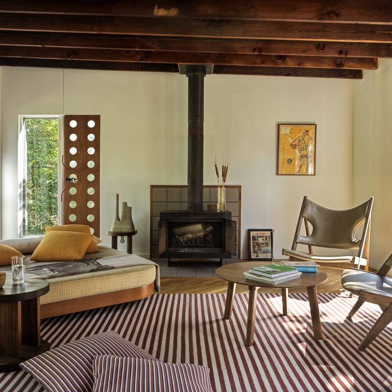
Above: The walls had been painted blue; a fresh coat of Farrow & Ball’s Strong White helps brighten the room, as does new flooring, courtesy of 7-inch-wide engineered planks in a sun-bleached finish from Madera. One thing the developer did right: preserving the original dentil moldings, marble fireplaces, and plaster ceiling rose. Hanging from the medallion is the Arca Single-Tier Chandelier by Matter Made.
the clients own a lot of artwork as the wife is a curator. between mies van der 18
Above: The clients own a lot of artwork as the wife is a curator. Between Mies van der Rohe’s Barcelona Couch and the black leather chair from DWR is a coffee-table-cum-art by New York–based artist Jessi Reaves. The painting over the fireplace is by Math Bass; the painting to the left is by Beauford Delaney.
a wall of vitsoe shelving holds the couple&#8\2\17;s book and record collec 19
Above: A wall of Vitsoe shelving holds the couple’s book and record collection. Cle’s Arc Encaustic Cement Tiles line the inside of the fireplace.
kit&#8\2\17;s favorite part of the project is the new, oversized arched win 20
Above: Kit’s favorite part of the project is the new, oversized arched window in the dining area. “It changed the space immensely,” she says.
reform&#8\2\17;s basis cabinet fronts upgrade the ikea kitchen. (see ikea k 21
Above: Reform’s Basis Cabinet Fronts upgrade the Ikea kitchen. (See Ikea Kitchen Upgrade: 11 Custom Cabinet Companies for the Ultimate Kitchen Hack.) The counters are made of Richlite, a paper-based counter material, in Black Diamond.
hanging above the vintage dining table are five painted wood junit pendant ligh 22
Above: Hanging above the vintage dining table are five painted-wood Junit Pendant Lights designed by Julia Jessen. A pair of Akoya 14 Pendants by Rich Brilliant Willing hover over the island.
the primary bedroom, relocated to the back of the duplex so that it has access  23
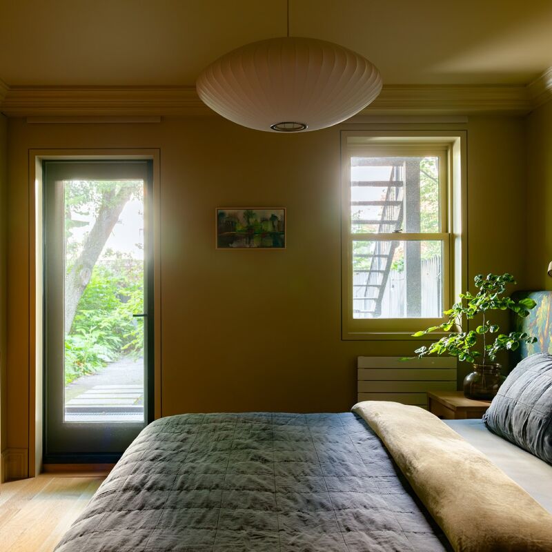
Above: The primary bedroom, relocated to the back of the duplex so that it has access to the yard, now has a window seat, lined in white oak, and ample built-in storage.
the nest storage bed is by niels bendtsen for design within reach. the walls on 24
Above: The Nest Storage Bed is by Niels Bendtsen for Design Within Reach. The walls on the lower floor are painted Farrow & Ball’s All White.
marmoreal, an engineered marble by british designer max lamb, is a bold additio 25
Above: Marmoreal, an engineered marble by British designer Max Lamb, is a bold addition to the bathroom.

For more Brooklyn homes we love, see:

(Visited 1,217 times, 1 visits today)
You need to login or register to view and manage your bookmarks.

Have a Question or Comment About This Post?

Join the conversation

v5.0