Icon - Arrow LeftAn icon we use to indicate a rightwards action. Icon - Arrow RightAn icon we use to indicate a leftwards action. Icon - External LinkAn icon we use to indicate a button link is external. Icon - MessageThe icon we use to represent an email action. Icon - Down ChevronUsed to indicate a dropdown. Icon - CloseUsed to indicate a close action. Icon - Dropdown ArrowUsed to indicate a dropdown. Icon - Location PinUsed to showcase a location on a map. Icon - Zoom OutUsed to indicate a zoom out action on a map. Icon - Zoom InUsed to indicate a zoom in action on a map. Icon - SearchUsed to indicate a search action. Icon - EmailUsed to indicate an emai action. Icon - FacebookFacebooks brand mark for use in social sharing icons. flipboard Icon - InstagramInstagrams brand mark for use in social sharing icons. Icon - PinterestPinterests brand mark for use in social sharing icons. Icon - TwitterTwitters brand mark for use in social sharing icons. Icon - Check MarkA check mark for checkbox buttons.
You are reading

By Instinct: A Colorful Project by Designer Sophie Rowell That Follows ‘No Rules’

Search

By Instinct: A Colorful Project by Designer Sophie Rowell That Follows ‘No Rules’

April 1, 2024

Why follow rules when you can follow your instincts? Much more fun that way, we say. And so would longtime fashion stylist-turned-rising interior designer Sophie Rowell of Côte de Folk. Sophie was commissioned by the owners of a classic Victorian terrace in Hackney, London, to create “a more functional kitchen, more light in the hallway, more storage (that’s on everyone’s wish list!)—a house that felt more like them.” She accomplished all this, plus weaving in unexpected color moments, by trusting her gut. “No rules!” she says. “That’s the key, I think. It’s all done on instinct.”

While Sophie may not heed a rulebook when it comes to color, she does follow an overarching design philosophy: Always try to work with what you have. There’s an argument to be made for building anew or replacing the old, but oftentimes, she finds, you can simply make over creatively instead of throw out completely. For this project, for instance, the clients, a young couple with a son, considered adding an extension for more space. “We convinced them not to extend out. Instead, we emphasized optimizing the original floor plan, particularly focusing on maximizing the functionality of the kitchen,” she says. And the outdated, orange-y parquet floors that the clients wanted to replace? Sophie persuaded them to refinish them with a lighter stain instead.

Let’s take a tour of this project, a winning mix of playfulness and restraint.

Photography by Chris Snook, courtesy of Côte de Folk.

sophie replaced the wall separating the entryway from the living room with a re 17
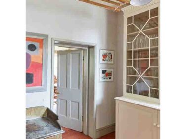
Above: Sophie replaced the wall separating the entryway from the living room with a reeded glass partition. “This not only modernizes the space but also illuminates the hallway entrance by harnessing natural light, addressing the common issue of dimness in these homes,” she says. A newly built mantel, lined with plum red Zellige tiles, surrounds the radiator and provides a place to store keys. The wallpaper is Cole & Son’s ‘Nuvolette.’
the living room is a joyful mix of modern and traditional. the red togo sofa wa 18
Above: The living room is a joyful mix of modern and traditional. The red Togo sofa was an existing piece that belonged to the clients. “The stunning leather Olmit Sling Chair by BDDW, we found secondhand for a steal!” shares Sophie.
&#8\2\20;we took their original loaf sofa and recovered it with a svenskt t 19
Above: “We took their original Loaf sofa and recovered it with a Svenskt Tenn fabric. We like to salvage existing items here at Côte de Folk rather than buy new when we can.”
sophie&#8\2\17;s favorite piece? &#8\2\20;our very own furniture piece  20
Above: Sophie’s favorite piece? “Our very own furniture piece [designed by Côte de Folk], The Chubby coffee table, of course—in cream! The dream colorway for those that dare!” About the refinished wood floors: “The client expressed her disdain for the traditionally varnished floors, which had turned what I call ‘baked bean color’. To address this we applied a white-based varnish to neutralize the yellow/orange tones, which significantly transformed the space immediately.”
there are multiple original fireplaces in the home. sophie lined the hearth of  21
Above: There are multiple original fireplaces in the home. Sophie lined the hearth of each with Moroccan tiles from The Mosaic Factory. Vitsoe wall units flank the fireplace. “I’m particularly fond of the striking contrast achieved by integrating modern shelving solutions within a more traditional setting,” she says. “Additionally, the client wished to conceal TV wires and equipment, which Vitsoe were on hand to help with.”
the view from the dining room to the living room. sophie designed a shelving un 22
Above: The view from the dining room to the living room. Sophie designed a shelving unit to surround the opening between the two rooms. Giant Rice Paper Shade pendants from Hay hang in both the living and dining areas.
sophie had vintage bruno rey dining chairs spray painted in lavender and green. 23
Above: Sophie had vintage Bruno Rey dining chairs spray-painted in lavender and green. It’s an unexpected color pairing that somehow works. The rugs in both the living and dining rooms are by Seagrass Story.
the kitchen ends with steel and glass french doors that lead to the patio. recl 24
Above: The kitchen ends with steel and glass French doors that lead to the patio. Reclaimed terracotta lines the floors. “I wanted to work with the garden designers to use something that worked inside and out so both spaces flowed from one to the other. They’re usually used in a herringbone formation, but I decided to lay them in a brick format for a more unusual, youthful feel,” says Sophie.
sophie had the existing kitchen cabinets repainted. &#8\2\20;they were a da 25
Above: Sophie had the existing kitchen cabinets repainted. “They were a dark blue and in a sorry state but essentially of good quality, so I had a carpenter fix them up and we had them professionally sprayed,” she says. “I love the color. It’s Edward Bulmer’s ‘Wash Stop’, named after washing-up water—what’s more perfect for a kitchen?” The ceramic sconce is by Jess Wheeler: “It gives off such a soft light,” says Sophie.
a farmhouse double sink put to good use here. the brass knobs and pulls are fro 26
Above: A farmhouse double sink put to good use here. The brass knobs and pulls are from deVOL.
&#8\2\20;i always surprise my clients with a gift for their new look home,  27
Above: “I always surprise my clients with a gift for their new look home, usually deeply personal. On this occasion, I had the kitchen cafe curtain embroidered with the family’s names, in the 5-year-old son’s handwriting, for a lovely keepsake. The clients’ response was that I’d forgotten about the cat!” Embroidery by Cressida Jamieson.
sophie designed a new pantry to go with the existing cabinetry and had it paint 28
Above: Sophie designed a new pantry to go with the existing cabinetry and had it painted ‘Kitty’ by Edward Bulmer.
plenty of organized storage inside the pantry. 29
Above: Plenty of organized storage inside the pantry.
a vintage indigo kantha, from the potting shed, covers the bed. the aaron wall  30
Above: A vintage indigo kantha, from The Potting Shed, covers the bed. The Aaron Wall Light is from Soho Home.
the couple had turned one of the bedrooms into a dressing room. &#8\2\20;wh 31
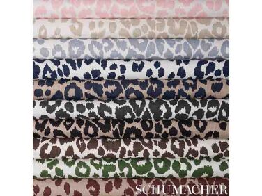
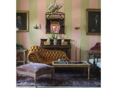
Above: The couple had turned one of the bedrooms into a dressing room. “While the pink cabinetry was already in place, we elevated the space by introducing a rich, deeper color on the walls and incorporated leopard print fabric from Schumacher, turning it into a luxurious haven of decadence.”

See also:

(Visited 16,680 times, 3 visits today)
You need to login or register to view and manage your bookmarks.

Frequently asked questions

Who is Sophie Rowell and what is her design philosophy?

Sophie Rowell is a fashion stylist-turned-rising interior designer behind Côte de Folk. Her design philosophy is to always try to work with what you have and be creative in making over existing items instead of completely replacing them.

What was the key approach Sophie Rowell took in the colorful project featured in the article?

The key approach Sophie Rowell took in the colorful project featured in the article was to follow her instincts and trust her gut, rather than following strict design rules.

What did Sophie Rowell convince the clients not to do in the project?

Sophie Rowell convinced the clients, a young couple with a son, not to extend out their space with an extension. Instead, she emphasized optimizing the original floor plan, particularly focusing on maximizing the functionality of the kitchen.

What color did Sophie Rowell choose to refinish the outdated parquet floors in the project?

Sophie Rowell chose to refinish the outdated, orange-y parquet floors with a lighter stain instead of replacing them.

How did Sophie Rowell transform the space by addressing the dimness issue in the hallway entrance?

Sophie Rowell replaced the wall separating the entryway from the living room with a reeded glass partition, which not only modernized the space but also illuminated the hallway entrance by harnessing natural light.

What personal touch did Sophie Rowell add to the kitchen cafe curtain for the clients?

Sophie Rowell had the kitchen cafe curtain embroidered with the family's names in the 5-year-old son's handwriting, creating a unique and personal keepsake for the clients.

Product summary  Item 6 161Item 7 162

ebnp wash stop utility lr 1 1   1 376x282
Paint

Wash Stop

£60.00 GBP from Natural Paint UK Ltd.
By Instinct A Colorful Project by Designer Sophie Rowell That Follows No Rules portrait 9
Paint

Kitty

£60.00 GBP from Natural Paint UK Ltd.

Have a Question or Comment About This Post?

Join the conversation

v5.0