Icon - Arrow LeftAn icon we use to indicate a rightwards action. Icon - Arrow RightAn icon we use to indicate a leftwards action. Icon - External LinkAn icon we use to indicate a button link is external. Icon - MessageThe icon we use to represent an email action. Icon - Down ChevronUsed to indicate a dropdown. Icon - CloseUsed to indicate a close action. Icon - Dropdown ArrowUsed to indicate a dropdown. Icon - Location PinUsed to showcase a location on a map. Icon - Zoom OutUsed to indicate a zoom out action on a map. Icon - Zoom InUsed to indicate a zoom in action on a map. Icon - SearchUsed to indicate a search action. Icon - EmailUsed to indicate an emai action. Icon - FacebookFacebooks brand mark for use in social sharing icons. flipboard Icon - InstagramInstagrams brand mark for use in social sharing icons. Icon - PinterestPinterests brand mark for use in social sharing icons. Icon - TwitterTwitters brand mark for use in social sharing icons. Icon - Check MarkA check mark for checkbox buttons.
You are reading

Kitchen of the Week: A Two-Toned Design in Denmark

Search

Kitchen of the Week: A Two-Toned Design in Denmark

August 10, 2023

Stilleben, a design store in the heart of Copenhagen, specializes in household objects that “reflect the time we live in.” In addition to selling work by contemporary artisans, the brand has its own collections of ceramics, glass, and prints, even hair clips. A few years ago, Stilleben Kitchens was added to the roster.

Created by Stilleben founders Ditte Reckweg and Jelena Schou Nordentoft in collaboration with architect Ditlev Rahbek, the designs aim to present the kitchen as “both a practical work place and a social living space.⁠” They’re currently available through Reckweg’s firm, Stillark.

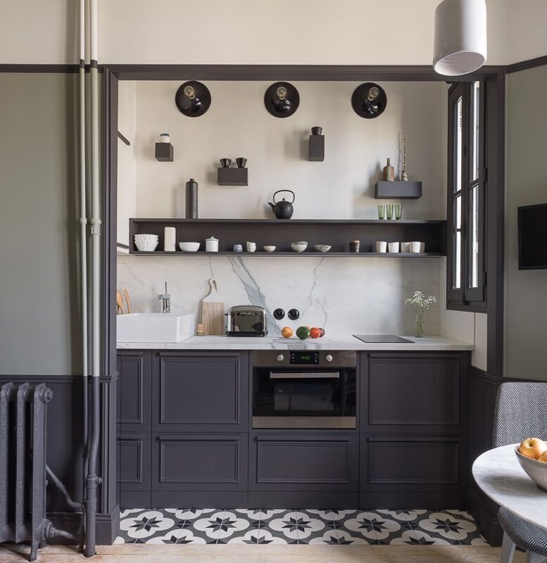
The two models on offer are all about solid-wood craftsmanship, functionality (including a surprise place to perch), and artful color: The exteriors and interiors are often painted in two different tones to add a touch of surprise and Danish-style joie de vivre.

Here’s an example of the top-of-the-line version, the Frame Kitchen, composed of modules adapted to each household’s needs and space. A similar, more budget model, the Section Kitchen, is also available.

Photography courtesy of Stilleben and Stilleben Architects.

the kitchens are neutral on the outside and festive on the inside. they&#8\ 17
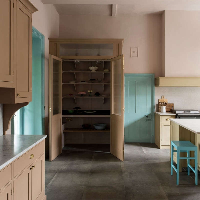
Above: The kitchens are neutral on the outside and festive on the inside. They’re always painted by hand: Here, Stillark’s own colors Limestone and Misty Blue were used.

The kitchen belongs to Marie Louise and Mads and their three young kids who moved from an apartment to a 1920s townhouse in Fredericksburg, just west of Copenhagen, to gain more space—and be able to install their ideal kitchen. “The design had to be practical and sustain extensive everyday use where spilling and playing with food are part of life,” says Marie Louise who works for Unicef. “We like the fact that the look is understated and doesn’t demand your attention, while at the same time it lifts everything around it.”

the parents requested an island &#8\2\20;big enough that we can cook and ba 18
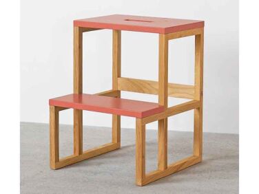
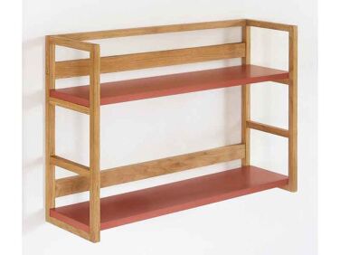
Above: The parents requested an island “big enough that we can cook and bake things together as a family, but small enough that it doesn’t dominate the room.” Like the cabinets, it’s made of FSC-certified oak, all hand built, and has a Silestone counter in Coral Clay. The oak and ash Tripper Stool and wall-hung Gable Shelf are signature pieces by Stillark.
at the end of the kitchen counter, a step with a rounded corner a serves as a s 19
Above: At the end of the kitchen counter, a step with a rounded corner a serves as a storage bench and place for kids to stand on and “take part in whatever their parents are doing.” Marie Louise says she loves to “enjoy a glass of wine on the bench while watching the kitchen activities unfold.”

The faucet is from Quooker. In lieu of a standard fridge, Marie Louise and Mads chose two under-counter Liebherr fridge drawers located in the back, immediately behind the island.

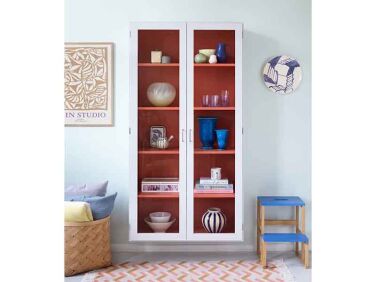
a two toned colour cabinet with glass doors holds the family dinnerware. the oa 20
Above: A two-toned Colour Cabinet with glass doors holds the family dinnerware. The oak herringbone floor extends into the adjacent living room.

Take a look at an earlier Stilleben kitchen design that offers a close look at the company’s workmanship.

More colorful kitchens:

N.B.: This story originally ran on April 15, 2021 and has been updated with new links and information.
(Visited 9,933 times, 1 visits today)
You need to login or register to view and manage your bookmarks.

Frequently asked questions

What is the design concept of two-toned kitchen cabinets?

The design concept of two-toned kitchen cabinets involves using different colors or finishes for the upper and lower cabinets to create a visually interesting and balanced look.

What is the benefit of two-toned kitchen cabinets?

Two-toned kitchen cabinets can add depth, contrast, and personality to a kitchen. They allow for creative expression and can help define different zones or areas within the kitchen.

Where can I use two-toned kitchen cabinets?

Two-toned kitchen cabinets can be used in various kitchen styles, from modern to traditional. They work well in large and small kitchens alike.

What colors can I choose for two-toned kitchen cabinets?

You can choose any combination of colors that complement each other and match your overall kitchen design. Popular choices include contrasting colors or using a light and dark shade of the same color.

Should the upper cabinets be a different color from the lower cabinets?

While it's common to have the upper cabinets in a different color from the lower cabinets, there are no strict rules. The key is to create a pleasing aesthetic and maintain a sense of balance in the kitchen.

Can I use two-toned cabinets in a small kitchen?

Yes, two-toned cabinets can work well in a small kitchen. Using lighter colors for the upper cabinets can help create a sense of openness and make the space appear larger.

How do I choose the right colors for my two-toned cabinets?

Consider the overall color scheme of your kitchen, including the walls, countertops, and flooring. Look for colors that harmonize with these elements. It's a good idea to test samples before making a final decision.

Can I add color inside the cabinets?

Yes, adding color inside the cabinets can be a fun way to inject personality and surprise into your kitchen. You can paint the interiors a contrasting color or use wallpaper or decorative elements to bring color inside.

Do I need to hire a professional to achieve a two-toned cabinet look?

While hiring a professional can ensure seamless results, it's possible to achieve a two-toned cabinet look as a DIY project. Make sure to properly prepare the surfaces, use quality paint or finishes, and follow best practices.

How do I maintain two-toned kitchen cabinets?

Regular cleaning and proper maintenance are key to keeping two-toned kitchen cabinets looking their best. Follow manufacturer's guidelines for cleaning the finish, and avoid using abrasive cleaners or materials that could damage the surfaces.

Product summary  

Kitchen of the Week A TwoToned Design in Denmark portrait 6
Living Room Cabinets & Sideboards

Colour Cabinet

kr24,500.00 DKK from Stillark
4 f9438fb505
Low Stools & Ottomans

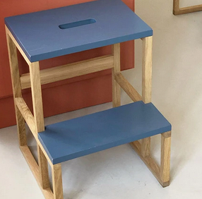
Gable Tripper

kr2,800.00 DKK from Stillark
Kitchen of the Week A TwoToned Design in Denmark portrait 8
Indoor Storage & Shelving

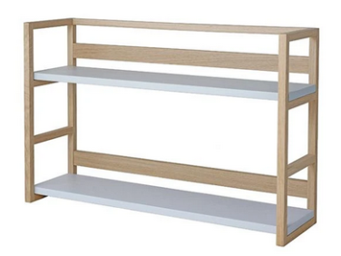
Gable Shelf

kr3,450.00 DKK from Stillark

Have a Question or Comment About This Post?

Join the conversation

v5.0