Icon - Arrow LeftAn icon we use to indicate a rightwards action. Icon - Arrow RightAn icon we use to indicate a leftwards action. Icon - External LinkAn icon we use to indicate a button link is external. Icon - MessageThe icon we use to represent an email action. Icon - Down ChevronUsed to indicate a dropdown. Icon - CloseUsed to indicate a close action. Icon - Dropdown ArrowUsed to indicate a dropdown. Icon - Location PinUsed to showcase a location on a map. Icon - Zoom OutUsed to indicate a zoom out action on a map. Icon - Zoom InUsed to indicate a zoom in action on a map. Icon - SearchUsed to indicate a search action. Icon - EmailUsed to indicate an emai action. Icon - FacebookFacebooks brand mark for use in social sharing icons. flipboard Icon - InstagramInstagrams brand mark for use in social sharing icons. Icon - PinterestPinterests brand mark for use in social sharing icons. Icon - TwitterTwitters brand mark for use in social sharing icons. Icon - Check MarkA check mark for checkbox buttons.
You are reading

Life, Rearranged: Changing the Layout of This Victorian Changed Everything

Search

Life, Rearranged: Changing the Layout of This Victorian Changed Everything

May 3, 2024

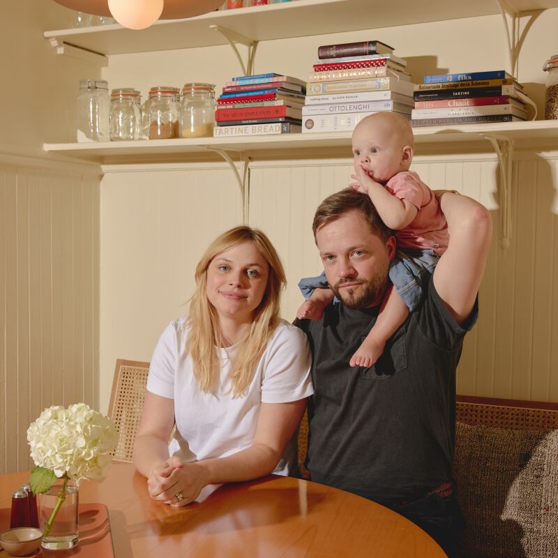
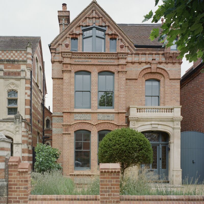
I suspect, for architects, a house with an ineffective layout is like fingernails on chalkboard. When Anaïs Bléhaut, director of Daab Design, was brought onboard to make sense of a client’s gracious but wonky London Victorian, it was indeed the main issue she needed to get right, before all else. The good bones were there—high ceilings, characterful architectural details, ample light—but the layout was simply all wrong and largely the reason why Zoe, the client, couldn’t get a handle on the domestic chaos that comes from raising two young children. “The house was beautiful and full of heritage features but sad, underused, and cluttered at the same time,” says Anaïs.

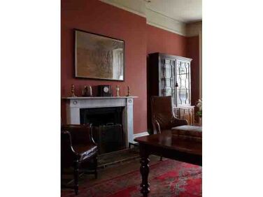
Before the remodel, the lower floor—which then held the kitchen, dining room, family room, boot room, and laundry room—did the heavy lifting. “It was acting as the entire family-life epicenter and was extremely crowded and unavoidably messy,” she says. The parlor floor above, meanwhile, consisted of just front and rear reception rooms, and went mainly unused. Anaïs’s solution was to spread out the public spaces between the two floors so that there would be natural flow and better storage. The kitchen and dining room migrated to the parlor floor (who needs two reception rooms?), leaving the bottom floor for just the family, laundry, and boot rooms.

Working with a tight budget—”Victorian houses are big and to fit it in a budget, you have to watch everything closely”—Anaïs was able to transform the once cluttered home into a tidy family sanctuary, with distinct spaces for distinct pursuits, even a room just for Zoe.

Here, Anaïs walks us through the remodel.

Photography by Henry Woide, courtesy of Daab Design.

the new heart of the home. prior to the remodel, the kitchen was on the bottom  17
Above: The new heart of the home. Prior to the remodel, the kitchen was on the bottom floor, which was dark and cramped. Now that it’s been moved to the parlor floor, with its grand windows, high ceilings, and generous proportions, the kitchen is a bright and inviting space. A Titan pendant light in olive green, by Original BTC, hangs above the dining table.
working with a tight budget, anaïs chose economical (but still stylish) op 18
Above: Working with a tight budget, Anaïs chose economical (but still stylish) options when it made sense. For the kitchen, she opted for Formica fronts from Plykea to go with Ikea’s Sektion kitchen cabinets.
a new doorway was carved out for access to the new laundry room. to the right i 19
Above: A new doorway was carved out for access to the new laundry room. To the right is a glass door that leads to the outdoor space and to the left are stairs to the lower level. In the interest of curbing waste, Anaïs rescued unwanted items from other parts of the home—sink, cabinet, and light—and reused them here. The oversized photograph of Central Park is by the client’s friend, photographer Mark King.
while enlarging the opening between kitchen and the living room, the contractor 20
Above: While enlarging the opening between kitchen and the living room, the contractor discovered an unusual truss system, which Anaïs decided to highlight as a link to the past. The tug and pull between modernity and tradition also shows up in her decision to paint the interiors of the original shutters a deep red. “It’s a nod to Victorian colour clashes that you find in the interiors of eccentrics of that time, such as Leighton House in Kensington,” says Anaïs of the project’s French-Gray and Book Room Red (both by Farrow & Ball) palette.
Above: The gray-green-red palette is repeated throughout the home. On the left, the entire stairwell (steps, railing, and walls) is painted in Book Room Red.
the view from the kitchen to the living room. all the kid activities (video gam 23
Above: The view from the kitchen to the living room. All the kid activities (video-gaming, playing, TV watching) now happen on the lower floor, while this floor is reserved for cooking, eating, and clutter-free relaxing.
the house has five levels. just above the the parlor floor is zoe&#8\2\17;s 24
Above: The house has five levels. Just above the the parlor floor is Zoe’s bedroom (the kids’ rooms are on the floor above hers).
zoe&#8\2\17;s ensuite bathroom features moroccan zellige tiles in a mossy g 25
Above: Zoe’s ensuite bathroom features Moroccan zellige tiles in a mossy green. Both the toilet and the sink are by Duravit.
the boys&#8\2\17; bedrooms are on the fourth floor. the original wood floor 26
Above: The boys’ bedrooms are on the fourth floor. The original wood floors throughout the home were re-finished and re-oiled.
the kids&#8\2\17; bathroom. anaïs chose a bathtub by trojan and a vani 27
Above: The kids’ bathroom. Anaïs chose a bathtub by Trojan and a vanity from Ikea in order to stay within budget.
the newly built stairway to the loft and roof terrace. the loft was an addition 28
Above: The newly built stairway to the loft and roof terrace. The loft was an addition that was put in by the previous owners, but it felt isolated from the rest of the home thanks to a small, awkwardly designed stairway leading up to it. “It felt more like an attic than a roof room,” says Anaïs. Her solution: a bespoke, modern, easily accessible birch-ply stairwell.
a newly enlarged window on the loft level perfectly frames a potted plant on th 29
Above: A newly enlarged window on the loft level perfectly frames a potted plant on the terrace.
prior to the remodel, the loft was underused: too hot in the summer, too cold i 30
Above: Prior to the remodel, the loft was underused: too hot in the summer, too cold in the winter, and hard to access in general. Anaïs (pictured here on the terrace) had it insulated and added triple-glazed sliding glass doors. The room is now bright and airy, with a palette courtesy of Kelly Wearstler’s California Collection for Farrow & Ball. And most important, it’s now used: The space is Zoe’s room of her own.

See also:

(Visited 14,964 times, 7 visits today)
You need to login or register to view and manage your bookmarks.

Frequently asked questions

What was the main issue Anaïs needed to address in the London Victorian remodel?

The main issue was the ineffective layout of the house, which led to domestic chaos for the client.

What changes did Anaïs make to improve the layout of the Victorian home?

Anaïs spread out the public spaces between two floors, moving the kitchen and dining room to the parlor floor and leaving the bottom floor for the family, laundry, and boot rooms.

How did Anaïs transform the cluttered home into a tidy family sanctuary?

Working with a tight budget, Anaïs created distinct spaces for specific purposes and ensured better storage options in the remodel.

What economical options did Anaïs choose for the kitchen in the remodel?

Anaïs opted for Formica fronts from Plykea to complement Ikea's Sektion kitchen cabinets, ensuring stylish choices while staying within budget.

What unique feature did Anaïs highlight during the remodel in relation to the Victorian past?

Anaïs highlighted the original shutters by painting their interiors a deep red, nodding to Victorian color clashes found in historic interiors.

Have a Question or Comment About This Post?

Join the conversation

v5.0