New York designer Magdalena Keck says that pieds-à-terre are her dream projects: “You get to know people from across the globe and work with them to realize their vision.” In the case of her most recent overhaul, Keck’s client was a São Paulo businessman who needed a toehold in New York and fell for a small one-bedroom TriBeCa loft. Though it needed light and storage, among other things, Keck’s client didn’t want to let go of the charming roughness that had wooed him in the first place.
His programmatic needs were simple: He travels to NYC every two to three months for business and pleasure, sometimes just for a day en route to Europe, other times joined by his family for a stay of several weeks. In response, Keck saw to it that the living room quickly converts into a sleeping space, and introduced a second bath plus washer and dryer to accommodate family and guests.
As for costs, the majority of project dollars went toward swapping existing living room windows for French doors that lead to small steel balconies; relocating the kitchen to join the living room in one open space; and adding the second bath. To keep budget in check, Keck salvaged the existing wood floor, used no-frills lighting wherever possible, and specified simple, reasonably priced fixtures for the bath. Take a look at her results.
Photography by Jeff Cate.
Above: The first and most dramatic order of business was to replace the existing living room windows with balcony doors to let in air and light. The client wanted an outdoor space, but his request to build a large terrace was rejected by building management. Instead, Keck installed two small steel balconies that project from the apartment about 18 inches, the maximum the building would allow. It’s enough space for the client to have standing room and even a tiny balcony garden.
Above: Keck removed the rusted and patched tin ceiling to reveal the original wood ceiling and steel hangers. NYC building code requires fireproofing between apartments, so Keck removed the ceiling’s aged paint and applied an invisible, matte fireproofing to the newly exposed ceilings. To lighten the space, Keck had the wood floors restored and whitewashed, and the worn brick walls painted white.
Above: Privacy curtains were needed in the living room, but how to keep them from dominating the doors? Keck chose a pure white linen to contrast with the rawness of the TriBeCa alley beyond. And instead of hanging standard, space-hogging curtains over the doors, she created a simple wooden-peg solution: A linen panel hangs loosely on one peg when open, and drapes across three pegs when closed.
Above: A custom kitchen replaced a worn one from the 1970s that had been tucked in an awkward location. The new design faces the living room, so Keck’s client can cook for guests while socializing.
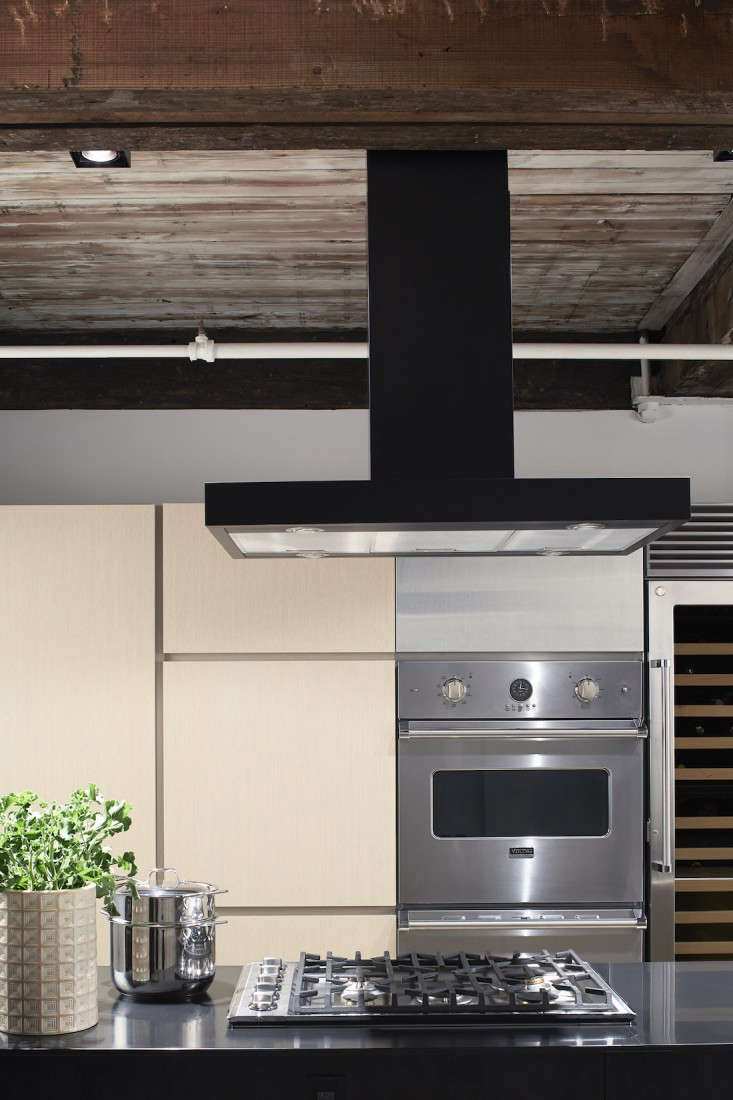
Above: The kitchen island is wrapped in black Corian on three sides, leaving stainless steel drawer facings to mirror the stainless steel appliances on the pantry wall. Keck used affordable black track lighting to spotlight the artwork on the far wall.
Above: The back wall of the kitchen is made of full-height oak pantries with a wall oven, warming drawer, and wine cooler from Viking.
Above: Keck chose Benjamin Moore Super White for the apartment walls. In the small dining area, vintage wood furniture stands out against the clean white background.
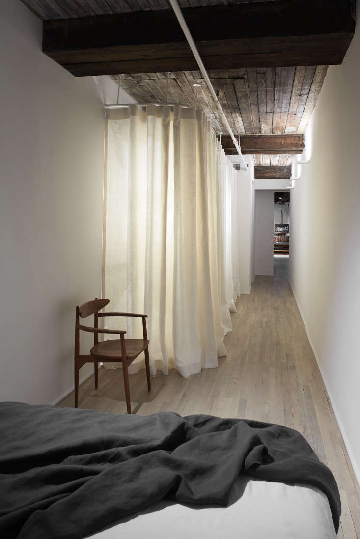
Above: The sole bedroom is small—it accommodates a queen-size bed with 10 inches of space on either side—but has a long hallway. Deciding to “embrace and exaggerate the unusual proportions,” Keck ingeniously put the hall to use as an extra-long, custom closet. Its white linen curtains can be pulled closed and backlit to create drama. At the end of the hall, the space is closed off by a sliding door.
Above: Along the bedroom/closet hallway, minimalist lights by Davide Groppi accentuate the aged beamed ceilings.
Above: In the bathrooms, Keck used an affordable marble tile for the showers and floor, the same black Corian counters that are in the kitchen, and minimal fixtures from Cifial. “The simple composition of genuine materials and clean forms works in these small spaces,” says Keck.
Above: White Corian shelves are incorporated into the marble shower tiling, so no hardware is visible. And full-height mirrors make the bathrooms feel bigger than they are.
Browse more lofts that we love:
- Curiosity Shop: A Multipurpose Room in a NYC Loft
- The Unplanned Designers’ Loft in Brooklyn
- The Ultimate Starter Apartment, Cobble Hill Edition
- How to Turn a Brooklyn Loft into an Urban Oasis






Have a Question or Comment About This Post?
Join the conversation (11)