Icon - Arrow LeftAn icon we use to indicate a rightwards action. Icon - Arrow RightAn icon we use to indicate a leftwards action. Icon - External LinkAn icon we use to indicate a button link is external. Icon - MessageThe icon we use to represent an email action. Icon - Down ChevronUsed to indicate a dropdown. Icon - CloseUsed to indicate a close action. Icon - Dropdown ArrowUsed to indicate a dropdown. Icon - Location PinUsed to showcase a location on a map. Icon - Zoom OutUsed to indicate a zoom out action on a map. Icon - Zoom InUsed to indicate a zoom in action on a map. Icon - SearchUsed to indicate a search action. Icon - EmailUsed to indicate an emai action. Icon - FacebookFacebooks brand mark for use in social sharing icons. flipboard Icon - InstagramInstagrams brand mark for use in social sharing icons. Icon - PinterestPinterests brand mark for use in social sharing icons. Icon - TwitterTwitters brand mark for use in social sharing icons. Icon - Check MarkA check mark for checkbox buttons.
You are reading

Fresh Directions: 9 Ideas to Steal from The James Bradley, a Moody Hotel in an Unlikely Locale

Search

Fresh Directions: 9 Ideas to Steal from The James Bradley, a Moody Hotel in an Unlikely Locale

William Jess Laird September 11, 2024

Just one block from the Jersey Shore’s sandy beaches, The James Bradley is a 17-room boutique hotel set in a 1904 Victorian mansion. The historic home once belonged to James A. Bradley himself, the wealthy brush manufacturer and real estate mogul credited with developing the area, but it had already been turned into a quaint inn by the time George DiStefano purchased it in 2021. He then enlisted New York City-based interior designer and close friend Sebastian Zuchowicki to gut the space and reimagine it for the modern traveler.

“It had been layered by so many different renovations, so there were Victorian details and Neo-Georgian details—it just looked like a hodgepodge,” Sebastian explains. “It was the perfect time to abstract everything and start from scratch. And I thought it could be nice for every room to have its own identity. It’s a good model to get people to keep coming back, so they can experience a different room every time they stay.”

Guests can choose from soft, neutral rooms and dark, moody suites—but textured limewash walls, sumptuous European linen bedding, and vintage furniture can be found throughout. Plus, George’s own creations–like folding white oak screens and wooden X-shaped lamps—are peppered in for a handmade touch. The result is an entirely fresh approach to coastal design—far from seaside tropes—that we’re eager to replicate.

Here, 9 ideas to steal from The James Bradley to get the dramatic-yet-relaxed look at home.

Photography by William Jess Laird, except where noted.

though george and sebastian stripped the inside of the \1\20 year old building, 17
Above: Though George and Sebastian stripped the inside of the 120-year-old building, they kept its grand facade intact to honor the history of the house.

1. Tile floor to ceiling.

across from the check in desk, a floor to ceiling grid of iridescent zellige ti 18
Above: Across from the check-in desk, a floor-to-ceiling grid of iridescent zellige tiles surrounds the fireplace. “All those tiles are made by hand, so they have a lot of movement and there’s a lot of variety in the color,” says Sebastian. “It doesn’t just feel like white everywhere. And it’s a good backdrop for anything you put on top of it.”
george (left) and sebastian, who sits in a guillerme et chambron style chair, i 19
Above: George (left) and Sebastian, who sits in a Guillerme et Chambron-style chair, in front of the pearly tiles and an Eric Wink photograph.

2. Add Venetian plaster.

the entire main level, including the reception area, is done in white venetian  20
Above: The entire main level, including the reception area, is done in white Venetian plaster. George and his friend Lucas Willings applied the coating themselves, which prompted them to launch their own decorative finish business, Lucas Willing Studios. “Plaster is so beautiful,” George says. “You feel the weight of it.”

3. Connect rooms with clean slates.

the common spaces are all neutral, with a light, earthy palette. photograph by  21
Above: The common spaces are all neutral, with a light, earthy palette. Photograph by EDSTA.
&#8\2\20;the goal is for someone to feel excited and relaxed when they come 22
Above: “The goal is for someone to feel excited and relaxed when they come in,” Sebastian says. “We decided to have all the furniture be neutral with art and accessories that feel personal to the owner of the hotel. In the breakfast room, we were inspired by the old school Axel Vervoordt long bench with the upholstery and pillows.” Note the white-washed floors. Photograph by EDSTA.

4. Paint the ceiling.

in each guest room, sebastian opted to paint the ceilings the same limewash hue 23
Above: In each guest room, Sebastian opted to paint the ceilings the same limewash hue as the walls, creating a “cozy cocoon feeling.”
the monochromatic paint technique is effective in both pale and deep tones, as  24
Above: The monochromatic paint technique is effective in both pale and deep tones, as evidenced by this olive green deluxe queen.
also in pale blue, as seen in a deluxe king room. 25
Above: Also in pale blue, as seen in a deluxe king room.

5. Use a folding screen as a headboard.

&#8\2\20;in a hotel, you want it to be as much of an experience as it possi 26
Above: “In a hotel, you want it to be as much of an experience as it possibly can be,” Sebastian says. This queen room, swathed in a rusty brown Bauwerk Colour lime wash called Tobacco, features one of George’s own folding white oak screens behind the bed in lieu of a built-in headboard.
in the two bedroom suite, matte, navy limewash complements a glossy black versi 27
Above: In the two-bedroom suite, matte, navy limewash complements a glossy black version of George’s folding screen for “a little more of an edge,” he says.

6. Introduce contrast.

another guest room pairs organic materials with hyper modern chrome lamps. & 28
Above: Another guest room pairs organic materials with hyper-modern chrome lamps. “Those lamps are actually from CB2, but they reminded me of Karl Springer, which I thought was the perfect juxtaposition,” says Sebastian. “Everything’s so layered and natural, and to have something a little seventies is great to disrupt that trendy look.”

7. Go for drapey bedding.

sebastian sourced heavy linen from belgium for the custom coverlets, shown here 29
Above: Sebastian sourced heavy linen from Belgium for the custom coverlets, shown here in the James Suite. “I’ve always loved puddling my drapes,” he says. “It’s an easy way to bring drama to a room. One day, I accidentally shopped an oversized blanket and I found a way to style it that looked cool. Then I started doing all my bedding like that. It’s relaxed. It’s casual. It’s how you should feel when you’re on vacation, especially by the beach.” (For more on the matter, see 5 Favorites: The Return of the Simple Bedspread.)

8. Embrace stainless steel.

the three bedroom bungalow behind the inn is outfitted with a sleek stainless k 30
Above: The three-bedroom bungalow behind the inn is outfitted with a sleek stainless kitchen. “I was itching for a stainless steel moment,” Sebastian says. “Hotel kitchenettes usually use very standard materials—stone top, tile backsplash, wooden cabinetry—so I thought it’d be nice to take a slicker approach.” (Stainless kitchens are having a moment: See Trend Alert: 11 Stylish Stainless Steel Kitchens.)
the adjacent dining area speaks to the metal clad kitchen with chrome and black 31
Above: The adjacent dining area speaks to the metal-clad kitchen with chrome-and-black leather Mies van der Rohe chairs.

9. Tell a color story.

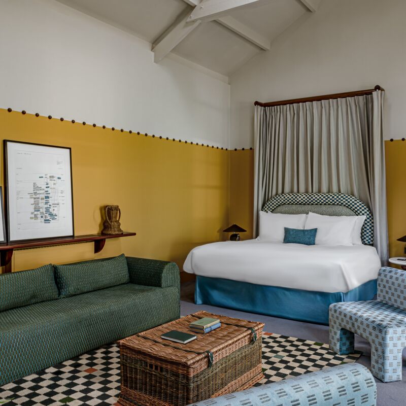
for the bungalow&#8\2\17;s bedrooms, sebastian riffed on the classic primar 32
Above: For the bungalow’s bedrooms, Sebastian riffed on the classic primary colors, painting one midnight blue, another terracotta, and the third golden yellow. “It looks like Mondrian, just warmer and cozier,” he says.
george built a daybed in the style of donald judd for the terracotta space. 33
Above: George built a daybed in the style of Donald Judd for the terracotta space.
vintage, marcel breuer style beds complete the golden yellow twin room. 34
Above: Vintage, Marcel Breuer-style beds complete the golden yellow twin room.

For more—and to book—head to The James Bradley.

And for more design destinations with ideas to steal, see:

(Visited 7,689 times, 1 visits today)
You need to login or register to view and manage your bookmarks.

Have a Question or Comment About This Post?

Join the conversation

v5.0