Icon - Arrow LeftAn icon we use to indicate a rightwards action. Icon - Arrow RightAn icon we use to indicate a leftwards action. Icon - External LinkAn icon we use to indicate a button link is external. Icon - MessageThe icon we use to represent an email action. Icon - Down ChevronUsed to indicate a dropdown. Icon - CloseUsed to indicate a close action. Icon - Dropdown ArrowUsed to indicate a dropdown. Icon - Location PinUsed to showcase a location on a map. Icon - Zoom OutUsed to indicate a zoom out action on a map. Icon - Zoom InUsed to indicate a zoom in action on a map. Icon - SearchUsed to indicate a search action. Icon - EmailUsed to indicate an emai action. Icon - FacebookFacebooks brand mark for use in social sharing icons. flipboard Icon - InstagramInstagrams brand mark for use in social sharing icons. Icon - PinterestPinterests brand mark for use in social sharing icons. Icon - TwitterTwitters brand mark for use in social sharing icons. Icon - Check MarkA check mark for checkbox buttons.
You are reading

The House on Dolphin Street: A Remodeling Tale of Tenacity and High Style

Search

The House on Dolphin Street: A Remodeling Tale of Tenacity and High Style

November 22, 2021

Artist/illustrator Russell Loughlan is a serial house remodeler who labels his latest project “a total impulse buy.” Located on Dolphin Street in the seaside town of Deal, in Kent, England, the 1768 Georgian row house had been untouched since the 1960s. And to see his fixer-upper now, you can understand why he fell for it. But what began as a cosmetic passion project devolved: this is a tale of hidden rot, rebuilding, and blown budgets. “The moment I viewed it, I just knew I had to have it,” Russell tells us. “It broke me financially and mentally, but it was worth it.”

For months now, Julie and I have been watching Russell chart his renovation on Instagram @thehouseondolphinst while camping out on friends’ sofas during the messiest stages. He’s now enjoying the results of his work—before succumbing to his next place. Russell has a master’s degree in fine art from Central St. Martins, and, since moving to Deal in 2005, he’s overhauled three houses (the first also on Dolphin Street). He recently thrilled his followers by announcing the launch of his own interior design studio, The House on Dolphin Street. Russell is ready to take on commissions and also to offer color consulting and hands-on styling. Join us for a look at what he can do (and scroll to the end for a glimpse of the project as it was).

Photography courtesy of Russell Loughlan.

the four story structure is on a block of historic fisherman&#8\2\17;s hous 17
Above: The four-story structure is on a block of historic fisherman’s houses that ends at the ocean. Shown here, Russell’s shades of blue color tests. What sold him on Deal are the “swatches of pastel-colored Georgian streets”—and the fact that it’s a” long, thin stretch of a town, so no matter where you are, you’re on the beach in minutes.”
the untouched state of the house was a big selling point for russell. the struc 18
Above: The untouched state of the house was a big selling point for Russell. The structure was designated Grade II— meaning of historic interest and warranting preservation—and slated to be auctioned, but, as a known real estate junkie in Deal, he was granted an advance look and option to buy.

“I ported over a mortgage from the sale of my last property,” says Russell. “It was a gamble but felt worth it as the resale would far outweigh any issues the house might have—or so I thought. I had a middle-rate survey done, but because the house was covered in layers of paneling, lino, carpets, etc., they couldn’t detect the rot, and the external structure was sound.” One month into the work—after the new kitchen had been installed—plumbers putting in pipes found live woodworms and crumbling rafters. “It turned out that the inside of the house was essentially a broken umbrella: there was nothing holding the rafters to anything,” Russell told The Modern House offshoot Inigo. “The roof and every support, ceiling, and floor had to be replaced: our renovation budget was completely blown.” Throwing in the towel didn’t feel like an option—the house wasn’t salable as it was, so Russell refinanced his mortgage, took out bank loans, maxed out his credit cards, and carried on.

the interior had long ago been stripped of most of its period details. after th 19
Above: The interior had long ago been stripped of most of its period details. After those unexpected months spent shoring up the building, Russell had his crew focus on re-creating Georgian features starting with the wood paneling: “we copied the one remaining original piece and replicated it throughout the ground floor.”
thanks to russell&#8\2\17;s art background, he is not afraid to make daring 20
Above: Thanks to Russell’s art background, he is not afraid to make daring color choices. He went with Farrow & Ball paints in their “modern eggshell” finish: “it has a slight sheen that echos the finishes the Georgians used.” Warm dark colors felt right for the dark and tavern-like downstairs rooms.
the sofa is a reupholstered ebay purchase and the brass swing light is the coop 21
Above: The sofa is a reupholstered eBay purchase and the brass swing light is the Cooper Wall Fitting, £136, from Pooky. Using sconces rather than overhead lighting, Russell notes, “lends itself to the heritage of the building and keeps the rooms cozy and intimate.”
the parlor&#8\2\17;s original restored fireplace is inset with a wood stove. 22
Above: The parlor’s original restored fireplace is inset with a wood stove.
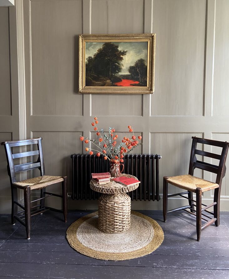
the paneling is painted hardwick white, a warm gray that farrow & ball crea 23
Above: The paneling is painted Hardwick White, a warm gray that Farrow & Ball created “to touch up the limewash at Hardwick Hall,” a 16th century National Trust estate in Derbyshire.
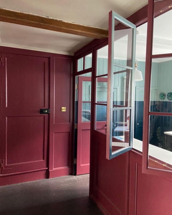
a glazed partition opens the kitchen to the living area and provides a perfect  24
Above: A glazed partition opens the kitchen to the living area and provides a perfect cocktail bar ledge—it was a 1960s addition that Russell decided to keep though it required rebuilding. The ruddy shade used on the paneling is Farrow & Ball’s Picture Gallery Red.
russell is constantly switching up the dining ensemble. we like this compact ea 25
Above: Russell is constantly switching up the dining ensemble. We like this compact early version with vintage metal folding chairs. See larger and more formal setups @thehouseondolphinst.
russell introduced beadboard paneling and used color blocks of blue to create p 26
Above: Russell introduced beadboard paneling and used color blocks of blue to create perhaps the most memorable room in the house. The new cabinets are from Wickes and the counter is quartz: after the discovery of woodworm—and the surprise collapse of the floor overhead—all had to be salvaged, stored, and later reinstalled.
farrow & ball&#8\2\17;s hague blue meets oval room blue on the back wal 27
Above: Farrow & Ball’s Hague Blue meets Oval Room Blue on the back wall. The fridge and freezer are tucked under the quartz countertops.
moroccan zellige in transparent pastel turquoise from the mosaic factory tile t 28
Above: Moroccan zellige in Transparent Pastel Turquoise from the Mosaic Factory tile the stove wall.
after painting stripes in the downstairs hall, he kept going upstairs. the blue 29
Above: After painting stripes in the downstairs hall, he kept going upstairs. The blue is Farrow & Ball’s De Nimes.
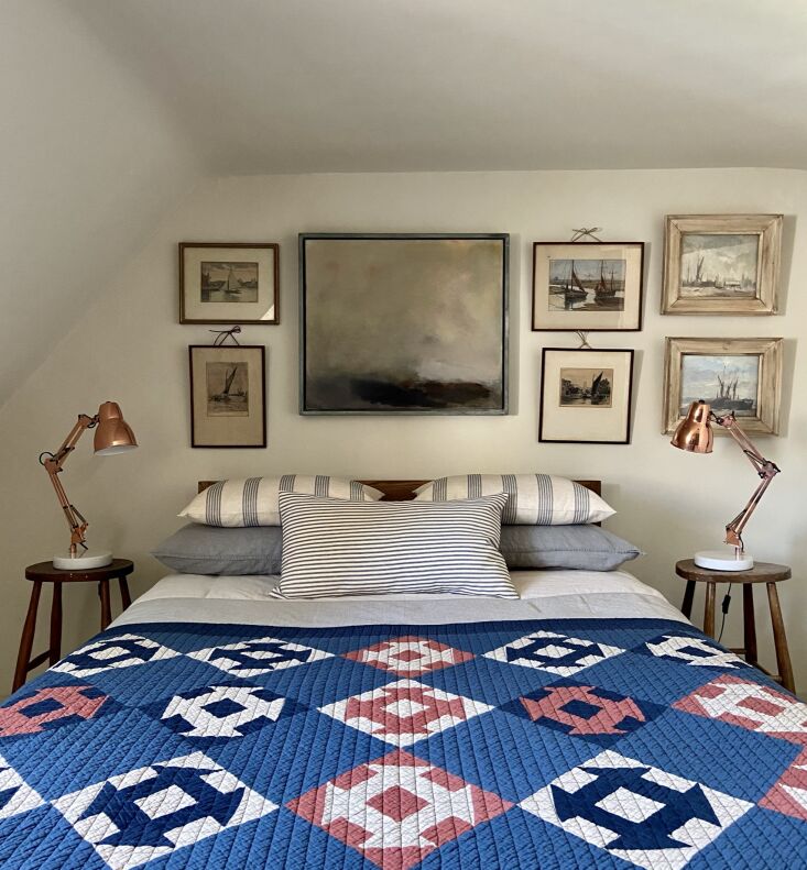
the guest room has a nautical theme. the abstract landscape painting is by loca 30
Above: The guest room has a nautical theme. The abstract landscape painting is by local artist Ned Kelly. The patchwork quilt came from a shop in Deal and has an unexpected provenance: it’s by Japanese brand BasShu.
the bedroom came with a fireplace that was little more than a hole in the wall. 31
Above: The bedroom came with a fireplace that was little more than a hole in the wall. Russell had his team restore it and add a period mantel purchased on eBay. The new wide-board pine flooring is painted Shaded White and the walls are Shadow White, both from Farrow & Ball.
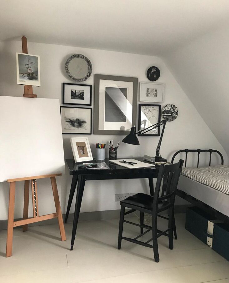
the garret is russell&#8\2\17;s art studio—that&#8\2\17;s some o 32
Above: The garret is Russell’s art studio—that’s some of his work on the wall. It’s the only room in the house that’s white.
in contrast to the cozy tavern feel of the ground floor, the upstairs is awash  33
Above: In contrast to the cozy tavern feel of the ground floor, the upstairs is awash in natural light, which inspired Russell to go with a seaside palette of greens and blues.
russell says he has &#8\2\20;zero talent&#8\2\2\1; when it comes to con 34
Above: Russell says he has “zero talent” when it comes to construction or “any kind of DIY,” but he knows how to paint. Needless to say, applying stripes in rooms with very irregular lines was challenging. Here, he used Farrow & Ball’s Verdigris Green. The black and white tiles are from Fired Earth.
russell hand striped his bedroom, too: &#8\2\20;it might look crazy but str 35
Above: Russell hand striped his bedroom, too: “it might look crazy but stripes are actually hypnotic and calming,” he says.

Before and In Progress

from russell&#8\2\17;s remodeling chronicles—the day he hauled away  36
Above: From Russell’s remodeling chronicles—the day he hauled away all of the carpeting.
interior paint samples on new paneling. 37
Above: Interior paint samples on new paneling.
the kitchen had a narrow breakfast bar and reeded glass windows, many of which  38
Above: The kitchen had a narrow breakfast bar and reeded glass windows, many of which cracked on removal; Russell used the intact panels elsewhere, including in a bedroom vestibule.
the sink was replaced but the kitchen windows and door remain. 39
Above: The sink was replaced but the kitchen windows and door remain.
creating the stripes involved tape and a lot of careful measuring. &#8\2\20 40
Above: Creating the stripes involved tape and a lot of careful measuring. “It’s not wallpaper, dammit!” writes Russell.
the bathroom nearly finished. 41
Above: The bathroom nearly finished.

Russell says he plans to rent out the house for the holidays—and eventually to put it on the market. Stayed tuned @thehouseondolphinst.

Here are four more remodeling projects with eye-opening color palettes:

(Visited 4,104 times, 1 visits today)
You need to login or register to view and manage your bookmarks.

Product summary  

Have a Question or Comment About This Post?

Join the conversation

v5.0