Brooklyn-based Studio Tack is gaining a reputation for artfully rehabbing old hotels and hospitality spaces. One of the newest additions to its portfolio? The Coachman Hotel in South Lake Tahoe, California.
Studio Tack designed the interiors, landscaping, and branding for the project in partnership with local architect Brian Shinault. The program included, in part, combining two separate motels (the Royal Coachman and the Green Lantern), transforming a residential owner’s unit into the hotel lobby, and turning a sad asphalt parking lot into an outdoor leisure HQ. And though the project admittedly cost several million dollars to complete, the designers still had to do it on a budget.
Their approach was high/low; to use affordable materials like plywood, and take the money they saved and invest it in higher-end lighting, furniture, and art objects throughout the development. Designers Leigh Salem and Ruben Caldwell gave me the details.
Photography by Luke Beard and Matthew Bolt, courtesy of the Coachman Hotel.
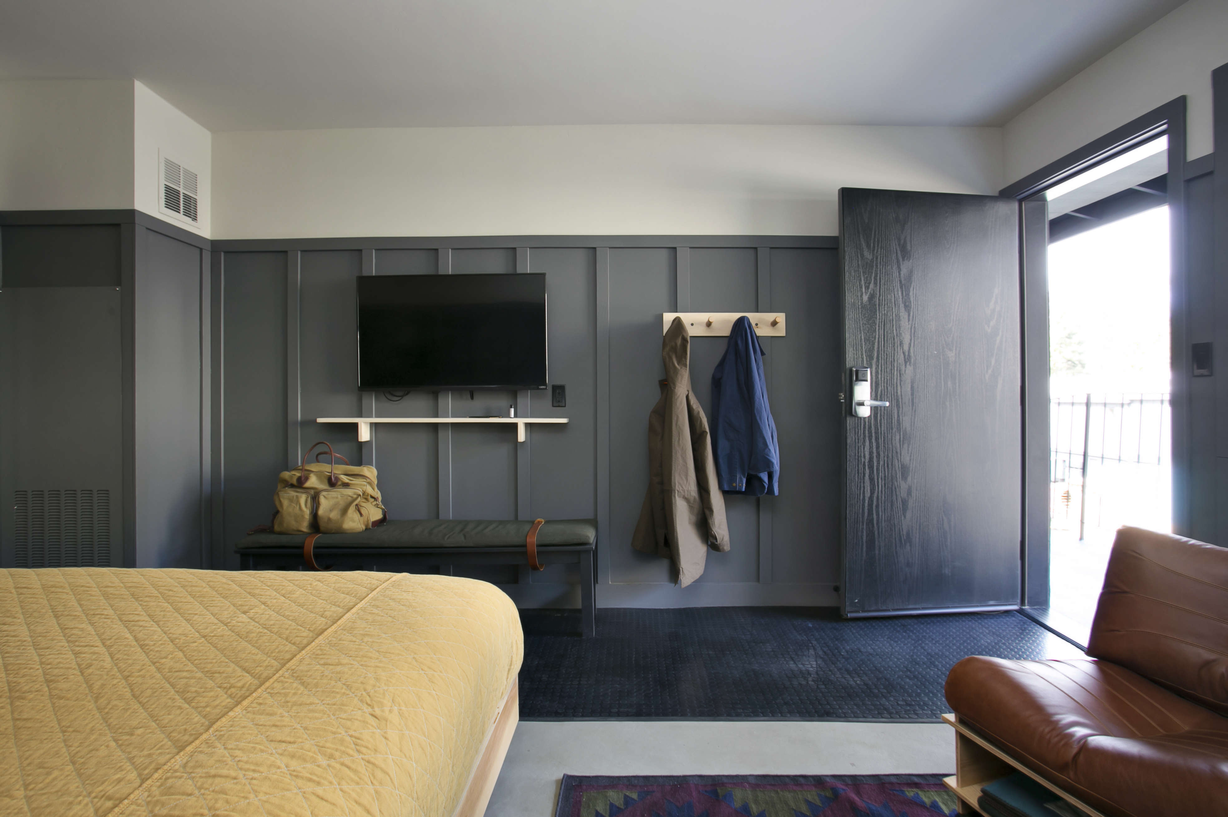
Above: Each of the 42 guest rooms is lined in plywood paneling painted in Benjamin Moore’s Iron Mountain. The plywood beds were fabricated on-site by the contractor, and the yellow canvas bedcovers are by Utility Canvas. Studio Tack designed the wall lights flanking the beds; ambient light disperses through a perforated metal screen when they’re on.
Above: Near the entryway, a “ski rack” hangs above a utilitarian strip of rubber flooring, both ready for wet coats, boots, and other snow gear. The rest of the floor is concrete, an example, says Caldwell, of their high/low approach: “We recognized early on that the floors and surfaces were going to get hammered,” he said, “so we realized we could have a super durable surface with a fairly small investment.”
Studio Tack designed custom rugs for the hotel, woven in India, to soften the otherwise industrial flooring. Beneath the TV is a custom-made wood bench with a wool cushion and a leather strap to hold it in place.

Above: The communal room of the hotel’s suite, which sleeps 11, has a plywood kitchenette and a plywood sofa designed in partnership with 100xBetter.
According to Caldwell, Studio Tack’s initial thinking helps keep costs down: “We don’t come into a space with preconceived ideas of what we’re going to do,” he said; instead, they stay open to what the existing space has to offer. They retained, for example, some fake 1960s lava stone stacks on the exterior, heart-shape bathtubs in some bedrooms, and bare concrete floors almost everywhere. “When we think about what we can save during the remodel, we come up with more interesting solutions,” he said.

Above: Studio Tack used plywood heavily throughout the project, and turned to it for its durability and relatively low cost after exploring a number of different materials. Luckily, the project’s contractors, Sierra Sustainable Builders, were able to fabricate the plywood designs on site.

Above: A plywood valet corner with sink separates the sleeping space from the toilet and shower. (For more, see Bathroom of the Week: An Economical Plywood Bath in Tahoe.)

Above: When work began, what is now the lobby with a communal bar and several lounges was a three-bay garage in the motel owner’s unit. Studio Tack covered the ceiling with rough framing lumber—a budget approach to completely transforming the space.
The chair is by J. Pickens and the coffee table is California burlwood in a high lacquer finish.

Above: All the plywood furniture, including this plywood loveseat with overstuffed cushions, is by 100xBetter. The coffee table is by Dust to Dust. The rugs in the common spaces are vintage Turkish kilim rugs.

Above: Studio Tack swapped the lobby’s garage doors for full-height sliding glass doors, which open onto a shared outdoor space with pool, hot tub, and fire pit. It gets plenty of use in the winter, the designers say, but in the summer the outdoor space merges completely with the communal lounge. The barstools were made by local supplier Forever Redwood.

Above: To the left of the check-in desk is a large L-shaped sofa by designer Stephen Kenn.
Above: Studio Tack replaced an asphalt parking lot with a multilevel deck to “enlarge the sense of public space,” said Salem. “We created new spaces simply by changing the ground plane.”
Above: The exterior of the buildings were painted a unifying coat of Benjamin Moore Black Panther.
For more snowy spaces, see:
- A Wabi-Sabi Ski Chalet in Aspen, Colorado
- Swiss Chalet: An Alpine Remodel by Jonathan Tuckey
- Into the Wild: Faviken Restaurant in Northern Sweden


Have a Question or Comment About This Post?
Join the conversation (1)