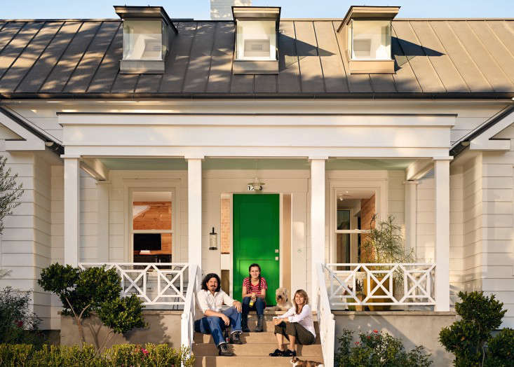
This week, architect Casper Mork-Ulnes and designer Alexa Mork-Ulnes of SF firm Mork Ulnes Architects tell us about preserving the sixties vibe of their Haight-Ashbury Victorian while modernizing it for their family. They’re available for the next 48 hours to answer any and all questions. Ask away!
A Victorian house that had been run as a hippie boarding house for over 30 years in Haight-Ashbury might not be everyone’s idea of the perfect first home. For fifth-generation California designer Lexie Mork-Ulnes, however, it was love at first sight, even if her architect husband Casper Mork-Ulnes, founder of Mork Ulnes Architects (and a member of the Remodelista Architect and Designer Directory), was not entirely convinced. “The house was full of hippie soul–it had a pornographic stained glass window next to stained glass salvaged from a church; trumpets turned into light fixtures, and enormous murals,” she says. “Casper and my parents thought that I was under the influence of the poppy plants on the front doors.”
Over the next seven years, the project became a labor of love for the couple as they renovated and modernized the 2,600-square-foot two-level flat in phases as they could afford it. The program included legalizing the attic space in order to add two bedrooms, reconfiguring an existing stair and bridge, renovating the kitchen, and adding a bathroom while incorporating more natural light. “We questioned every design decision, making sure we would stay true to the original character of the house,” Casper says. “We had no interest in gutting the space and stripping it of its soul–the ultimate challenge was to maintain its sense of place and history in both the Victorian and hippie eras of San Francisco while bringing a current sensibility to the space and allowing us to live there as a family.”
Photography by Bruce Damonte.
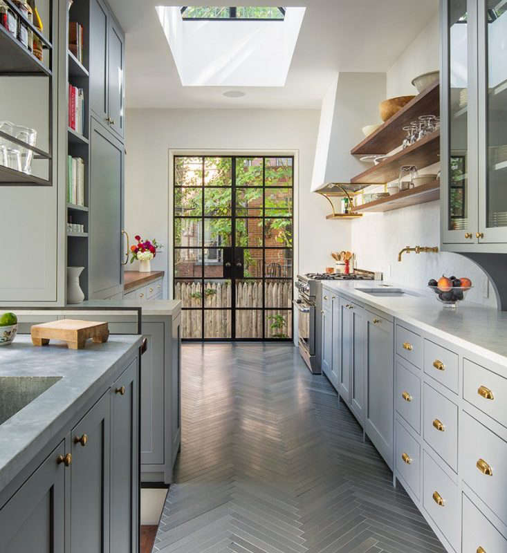
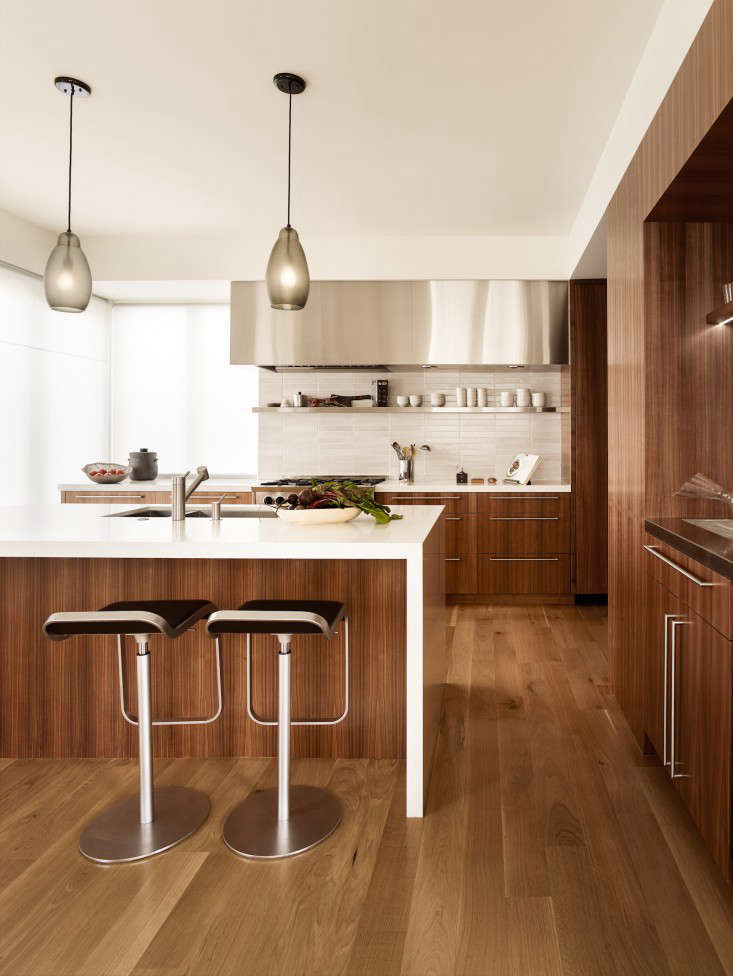
Above: The couple streamlined the kitchen for efficiency while adding windows to allow in more light. The cabinets are made from rift-cut white oak and the countertops are Caeserstone Blizzard White. An Axor Starck 2-Spray Semi-Pro Kitchen Faucet by Hansgrohe adds a sculptural utility to the setup.

Above: The dining room retains its Victorian character while offering views through to the modernized kitchen (where a rolling library ladder provides access to storage). Midcentury Fiberglass Eiffel Side Chairs from Modernica are paired with an English drop leaf table from Sleuth Antiques in Sausalito, while a hand-carved bench of alder and walnut, a wedding present made by Alexa’s brother woodworker Nick Damner, sits on the side of the room.

Above: The original double-height living room was cluttered with thick beams and a bridge that zigzagged across the space. The couple streamlined the room and added skylights over the stair and the bridge to bring in more natural light. Inspired by a photo of a swing in a living room, Lexie asked her brother to make a four-foot-long version, matching the bench he made in the dining room, to hang from the structural bridge.

Above: The modern detailing of the new sculptural wood stair that leads to the attic complements the couple’s Florence Knoll sofa and Eames rocking chair. “To celebrate the stair as a sculptural object and to keep the room feeling light, we used a glass guardrail,” Casper says.

Above: With functionality and code compliance in mind, the couple reluctantly replaced the existing solid wood spiral stair, which had been suspended from ceiling with black steel rods. Wanting to make something equally interesting in the same spirit, they recycled the floorboards from the attic by laminating them together to create a solid butcher block-like stair. “The stair feels right because it’s built from the original materials of the home, complete with old nail holes and turquoise floor paint from the 1970s,” Alexa says.

Above: In the master bedroom suite on the attic level, a bathroom and closet are enclosed by a wall of wood panels that run horizontally to maintain the spatial quality of the attic. Polycarboate panels in the clerestory above the wall allow southern light to filter into the library space adjacent to the bedroom. To keep the wood on the wall from yellowing, the couple finished it with lye and white oil, a traditional Scandinavian treatment.

Above: A large window overlooks St. Ignatius Cathedral and offers a partial view of the Golden Gate Bridge; the window has operable frosted lower panes that provide privacy and obstruct views of a neighbor’s roof and ventilation.

Above: The ingenious wood headboard, designed by Yvonne Mouser, incorporates built-in storage while also providing structural reinforcement: “The two sloped parts of the headboard on either side of the bed reinforce the wall framing that was sagging as a result of some rather unorthodox hippie construction techniques,” Casper says.

Above: A glass sliding door and partition enclose the master bedroom without compromising the view through the attic space.

Above: A bridge made of blackened steel and reclaimed floorboards (from the old attic) connects a children’s bedroom to the master bedroom.

Above: Many of the original Victorian rail turnings were missing, and the couple went to a local wood turner to have them recreated. “We left the turnings unpainted as a testament to their mismatched history,” Casper says.

Above: In the master bathroom, the limestone walls of the shower are layered on top of the existing pre-distressed brick chimney. The cabinet is built from Douglas fir, treated with lye and white oil, and has a soapstone countertop.

Above L: Before the couple started working on the house, it had a hand-done stucco exterior. Above R: In removing the stucco from the front faí§ade, the couple discovered that most of the original Victorian detailing was intact underneath. “We played around a lot with paint color options on Photoshop before picking the dark palette, which we felt made it more modern,” Alexa says.
Before

Above: A colored glass pendant and stained glass panel were part of the hippie decor in the kitchen.

Above: The dining room was used as a small sitting room.

Above: A trumpet made into a light fixture is another 1960s-era intervention. “When we found it, the closet door was painted a bright glossy orange,” Alexa says.

Above: The living room originally had a solid wood spiral stair and a large wall mural.

Above: The attic before the couple converted it into their master bedroom suite. “Converting an attic into habitable space is not as straightforward as you might think because of California’s seismic environment,” Casper says. “Meeting building and planning code requirements is challenging, especially in historic homes.”

Above: The communal shower, which was entered via saloon doors, had a graphic stained glass window (look carefully on the left) next to a stained glass window salvaged from a church.
Like the dark exterior of this house? Bay Area architect Douglas Burnham of Envelope A+D tells us why he painted his Victorian the perfect shade of black in Expert Advice: How to Mix a Color. And over on Gardenista, it’s black fences that are trending. If you enjoyed this installment of The Architect Is In, see our library of previous posts.


Have a Question or Comment About This Post?
Join the conversation (40)