Over the last 20 years, New York-based firm Platt Dana Architecture has developed a reputation for transforming traditional buildings and apartments into spaces oriented around contemporary family living. This week, Kate Platt and Hope Dana talk to us specifically about their update of a classic, prewar eight-room apartment for a busy family of five on the Upper East Side of Manhattan.
The most satisfying architecture delivers elegant design solutions without ever appearing as if it’s tried too hard. Trading space and light as currency, Platt Dana Architecture (members of the Remodelista Architect/Designer Directory) are well practiced at “robbing Peter to pay Paul” in the floor plans of their clients’ apartments, ensuring that the flow of rooms addresses the way they live. In this classic eight, a family room was gained through the loss of a bedroom (in turn, a small office behind the kitchen was converted into a guest bedroom), while the kitchen was made bigger by acquiring the space from the adjacent study. Borrowed light flows freely through the enlarged openings among the entry foyer, kitchen, living room, and newly positioned dining room, creating an overall generous sense of open and free-flowing space. And finally, by filling every available nook and cranny with well-designed, efficient storage, the architects manage to squeeze out even more precious space; leaving their clients with a healthy “space” account in the black.
Photography by Ty Cole.

Above: Glass mosaic tiles from Cheryl Hazan Mosaic set a calm tone in a busy kitchen. Stainless steel counters sit above white kitchen units from Bulthaup while a Calacatta Marble countertop is used for the kitchen island.

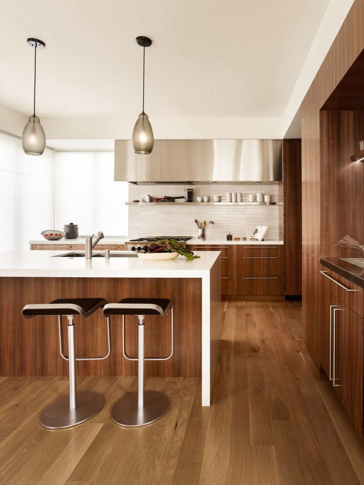
Above: By acquiring space from the adjacent study, the kitchen gained a window and light as well as space. A pendant light by Niche Modern hangs above an Eero Saarinen table surrounded by Norman Cherner chairs.

Above: A view from the kitchen of the family room, which was previously a bedroom. The cabinets, custom designed by Platt Dana, house the television and centralized sound system and are horizontal grain oak with a white stain.

Above: A muted palette of grays, selected by interior designer Debra Notis, works well with the Korean landscape paintings that represent the four seasons and presented to the client by her parents as a wedding present. An Arctic Pear chandelier from Ochre hangs above the dining table and chairs from B&B Italia. The living room sofa is also from B&B Italia while the textured side table is from Oly.

Above: For the musical family, the piano occupies an important corner of the living room in front of a wall of custom built bookshelves and storage.

Above: The two boys in the family share a room; made feasible through the custom-built storage and desk system, which is mirrored on the other half of the wall.

Above: In the master bedroom, a built-in desk system fits into the window alcove. “Our client hates clutter, and so we designed a desk where most of the countertop opens and reveals hidden storage for makeup and jewelry as well as electrical outlets for charging iPhones and a hair dryer,” says Dana.

Above: A mosaic tile installation by Cheryl Hazan brings blossoms in to the bathroom shower.

Above: The kitchen before Platt Dana incorporated the space and window from the study next door.

Above: The previous dining room was next to the kitchen and has now been converted into a family room.

Above: A view of one of the bedrooms before the Platt Dana renovation.

Above: A comparison of the existing and revised floor plans illustrate Platt Dana’s skill in updating a floor plan for modern family living. The updated floor plan has a stronger diagrammatic clarity between public and private space and as a result, the public spaces have a more coherent relationship with enhanced flow between the spaces. A new family room is adjacent to the kitchen while the dining room has been repositioned to sit directly across the kitchen via the entry foyer. The kitchen has gained space and light by acquiring both from the adjacent study, and the office tucked in the back has been turned into a guest bedroom. A laundry room and additional storage have been carved out of the family room and their location in the hall makes them easily accessible.
N.B.: Useful and efficient storage has unlimited value in our modern culture of accumulation. See 420 images of Cabinets in our Gallery of rooms and spaces.


Have a Question or Comment About This Post?
Join the conversation (29)