As an urbanite, I long for wide-open spaces, but what I dream of are lofts rather than Great Plains. Designing lofts, however, comes with its own set of unwieldy challenges. This week, New York architect Eric Liftin of Mesh Architectures shares a Nolita loft conversion and his insights into the design process. He’s available for the next 48 hours to answer and any and all questions. Ask away!
Liftin’s brief was to turn two apartments into a single 3,400 square-foot loft for two writers who had been living side by side in a divided industrial space when they fell in love and decided to combine assets. On their wish list: a heavy-duty kitchen, a living and dining space, master bedroom suite, two writing studios, a guest room, and a guest bathroom.
Liftin, a founding partner of Mesh Architectures and a member of the Remodelista Architect & Designer Directory, agreed to work within a cost-conscious budget, but his task was admittedly daunting. “With lofts, you start with these wide-open spaces, and after you fit in all the programmatic requirements, you run the risk of ending up with either a traditional apartment layout or, worse, a series of rooms running down a corridor as in a hotel,” he says. “The problem is also compounded by the fact that in typical old loft buildings such as this, the windows are only in the front and back, leaving you with a vast middle area that gets no sunlight; we’re always left puzzling, ‘How do we use this space?'” The architect rose to the challenge through an ingenious use of translucent materials and moving bookshelves in the heart of the loft, and without sacrificing any of the expansiveness. Have a look.
Photographs by Frank Oudeman.

Above: The 3,400 square foot loft has an open central corridor. Bookshelves in the windowless middle area section off a library/media room. The space is on the second floor of what was once probably a slaughterhouse. The architect exposed all of the wooden joists in the ceiling and cleaned out layers of dirt and char from old fires by shot blasting them. The red steel columns were installed in a previous renovation and most likely replaced columns that had been damaged by fire. “The columns were already painted red,” Liftin says. “We treated them as found objects and left them that way.”

Above: The kitchen displays the materials and color palette that extends throughout. “We used a lot of Baltic birch plywood; the natural warmth of the material and the maple flooring balances our inclusion of some bold synthetic colors, such as the kitchen’s blue,” he says. To get the color, a high-strength and durable blue epoxy was poured onto the floor and continued up the kitchen island, creating a sculptured effect.

Above: Tucked into a back corner, the guest powder room has a metal mesh door and ceiling made of Panelite panels, a translucent material with an aluminum honeycomb core and fiber glass facings.

Above: The central area of the loft is occupied by a combination library and media room. Liftin turned the lack of natural daylight into a feature. “At night, a space with no windows feels intimate and protected, and so we created a cozy room, and then designed the walls as bookshelves that open up–one bookshelf slides, the other pivots,” he explains. “The owners entertain a lot, and this mechanism enables a wide-open space conducive to parties. Alternatively, if some of the family are watching a movie or reading, they can close the library for privacy.” Watch the video at the end of the post to see how the moving walls create flexibility.

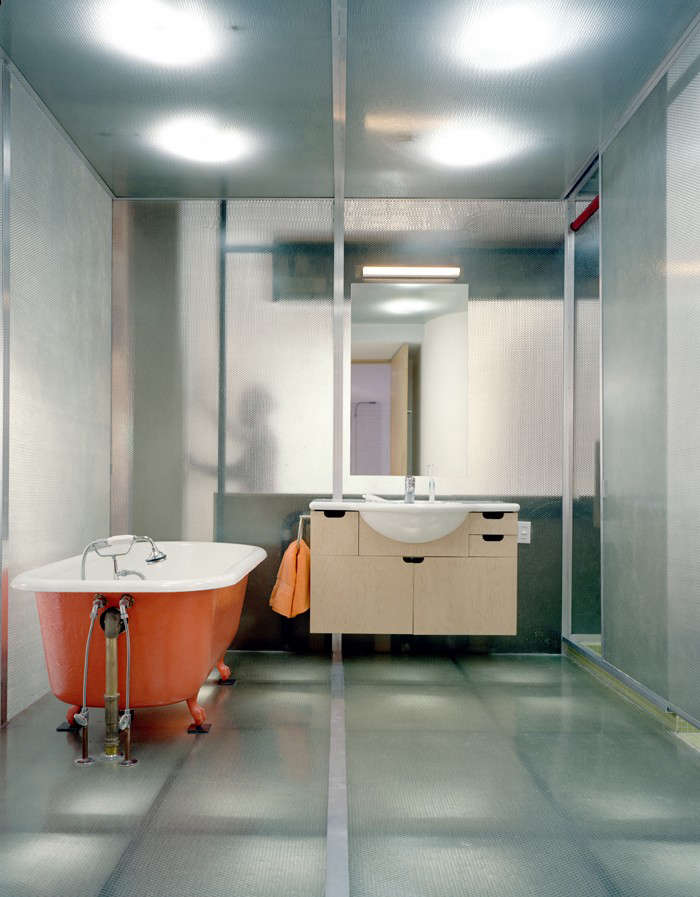
Above: Adjacent to the library, the architect created a translucent master bathroom out of Panelite panels. Lit from without (below the floor and above the ceiling), the bathroom acts like a giant light fixture for the loft, illuminating and activating the space around it. “As you can see in the photo, only elements that are close to the panels are visible,” Liftin says. “If you desire more discretion, don’t lean against the material and you won’t be seen.”

Above: The concept of the master bath as a translucent cube was borne out of a practical requirement: the room had to be build on a platform above the plumbing. The result is a futuristic space with a fiberglass Panelite floor and the surprise addition of an old cast-iron clawfoot tub in bright orange.

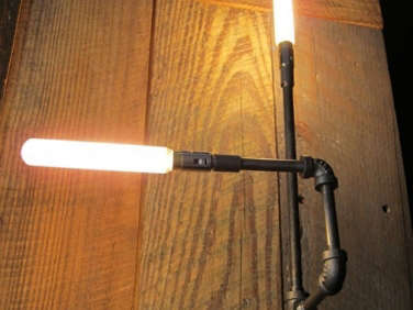
Above: All of the bedroom doors, including the master bedroom shown here, are made of birch plywood that have been laminated around sheets of orange acrylic. The cut-outs offer an inexpensive solution to creating unique doors with controlled degrees of transparency. The hallway is lit by Liftin’s Pointer-Pipe Light mounted using pipe fittings on the exposed ceiling joists. Along with his other light designs, the Pointer-Pipe Light is available from through his Etsy store, MESH architectures.

Above: In the master bedroom, the red is used as an unexpected accent on the windows and closet door (previously a cabin door on a ship). “The red curtains are graphic and bold–the opposite of white sheers which normally impart serenity,” Liftin says. “These curtains are energetic and passionate.”

Above: Tucked away at the back with no natural light, the guest room has decorative doors that are bi-fold so that when not in use, the room can be wide open to the rest of the loft. The cut-out acrylic draws light into the area. Fun detail: The corner door leads to one of the writer’s studies, and the vertical stripe of transparent acrylic to the left of it is shows the layers of soundproofing that were required between it and the other writer’s studio.

Above: The architect used epoxy flooring in areas of high traffic for easy cleaning and water resistance. The blue epoxy floor from the kitchen curves around in front of the entrance to the loft and into the guest bathroom behind the kitchen.

Above: The plan of the 3,400 square foot loft for two writers. “The construction budget was extremely aggressive, which I don’t mind because economy breeds invention,” LIftin says.
Above: Watch this video to better understand how the library/media room becomes another space through the use of bookshelf walls that move.
Still longing for the wide-open spaces of New York? See another firm’s very different solution to loft challenges in The Architect Is In: Seeking Sunlight in Chelsea.


Have a Question or Comment About This Post?
Join the conversation (10)