The story of a recently completed San Francisco remodel by San Francisco firm Sagan Piechota starts out like that of many others. A sturdy but uninspired house–this one built in the 1930s as part of a large San Francisco housing development–needs an update. The owners want to respect what’s already there but want to insert modernity “in a tasteful and elegant way,” as architect Daniel Piechota says, “while keeping an eye on costs.”
But different people have different priorities. Piechota’s clients, former professional chef Randy Windham (of now-closed Monk in SF) and entrepreneur and tech consultant Larry Halff are “more passionate about food than anyone else I know.” They also collect art (think Ellsworth Kelly and Serrat) and wanted space to display their art collection.
So when Piechota of Sagan Piechota Architecture in SF (a member of the Remodelista Architect/Designer Directory) came on board, the plan began to take shape. The first order of business was to focus on the kitchen, for the happiness of the owners. Next, a basement overhaul to add real estate value to the project, which involved dropping the house’s foundation by two feet but turned a two-bedroom, one-bath house into a three-bedroom, three and a half bath. Through it all, they brightened the space with white paint and improved the flow to create a more modern experience from room to room.
Architect Daniel Piechota is available for the next 48 hours to answer any and all questions. Using the comments section below, ask away!
Photography by Joe Fletcher courtesy of Sagan Piechota Architecture.
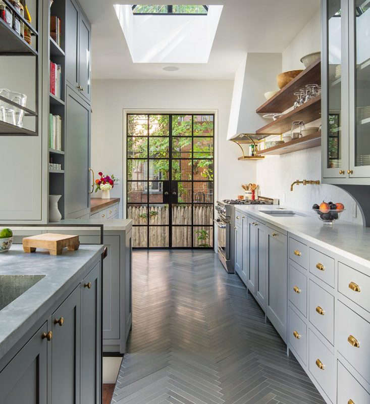
Above: The new, entirely custom kitchen features vertical grain walnut cabinetry, white Caesarstone countertops, and character-grade oak flooring with knots, sapwood, and defects that give the wood its name (according to Piechota, “It used to be the cheaper option, but now the look is so popular it’s the more expensive one”).
Above: A walk-in pantry holds the refrigerator, two ovens, and other appliances. The nook at the back left is a coffee bar, where the couple’s espresso machine lives. Opposite is a specialty prep space with a sliding glass appliance garage. The pantry is tucked in the kitchen’s back corner, out of sight, but with open shelves for ease of use.
Above: The old kitchen was spacious but poorly laid out. Like many San Francisco homes, it had an awkward closed-in porch off the kitchen. Subpar additions had taken their toll, and part of the foundation needed repair. There wasn’t much space to prepare food, and the chef and his refrigerator were on opposite sides of the room. In the end, the project required tearing off the back side of the house and starting over.
Above: The owners entertain frequently, so Piechota created a wine and cocktail bar in the transition area between the kitchen and dining room. The backsplash is lined in white tile from Heath Ceramics.
Above: The owners found this hand-carved marble sink–more than 100 years old–while traveling in France. Piechota set it into a stainless steel counter and chose a wall-mounted faucet rather than attempting to mount a modern faucet into the ancient sink. Half of the marble piece functions as an integrated drain board.
Above: The dining room required only modest updates. The architects retained an existing bay window–the source of the room’s ample light–and finished the walls without baseboards for a modern look. They narrowed the opening between the kitchen and dining room and clad it in the same vertical-grain walnut used in the kitchen. Here, the architect actually decreased the flow between the kitchen and dining room; “It makes the dining room a little more formal,” says Piechota.

Above: A new staircase leads to the former basement. Piechota added a wood slat screen to serve as a guardrail to fulfill code requirements.
Above: As in the dining room, the bedroom required only minimal updates. The architect replaced the floors and lighting and removed the baseboards, then added blackout curtains to darken the room. Beyond the window, he added a handrail to an existing “balcony,” making it usable.
Above L: The master bath has a clerestory window that runs from the shower to a toilet enclosure. The floor is made of the three largest limestone slabs the team could find, in order to minimize seams. The walnut cabinet and mirror are custom, and the mirror is backlit with twin incandescent tube lights integrated into the mirror. The sinks and countertop are Caesarstone, and the shower tile is from Heath Ceramics. Above R: On the main floor, a coat closet became a powder room with a marble sink and similarly lighted mirror.
Above: The architects retained the original entry staircase, complete with original treads. But it got an update: its dark wood bannisters and handrail were painted in instantly modernizing white. This is the only “traditional”-looking area in the house, complete with baseboards.
Above: The kitchen opens onto the backyard via a three-paneled glass door that folds entirely to one side. The backyard was previously dominated by the existing deck, so Piechota trimmed its square footage in a new mahogany version. The landscape design is by Lutsko Associates.
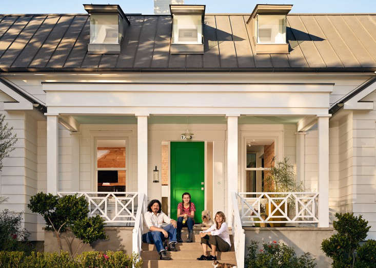
Above: Owners Randy Windham and Larry Halff.
Architect Daniel Piechota is available for the next 48 hours to answer your questions. Using the Disqus tool below, ask away!
See all posts in our Architect Is In series, including:
- Tile Intel: A Budget Remodel with Heath Seconds
- The Architect Is In: From the Ashes, a Modern Barn
- The Architect Is In: Porch Appreciation from Connecticut
- The Designer Is In: A Midcentury Dream on the Upper West Side


Have a Question or Comment About This Post?
Join the conversation (41)