Every remodel has its budget. This week, E. B. Min from Min|Day talks us through spreading a budget effectively while spending it in the right places, as in this conversion of a 1970s ranch house into a modern farmhouse. For the next 48 hours, E. B. Min, the SF-based architect of this project, is available to answer any and all questions. Ask away!
If a farm’s occupants include horses and their trainers, the farmhouse itself has to be hard-wearing and easy to clean. Can durability look good (modern) and not cost the earth? Despite a complete transformation, the footprint of this original ranch house in Sonoma County did not change; instead Min a founding partner of Min|Day (a member of the Remodelista Architect/Designer Directory) worked on getting the “bones” of the house right, including rebuilding most of the walls with new windows and doors. “These are things that should last a long time and it’s important to spend the money here,” she says. Saving money on the interiors, she selected medium priced finishes and off the shelf items while establishing a visual consistency with the color white. “There’s a lot to be said for restraint,” she says. “A judicious use of color and custom pieces can then have a great deal of impact.”
Photography by Bruce Damante unless otherwise noted.

Above: Min installed an orange linoleum floor in the mudroom and office of the farm. “Linoleum is a utilitarian, cost-effective material and we knew it would be durable,” Min says. “Linoleum gave us an opportunity to think about the floor differently as a solid color gives the floor a monolithic feel.”

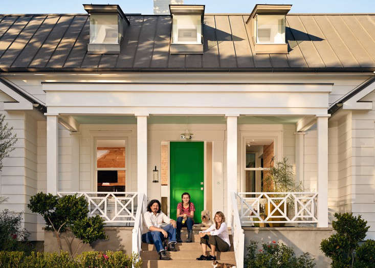
Above: A modern farmhouse, transformed from a 1960s ranch house.

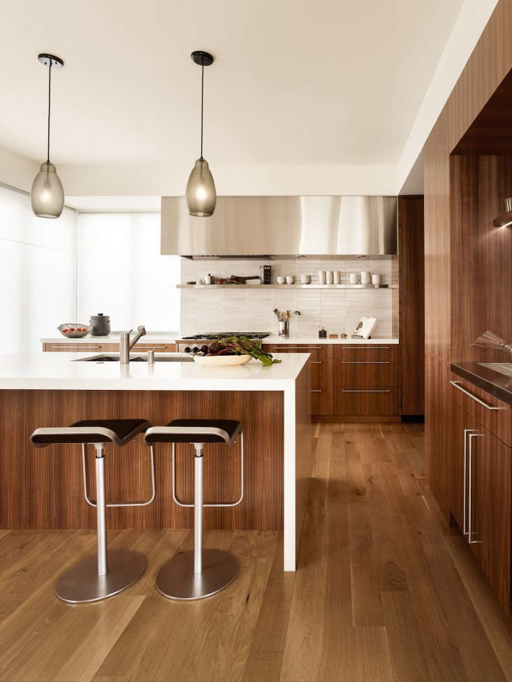
Above: Min establishes a visual consistency by using the color white for the kitchen cabinets as well as the walls. Caesarstone was used for the island countertop while stainless steel was used for the others.

Above: The house was designed to be comfortable; the banquette in the dining area is wide enough to lie on.

Above: The salvaged wood was purchased from Evan Shively to make a dining table using a base from Room and Board. The color white is applied to the crockery as well, allowing for the ease of mixing and matching.

Above: The working kitchen has a neutral palette.

Above: A restrained palette is used throughout the house, with occasional dashes of color like the orange linoleum floor in the mudroom at the end of the hall.

Above: In the reworking of the existing ranch house, Min installed new windows to let in more light. “We spent money on the architecture,” says Min. “Good windows, good doors–wooden, tall, and well made.” The narrow and square trim on all the door strips and mullions create crisp modern edges and a high baseboard allows for vents and outlets which adds to the visual consistency. Photograph by Min|Day.

Above: One of the few customized items was the wood fireplace with a catalytic converter. The architect worked with the German manufacturer to create a detail which would allow the wood fire to vent on top of the fireplace. The architect was then able to integrate the venting into the design of the sheetrock surround.

Above: The bathrooms all have the same hard-wearing porcelain tiles in different shades of gray. The tiles have an outdoor scale with dimensions of 12 by 24 inches and have the appearance of stone tiles.

Above: The entry to the farmhouse is straightforward, with large concrete pavers set in gravel. (N.B. See Design Sleuth: Pavers and Gravel to recreate this look.) Photograph by Min|Day.

Above: The founding partners of Min|Day, Jeffrey Day and E. B. Min, with their Stones Table.
N.B. Looking for more modern farmhouse inspiration? See 1176 images of Modern Farmhouses in our Gallery of rooms and spaces.


Have a Question or Comment About This Post?
Join the conversation (1)