When builder Steve Albertson and his wife Carole sold their former home, they intended to find some land and build a forever home for themselves and their son Ty. It took nearly seven years, but they finally landed on the perfect parcel: in charming Hatfield, Massachusetts, on the banks of a large pond. Keeping the home healthy for Ty, who has autism, was at the top of their priority list and to that end, their forever home is equipped with whole-home air and water filters, as well as having a Net Zero energy rating and solar power.
The entire build took 13 months from start to finish, and designer Shannon Tate-Giordano (who uses Steve as her go-to local contractor—”when you find that person, you don’t let them go!”) got involved when the structure of the house and windows were in place, but nothing had yet been finished. Steve had a basic layout in mind, with a small kitchen open to the dining and living rooms. It was Shannon who suggested allocating all the dining room and kitchen space to the kitchen and including a custom-made island for seating. “When I first had Steve and Carole over for a design meeting they were so on-board with everything I proposed, and that was such a fun place to start from. The theme I was working was ‘Organic Modern Zen’ because of who they are and the style of the build itself.”
Let’s take a closer look at the finished kitchen:
Photographs by Joyelle West.

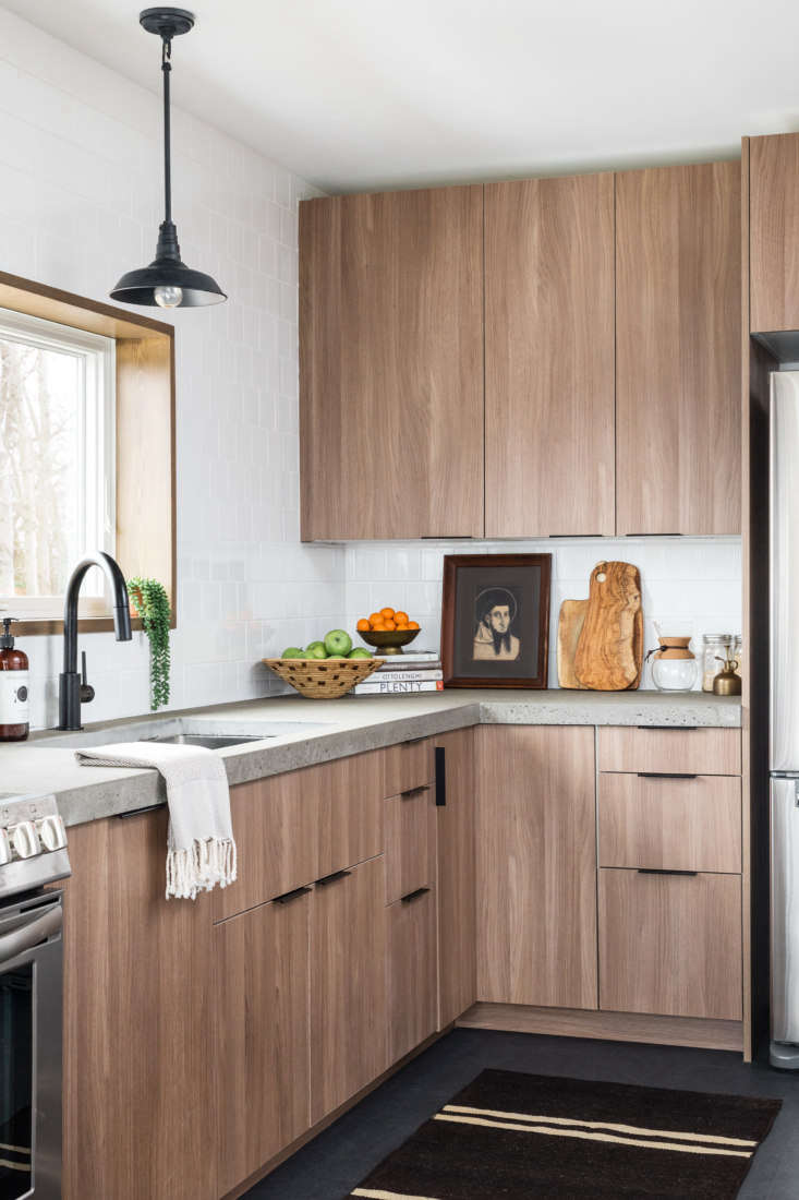
When Shannon got involved in the project, building costs were already higher than the family had projected, so she went with Ikea cabinet boxes and Semihandmade fronts for a more elevated look. Paired with concrete countertops and Marmoleum floors, the space stays in keeping with the home’s sustainable ethos.

Steve built the custom stainless steel-topped island, which doubles as the family’s dining table. Although Steve and Carole both have work desks in other rooms, they both report that they gravitate towards the kitchen and spend much of their time working at the island instead. The range hood cover was another custom piece by Steve and the range is Frigidaire’s 30 inch Electric Front Control Range.

A timeless square tile backsplash makes a quiet backdrop for a selection of vintage treasures and houseplants Shannon sourced after the remodel was complete. A vintage Turkish runner warms up the floor in the kitchen workspace.

Steve poured the concrete countertops, which were both an economical choice and nicely complement the organic theme of the home. For more on concrete countertops, see Remodeling 101: Concrete Countertops.

More elevated takes on Ikea kitchens:
- A Reimagined Ranch House: An Artist’s Family Home, Ikea Kitchen and DIY Bath Ideas Included
- The New Sanctuary: Inside a Curator’s Haven on the Coast of Maine, Ikea Kitchen Included
- Kitchen of the Week: A Designer’s Own Ikea Hack Kitchen in Provence, Before and After


Have a Question or Comment About This Post?
Join the conversation (2)