Icon - Arrow LeftAn icon we use to indicate a rightwards action. Icon - Arrow RightAn icon we use to indicate a leftwards action. Icon - External LinkAn icon we use to indicate a button link is external. Icon - MessageThe icon we use to represent an email action. Icon - Down ChevronUsed to indicate a dropdown. Icon - CloseUsed to indicate a close action. Icon - Dropdown ArrowUsed to indicate a dropdown. Icon - Location PinUsed to showcase a location on a map. Icon - Zoom OutUsed to indicate a zoom out action on a map. Icon - Zoom InUsed to indicate a zoom in action on a map. Icon - SearchUsed to indicate a search action. Icon - EmailUsed to indicate an emai action. Icon - FacebookFacebooks brand mark for use in social sharing icons. flipboard Icon - InstagramInstagrams brand mark for use in social sharing icons. Icon - PinterestPinterests brand mark for use in social sharing icons. Icon - TwitterTwitters brand mark for use in social sharing icons. Icon - Check MarkA check mark for checkbox buttons.
You are reading

Kitchen of the Week: Stylist Brittany Albert’s Cosmetic Kitchen Upgrade, Trade Secrets Included

Search

Kitchen of the Week: Stylist Brittany Albert’s Cosmetic Kitchen Upgrade, Trade Secrets Included

March 7, 2024

Brittany Alberts’s lament is a familiar one: “If budget hadn’t been a consideration, we would have loved to expand the footprint of our kitchen. And we would have loved to put in new cabinets and appliances. Instead, we had to stick with—and enhance what—was already in place.”

The wrinkle? Brittany is a stylist who works with interior designers and home design brands, so she approached her own home with a ready arsenal of accessories and tricks.

The narrow kitchen in question—an L-shaped galley probably last updated in the 1990s (scroll to the end for a Before shot)—was built as an addition to an 1880 farmhouse in Litchfield County, Connecticut, that Brittany and her husband, Sanders Witkow, a lawyer, bought as a retreat from their base in Brooklyn.

Taking a cosmetic tack made sense: the couple had a whole house to pull together and the existing kitchen, if not exactly to their taste, was in good working order. Come see how an interior stylist makes do—and where she ponies up.

Photography by Kate S. Jordan (@katesjordan), courtesy of Brittany Albert (@britt_albert). See disclaimer at end.

After

the kitchen is situated just off the living room, which has its original hearth 17
Above: The kitchen is situated just off the living room, which has its original hearth and beehive oven, and is likely where the kitchen was originally situated. As a link between the old and new—and an extra work surface—Brittany introduced an antique pine table from Plain Goods in New Preston, Connecticut, and hung a catchall Shaker peg rail over it.

For peg rail inspiration, go to our posts Instant Order and 16 Design Ideas to Steal from the Shakers.

brittany simply painted the cabinets and kept the existing dishwasher and other 18
Above: Brittany simply painted the cabinets and kept the existing dishwasher and other appliances. But she splurged by replacing the sink with a Shaws fireclay basin and deVol bridge faucet; read about the one she chose in our post Found: The Perfected Aged Brass Kitchen Faucet. Equally significantly, she swapped out the red granite counter.

How was she able to swing the new Calacatta Gold marble counter? “We found a slab at a local stone yard that had been sitting for months—it had been reserved by another customer but never purchased—and they gave us a big discount. Still, it was probably our biggest expense.”

&#8\2\20;i was tempted to take out the upper cabinets and have open shelvin 19
Above: “I was tempted to take out the upper cabinets and have open shelving,” Brittany tells us, “but we were wary of hidden costs: when you rip out something. you don’t knowing what you’ll find behind it.” Instead, she painted the upper bank Benjamin Moore White Dove “to bounce more light around.” Not wanting a chilly, all-white kitchen, she used Farrow and Ball’s Elephant’s Breath on the lower cabinets: “I chose this light taupe for bit of contrast and interest—and because it works so nicely with the palette in the rest of the house.”

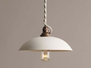
The light over the sink is deVol’s Small PlainSkullcap Porcelain Light; $290.

another easy upgrade: brittany replaced the existing cabinet hardware with a57  20
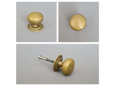
Above: Another easy upgrade: Brittany replaced the existing cabinet hardware with A57 Plain Knobs from Optimum Brasses in the UK: “I couldn’t find any sources here that had that same nice patina and handmade quality. It was a very easy process and they didn’t take long to come.” Unlacquered brass, she notes, “brings warm light to the room.”
the existing range and microwave stayed in place. so did the lovely but damaged 21
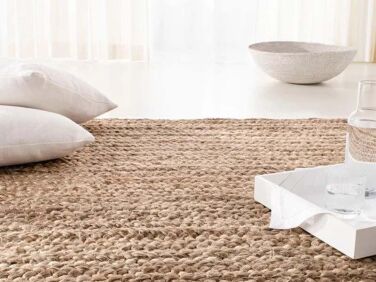
Above: The existing range and microwave stayed in place. So did the lovely but damaged wooden floor: a natural fiber mat, the Ralph Lauren Carena Weave Solid Jute Rug from Overstock, covers a problem area and “brings in some really nice texture.”

For the upshot on the perfect brass ceiling lights, go to Remodelista Reconnaissance.

the work table is next to the fridge (not shown), which is tucked into an exist 22
Above: The work table is next to the fridge (not shown), which is tucked into an existing cabinet.
the stylist at home: brittany&#8\2\17;s restrained touch is a reminder that 23
Above: The stylist at home: Brittany’s restrained touch is a reminder that a tight space calls for simplicity.
there&#8\2\17;s a pantry in the hall right off the kitchen: it leads to the 24
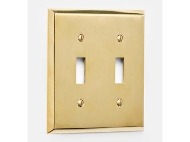
Above: There’s a pantry in the hall right off the kitchen: it leads to the dining area in a large converted barn. Note the Lewis Double Switchplate, $25, from Rejuvenation—Brittany replaced all of the white plastic switch covers with brass updates, a tiny detail that makes a difference.
the pantry doors are also painted farrow & ball&#8\2\17;s elephant& 25
Above: The pantry doors are also painted Farrow & Ball’s Elephant’s Breath.

Before

the kitchen was painted a pale gray and had a red granite counter, cabinet knob 26
Above: The kitchen was painted a pale gray and had a red granite counter, cabinet knobs in a satin silver finish, and recessed ceiling lights.

Thinking of a cosmetic upgrade in your own kitchen? Take a look at:

N.B.: This post is a favorite from our archives; the original ran on February 9, 2023, and has been updated. The photographs in this post are licensed for Remodelista’s use and cannot be repurposed or used on any other website without the photographer’s permission.
(Visited 15,556 times, 1 visits today)
You need to login or register to view and manage your bookmarks.

Frequently asked questions

What was Brittany Albert's main lament about her kitchen?

Brittany Albert lamented that if budget had not been a consideration, she would have loved to expand the footprint of her kitchen and put in new cabinets and appliances.

What approach did Brittany Albert take with her kitchen upgrade?

Brittany Albert took a cosmetic approach to upgrading her kitchen, using her skills as a stylist to enhance the existing space.

What was the main feature of Brittany Albert's original kitchen?

The original kitchen was an L-shaped galley last updated in the 1990s, built as an addition to an 1880 farmhouse in Litchfield County, Connecticut.

What was one of the significant changes Brittany Albert made in her kitchen upgrade?

Brittany Albert splurged on replacing the sink with a Shaws fireclay basin and deVol bridge faucet, while also swapping out the red granite counter.

How did Brittany Albert afford the new Calacatta Gold marble counter?

Brittany Albert found a discounted slab at a local stone yard that had been reserved by another customer but never purchased, allowing her to afford the marble counter.

Product summary  Item 6 158Item 7 159

Have a Question or Comment About This Post?

Join the conversation

v5.0