Icon - Arrow LeftAn icon we use to indicate a rightwards action. Icon - Arrow RightAn icon we use to indicate a leftwards action. Icon - External LinkAn icon we use to indicate a button link is external. Icon - MessageThe icon we use to represent an email action. Icon - Down ChevronUsed to indicate a dropdown. Icon - CloseUsed to indicate a close action. Icon - Dropdown ArrowUsed to indicate a dropdown. Icon - Location PinUsed to showcase a location on a map. Icon - Zoom OutUsed to indicate a zoom out action on a map. Icon - Zoom InUsed to indicate a zoom in action on a map. Icon - SearchUsed to indicate a search action. Icon - EmailUsed to indicate an emai action. Icon - FacebookFacebooks brand mark for use in social sharing icons. flipboard Icon - InstagramInstagrams brand mark for use in social sharing icons. Icon - PinterestPinterests brand mark for use in social sharing icons. Icon - TwitterTwitters brand mark for use in social sharing icons. Icon - Check MarkA check mark for checkbox buttons.
You are reading

A Luminous, Euro-Style Row House in Washington, DC, Courtesy of Studio Oink

Search

A Luminous, Euro-Style Row House in Washington, DC, Courtesy of Studio Oink

February 26, 2018

We’ve been followers of German design firm Studio Oink for a while now, so when Margot spotted a project in Washington, DC, on their Instagram feed, we took notice. A couple of weeks ago, our ever-game photographer Matthew Williams and I took a train to DC to investigate.

The house is located on a street that looks like any other in northwest Washington, DC: rows of Federal-style houses with painted brick and historic details, each house a little different—but mostly the same. Then there’s one painted monochrome gray, the perfect shade (a Farrow & Ball color), that signals something different. Inside, every detail is considered, down to the hinges and switch plates (painted to match the walls). You’d never guess it was designed remotely.

The owner, an attorney in DC, bought the 900-square-foot row house in 2013 with the intention to renovate. She hired a contractor to collaborate, but a year in, she realized she needed an interior design firm (she had admired the work of Leipzig, Germany–based interior architects Studio Oink on Remodelista, but factoring in distance, she decided to look locally for similar design firms). “Eventually I realized that rather than try to find a firm like Studio Oink, I should just ask Studio Oink,” she says.

Turns out, they were willing. “We were intrigued by the idea of working on a project overseas,” says Lea Korzeczek, who, along with her husband, Matthias Hiller, comprises the do-it-all team behind Studio Oink. “The owner was very sympathetic. Her biggest wish was a home that doesn’t look like a typical American house.”

Studio Oink’s vision for the project was based on the palette of a Flemish painting, “where you see a variety of dark and pastel shades,” as they say. They studied the photos and iPhone videos from the owner to develop a palette and capitalize on the light in the narrow building. Minor structural interventions were made—walls slightly modified, extended, or opened—and the designers worked with the owner’s contractor, Four Brothers, to realize the renovation. Join us for a tour.

Photography by Matthew Williams for Remodelista; styling by Alexa Hotz.

few changes were made to the exterior: just the color, farrow & ball d 17
Above: Few changes were made to the exterior: just the color, Farrow & Ball Dimpse; the front door hardware is matte black from Emtek.
studio oink integrated a partial glass wall, an architectural detail borrowed f 18
Above: Studio Oink integrated a partial glass wall, an architectural detail borrowed from turn-of-century Parisian buildings, on the main level (two bedrooms are above, and below is a living area). The table is the Eero Saarinen Round Dining Table with a Louis Poulsen PH4/3 Pendant Lamp suspended overhead. The chairs are Afteroom Dining Chairs from Menu; the built-in bench has Mölle Linen Cushions. The builder-grade white oak floors came with the house, and the owner finished them with Rubio Monocoat.
the kitchen renovation was partially complete when studio oink joined on. the o 19
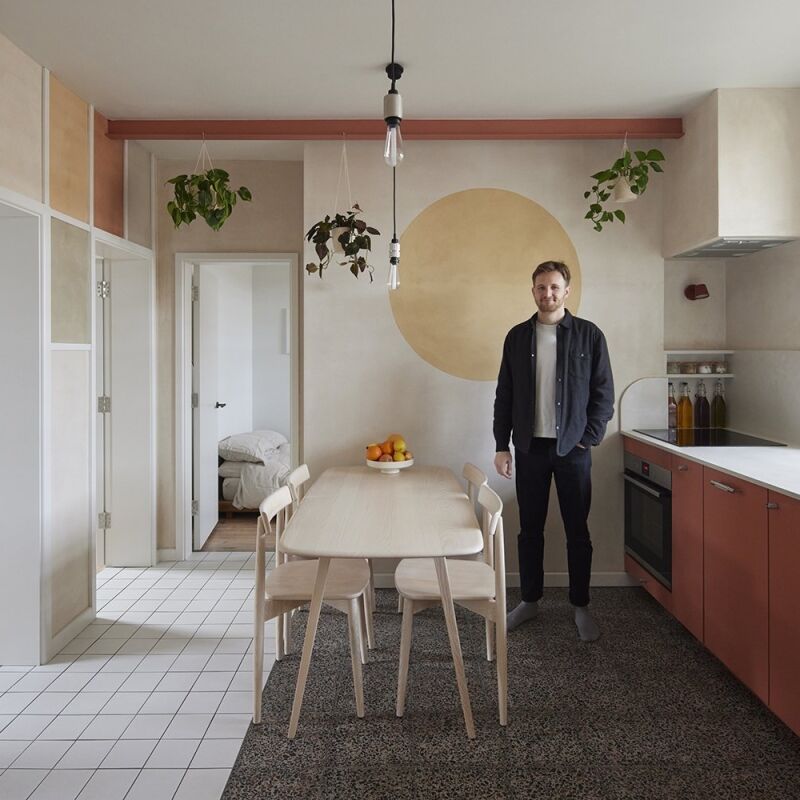
Above: The kitchen renovation was partially complete when Studio Oink joined on. The owner had worked with Four Brothers to realize a cabinetry concept inspired by Plain English (“square inset flush, graduated drawer size”) and painted it in Benjamin Moore’s Smoke Embers. She spec’d a two-centimeter marble countertop, but after two slabs shattered at the fabricator, the stone masons sold her a three-centimeter statuary slab they had on site. Studio Oink orchestrated the color palette, light fixtures, furnishings, and designed a streamlined range hood enclosure.
the amber glass vase is luca nichetto for mjölk and the gray glass bowl is 20
Above: The amber glass vase is Luca Nichetto for Mjölk and the gray glass bowl is Studio Prepa. The range is a Bertazzoni 30-inch duel fuel model (a JIA Inc. Ceramic Steamer sits atop). The light is the Menu Carrie LED Table Lamp and the kitchen window light fixture is the Wireflow LED Pendant by Arik Lévy for Vibia. The faucet is the Vola KV1-27 Faucet, the edge pulls are Hafele, and on the counter are Noda Horo Tutu Containers, the Michaël Verheyden Oak Coupe, and the Ferm Living Half Candleholder in grey.
studio oink extended the wall to create a nook for the refrigerator, a liebherr 21
Above: Studio Oink extended the wall to create a nook for the refrigerator, a Liebherr CS1400. The owner added a Verso Design Tikas Ladder in birch, with two Tikas Shelves for extra storage.
the top floor has a bathroom and two bedrooms. the floors are the same builder  22
Above: The top floor has a bathroom and two bedrooms. The floors are the same builder-grade white oak seen on the first floor, but painted in Farrow & Ball’s Elephant’s Breath.
a muller van severen first chair is parked in front of the custom desk, which i 23
Above: A Muller van Severen First Chair is parked in front of the custom desk, which is illuminated by an Artemide Nessino Table Lamp.
the guest room bed is from urban green furniture in brooklyn, painted in farrow 24
Above: The guest room bed is from Urban Green Furniture in Brooklyn, painted in Farrow & Ball’s Slipper Satin (the ceiling is Wevet).
throughout the house, studio oink spec&#8\2\17;d flush mount bocci electric 25
Above: Throughout the house, Studio Oink spec’d flush-mount Bocci Electrical Outlets.
the pendant light is the aballs pendant lamp by jaime hayon & parachilna. t 26
Above: The pendant light is the Aballs Pendant Lamp by Jaime Hayon & Parachilna. The switch plates throughout are Legrand Adorne painted the same color as the walls.
the walls in the upstairs bathroom are painted in farrow & ball&#8 27
Above: The walls in the upstairs bathroom are painted in Farrow & Ball’s Slipper Satin. The floor and shower are tiled in Mutina Pico Ceramic Tiles sourced through Stone Source in the US. A Grillo Wall Lamp by Elise Fouin is set into a Robern M Series mirrored cabinet. The sink is the Bounce Lavabo from Ever and the matte white faucet is the Avalon Lavatory Wall Faucet from California Faucets.
the california faucets avalon showerhead and handles fixtures in matte whi 28
Above: The California Faucets Avalon Showerhead and Handles fixtures in matte white add a neutral note; the shelf is custom fabricated.
according to lea, &#8\2\20;the owner was thinking of something different&#x 29
Above: According to Lea, “The owner was thinking of something different—something much more ‘clear,’ and without the typical American doors and handles.” When sourcing hardware and accessories in the US proved impossible, Lea and Matthias “bought a lot of items in Europe, put them in a big crate, and sent them to Washington, DC.” The white powder-coated edge pulls and hinges are from New Zealand architectural hardware company Halliday & Baillie.
 “in the us, custom work is hugely expensive and difficult to sourc 30
Above: “In the US, custom work is hugely expensive and difficult to source,” says the owner. “That isn’t true in Germany, where there are many highly skilled local artisans. As a result, some really wonderful concepts weren’t feasible.” The hallway construction, seen here, was originally conceptualized as steel and glass, but when fabrication and installation proved cost-prohibitive, Studio Oink spec’d a wood and glass construction, which was built by hand by Alfred Johnson of Four Brothers. (The bench is the Sancal Elephant Bench in gray.)
the ikea pax wardrobe system serves dual function; it acts as both cl 31
Above: The Ikea PAX Wardrobe System serves dual function; it acts as both closet and partition between the hall and the master bedroom. The doors are painted in Farrow & Ball’s Slipper Satin.
the cabinet knobs were spec’d by studio oink, but finding them stateside 32
Above: The cabinet knobs were spec’d by Studio Oink, but finding them stateside wasn’t possible. Instead, the owner sourced 1 1/4-Inch Knobs from Cabinetparts.com. Her contractor, Four Brothers, created an offset solution to fasten the knobs to the door. The cube-shape doorstop is the same thickness as the door, with an inch of adhesive felt.
the pocket size bedroom is painted in farrow & ball&#8\2\17;s slip 33
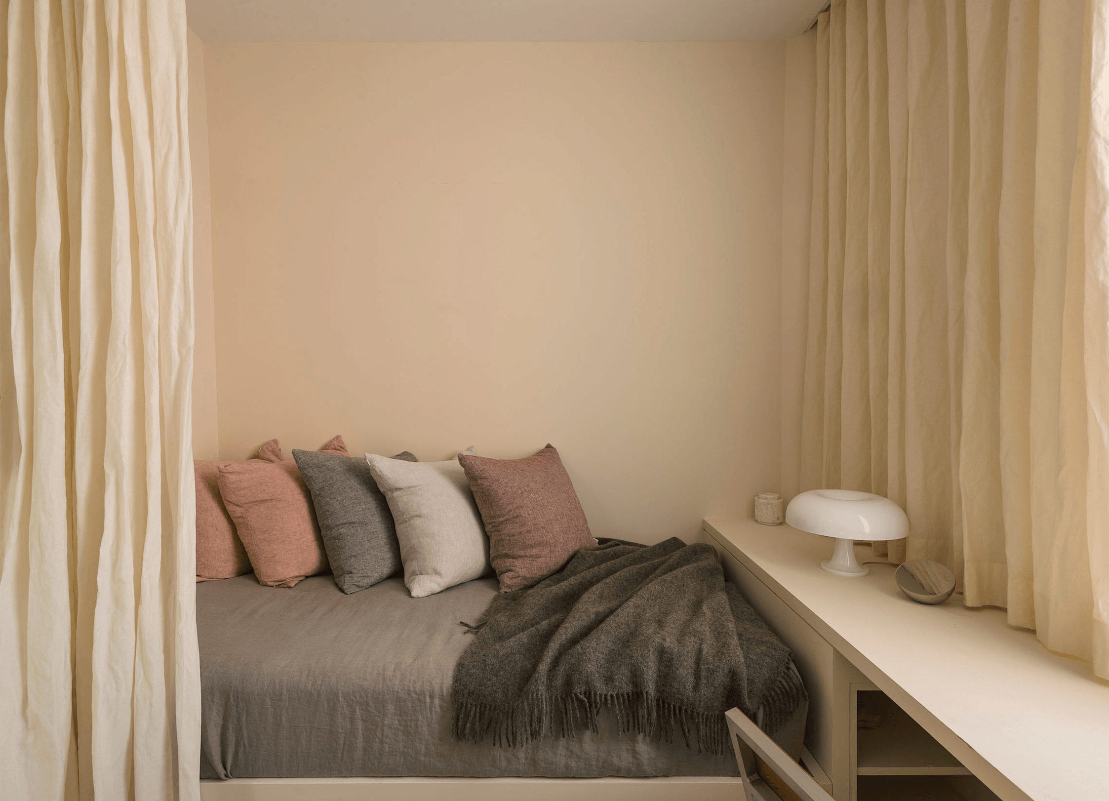
Above: The pocket-size bedroom is painted in Farrow & Ball’s Slipper Satin (the ceiling is Wevet). The curtains are Kinnasand Como (discontinued), a linen fabric with metallic weave. The bed linens are from Restoration Hardware and the throw is the Abrazo Blanket from the Citizenry. The bedside sconce is the Austere-W Sconce and the framed print is from Studio Oink.
the wall mounted shelf is the montana møbler write wall desk in snow. sitt 34
Above: The wall-mounted shelf is the Montana Møbler Write Wall Desk in Snow. Sitting atop: a sculpture by Jiro Yoshida, an Ilse Bowl by Georg Jensen, a Catellani & Smith Sorry Giotto Table Lamp, and a Marlies Neugebauer Cone Vase. The stool is the Discipline Last Stool by Max Lamb.
in the entry, which is painted in farrow & ball&#8\2\17;s setting  35
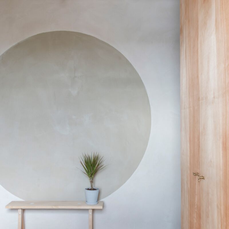
Above: In the entry, which is painted in Farrow & Ball’s Setting Plaster, Studio Oink installed two String Light Pendants by Michael Anastassiades for FLOS.
the lower level is painted oval room blue from farrow & ball, signalin 36
Above: The lower level is painted Oval Room Blue from Farrow & Ball, signaling a change in palette. Studio Oink designed flush storage cabinets under the stairwell. The textile wall hanging is a private commission from Alessandra Taccia for Studio Oink.
the designers reconfigured the basement as a living room and fixed existing lig 37
Above: The designers reconfigured the basement as a living room and fixed existing lighting mistakes. “If you have a space with such low ceilings with few windows to direct natural light, it’s the worst decision to use down lights to illuminate the space. Light coming from the ceiling will only accentuate the low ceiling,” says Lea. “We decided to create illuminated islands for different purposes: a light behind the bench for reading, and lights on the built-in shelves.” The floors are Mutina Pico Ceramic Tiles in DownTerre (a discontinued color) with a Kamet Carpet from Urbanara. The light in the foreground is the FLOS Parentesi, the coffee tables are Cassina Torei Tables by Luca Nichetto, the walnut chair is the Cherner Armchair, the pink rocker is the Muller van Severen First Rocking Chair, and the black stool is the Mattiazzi Osso Stool.
studio oink designed a shelving system with a built in bench. the fireplace is  38
Above: Studio Oink designed a shelving system with a built-in bench. The fireplace is painted in Farrow & Ball’s Studio Green to contrast with blue. On the shelf is one of Studio Oink’s favorite lights, the Moustache Vaporetto Table Lamp, and Lundia Grey Boxes for storage.
the downstairs half bath is painted sudbury yellow from farrow & ball. 39
Above: The downstairs half-bath is painted Sudbury Yellow from Farrow & Ball.
the bath has a hay shapes mirror, porcelanosa krion sink (discontinued), m 40
Above: The bath has a Hay Shapes Mirror, Porcelanosa Krion Sink (discontinued), matte white Newport Brass Priya Faucet, and Allied Maker Composers Sconce. The flush grille is the Caspian pattern from Majestic Vent Covers.
a solarium located off the lower level is painted strong white (another fa 42
Above: A solarium located off the lower level is painted Strong White (another Farrow & Ball color). The owner kept the washer/dryer from the previous owners.
a built in workspace table is painted in farrow & ball&#8\2\17;s nancy& 43
Above: A built-in workspace table is painted in Farrow & Ball’s Nancy’s Blush. On it is the Vertigo Bird Balloon Light (in a custom color by Studio Oink) and a Notary Ceramics Candlestick. The artwork is Teemu Järvi’s Hare Poster, and the lights are two Menu Bollard Lamps.

Floor Plans

plan of the second floor bedrooms. 44
Above: Plan of the second-floor bedrooms.
the first floor kitchen and dining room plan. 45
Above: The first-floor kitchen and dining room plan.
the basement living room and solarium plan. 46
Above: The basement living room and solarium plan.

See more of Studio Oink’s work:

(Visited 3,897 times, 1 visits today)
You need to login or register to view and manage your bookmarks.

v5.0