Icon - Arrow LeftAn icon we use to indicate a rightwards action. Icon - Arrow RightAn icon we use to indicate a leftwards action. Icon - External LinkAn icon we use to indicate a button link is external. Icon - MessageThe icon we use to represent an email action. Icon - Down ChevronUsed to indicate a dropdown. Icon - CloseUsed to indicate a close action. Icon - Dropdown ArrowUsed to indicate a dropdown. Icon - Location PinUsed to showcase a location on a map. Icon - Zoom OutUsed to indicate a zoom out action on a map. Icon - Zoom InUsed to indicate a zoom in action on a map. Icon - SearchUsed to indicate a search action. Icon - EmailUsed to indicate an emai action. Icon - FacebookFacebooks brand mark for use in social sharing icons. flipboard Icon - InstagramInstagrams brand mark for use in social sharing icons. Icon - PinterestPinterests brand mark for use in social sharing icons. Icon - TwitterTwitters brand mark for use in social sharing icons. Icon - Check MarkA check mark for checkbox buttons.
You are reading

Kitchen of the Week: A Closeup of Jess Thomas’s Crowd-Pleasing Brooklyn Kitchen

Search

Kitchen of the Week: A Closeup of Jess Thomas’s Crowd-Pleasing Brooklyn Kitchen

November 2, 2017

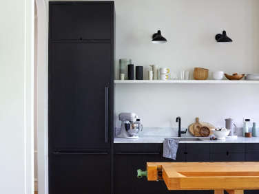
As we try to fathom the fact that it’s already November, we’re revisiting our most popular post of last month, architect Jess Thomas and director-producer Hagan Hinshaw’s Bedford-Stuyvesant, Brooklyn, townhouse redo—see The Sentimental Minimalist. Today’s focus: the kitchen, which Thomas, the co-principal at Shapeless Studio, slotted into what had been a long, narrow bath on the first floor. To make the space work, she opened it up to the adjacent dining room and positioned her grandfather’s worktable as an island that artfully bridges the two territories.

With the view from the dining table in mind, Thomas designed cabinetry that is the kitchen equivalent of the perfect everyday bespoke suit. Its simple look belies deep thinking and a lot of back and forth between Thomas and her esteemed millworker, James Harmon of Workshop Brooklyn. “Working with James is a very collaborative and rewarding process,” she tells us. “As he translates my drawings into mockups, he really thinks about how things function and how they could be made better.” “I try to put myself in everyone’s shoes to make sure all the elements are usable,” explains Harmon. Here’s what they both had to say about the making of the kitchen.

Photography by Kate Sears, unless noted; styling by Kate S. Jordan.

a wide archway connects the approximately 90 square foot kitchen and the twice  17
Above: A wide archway connects the approximately 90-square-foot kitchen and the twice-that-size dining room. “We wanted to create a warm gathering space that is very social,” says Thomas.

In response to a reader’s query about what where everything in the compact setup is kept, Thomas explained, “Above the fridge (Bosch’s custom-panel Benchmark), we store our blender, slow cooker, Soda Stream, and vases. We only use a French press and don’t have a microwave. The drawers hold a mixture of mixing bowls, silverware, and cooking pans: To be honest, we don’t have many pots and pans.”

the cabinet fronts are made of rift sawn white oaks in benjamin moore&#8\2\ 18
Above: The cabinet fronts are made of rift-sawn white oaks in Benjamin Moore’s Midnight Dream, a color selected after Thomas and Hinshaw tried out at least 10 other shades: “We painted 12-by-12-inch plywood samples and held them up in different lights. We love this color because it changes throughout the day—sometimes it looks nearly black and other times it is so blue.”
For durability and to allow the grain to show through, Harmon stained the cupboards using Arborcoat, a matte finish available in the full range of Benjamin Moore colors and made for exterior use. The workbench, which Thomas’s artist grandfather used to make frames, is by Lachappelle; sadly the German company discontinued the line in 2000, but similar designs can be found, including on eBay (search “hardwood workbenches“).

for a seamless look, the cabinets have capsule shaped cutout handles (see the e 19
Above: For a seamless look, the cabinets have capsule-shaped cutout handles (see the evolution of the design below). The 0.7-inch-wide countertop and six-inch-high backsplash are Bianco Carrara marble. The stainless steel sink is the Blanco Quatrus and the pullout faucet is Kohler’s Purist in matte black. The wall lights are Bernard Schottlander’s Mantis Sconces.
Note the floating wood shelf that stretches from the fridge enclosure to the “hood shroud.” Harmon counts it as one of the most challenging details in the townhouse: “To incorporate halogen puck lights on the underside, I had to create pathways for wires and transformers into the thin wood, and they had to be accessible for repair and replacement. The shelf is supported by custom steel brackets. The whole thing was no small feat.”

the design gets even more interesting on close inspection. &#8\2\20;from af 20
Above: The design gets even more interesting on close inspection. “From afar, the cabinets appear to be simply monolithic,” says Harmon, “but in fact the vertically oriented grain was carefully arranged in a running sequence, meaning the pattern in the veneer carries through from one door or drawer to the next.”
&#8\2\20;matching the graining may seem like a lost effort since it&am 21
Above: “Matching the graining may seem like a lost effort since it’s stained black,” adds Harmon, “but that’s not the case: The veneer was wire brushed prior to staining, which lifts out the softer wood fibers and leaves the more hard, dense grain lines visible. White oak takes this wire brush process better than most woods. The subtly of its character steps forward as one enters into the kitchen zone.”

Thomas wanted to preserve the chalky, matte finish of the Arborcoat but wondered if a wax finish was necessary for durability. Harmon went with an unobtrusive waterborne flat clear coat applied with a brush: “It’s a tricky process because it dries quickly, so reworking strokes can cause problems—but the results are what we were after.”

 the range is a bertazzoni professional series 30 inch with a bertazz 22
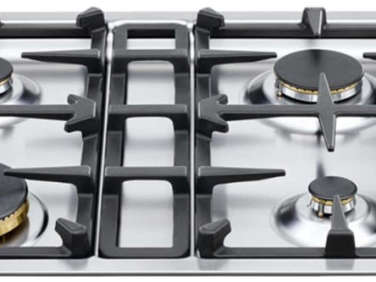
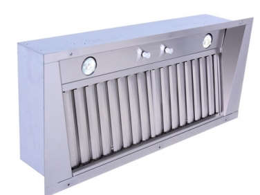
Above: The range is a Bertazzoni Professional Series 30 Inch with a Bertazzoni four-burner cooktop. The custom hood shroud is made of MDF inset with a Prestige Pro Line liner.
&#8\2\20;it can be tough to find pleasing hoods,&#8\2\2\1; says thomas. 23
Above: “It can be tough to find pleasing hoods,” says Thomas. “A nice, clean box that recedes helps to direct the focus to other elements, such as what’s on the shelf; it also guides the eye upward to the crown molding that traces the perimeter of the room.” (Explore the options in our Range Hood series.)

The flooring is the pine subfloor that had been hidden under battered tiles. It’s sealed with water-based Bona Naturale.

The Evolution of the Cutout Handle Design

as drawn, the design was a simple u shape. 24
Above: As drawn, the design was a simple U shape.

“When I initially scanned the drawings,” Harmon tells us, “I figured it would be easy enough to create the pull. However, things often occur to me when the material is in hand. My concern for the pull was how tactile the response would be. Working with a three-quarter-inch-thick drawer front would mean one’s fingertip would have to reach quite far to pull the drawer or door open.” Photograph by James Harmon.

&#8\2\20;i think it would easier to use if it had a steeped condition, so y 25
Above: “I think it would easier to use if it had a steeped condition, so your finger would sense a little ridge,” Harmon emailed Thomas. After a technical discussion of rabbets and jigs, a doughnut shape was the next possibility he tried. Photograph by James Harmon.
the third approach, a rounded section with good grab, was the answer. “r 26
Above: The third approach, a rounded section with good grab, was the answer. “Routing a cove shape into the backside of the splice gives it a more comfy hold for fingers to grip,” says Harmon, noting it took six steps to fabricate each pull. Thomas was delighted with the refinement and the results. Photograph by James Harmon.
the open sink doors display the otherwise hidden sculpture . photograph by jame 27
Above: The open sink doors display the otherwise hidden sculpture . Photograph by James Harmon.
harmon completely fabricated the lower cabinet run in his brooklyn studio. the  28
Above: Harmon completely fabricated the lower cabinet run in his Brooklyn studio. The carcass is made of prefinished maple veneer plywood. “It may seem like a lot of extra steps went into the construction,” he says “but they all add up to a more intriguing design and a more interesting and high-functioning kitchen.” Photograph by James Harmon.

Explore the rest of the townhouse and see Before photos here.

Take a look at three more of our favorite kitchens with dark cabinetry:

(Visited 2,545 times, 1 visits today)
You need to login or register to view and manage your bookmarks.

Frequently asked questions

Who designed the streamlined kitchen with black cabinets in this post?

The architect Jess Thomas designed the kitchen.

What color are the cabinets in this kitchen?

The cabinets in this kitchen are black.

What is the material of the countertops in this kitchen?

The countertops in this kitchen are made of quartz.

Are the appliances in this kitchen integrated into the cabinetry?

Yes, the appliances in this kitchen are integrated into the cabinetry.

What is the style of this kitchen?

This kitchen has a modern and streamlined style.

What type of lighting is used in this kitchen?

LED lights are used in this kitchen for both ambient and task lighting.

Are there any open shelves in this kitchen?

No, there are no open shelves in this kitchen.

Is there a pantry in this kitchen?

Yes, there is a pantry in this kitchen.

What type of flooring is used in this kitchen?

The flooring in this kitchen is made of white oak.

Product summary  Item 6 161Item 7 162

Have a Question or Comment About This Post?

Join the conversation

v5.0