Moving from Venice Beach, California, to NYC's SoHo was quite a transition for a young film producer, but interior designer Martin Raffone did what he could to soften the landing—by channeling his inner beachcomber.
Raffone (a member of the Remodelista Architect/Designer Directory) enjoys the spatial challenges of designing lofts, and has done many over the last two decades. "When my client sent me the floor plan, I thought: 'It’s like a bowling alley. What am I going to do with this?'" he says. The former warehouse space was long and narrow—100 feet long, 25 feet wide—with windows only on one end; to organize the space, Raffone created low room dividers of wooden planks, which are a subtle reference to his client's old life on the Southern California coast. He also worked with color consultant Eve Ashcraft, to develop "the perfect driftwood color for all of the planked paneling, the satin for the existing ancient maple flooring, and the right shade of white in the natural light–deprived space."
Photography by Åke E:son Lindman.

Above: Custom room dividers are bolted down to the floor, and do double duty as ledges for drinks when the client entertains. The loft's entrance is to the left of the windows, through a black-slatted door.

Above: You exit the elevator into a vestibule with a bench; the black door pivots open. "It's quite dramatic, when you come from the elevator and then push this large wall to reveal the space," says Raffone.

Above: The loft is on the fourth floor of an old warehouse in Soho.

Above: Raffone designed or picked out everything, aside from "a few boxes of books" and the artwork, which the client purchased from galleries in Chelsea. "It was a complete and total vision on my part," he says. "I even put food in the fridge, so it was done when the client flew out from California."
Above: Marc Newson's Wooden Chair for Cappellini has a commanding view of the living area.

Above: The dining area is separated from the rest of the open space with another low divider.
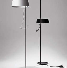
Above: Across from the dining area is a lounge area. The clip-on light is a custom design by Raffone; it has a blackened-steel clamp that allows it to be repositioned along the divider. The white floor lamp is the Anta Ella.

Above: The kitchen cabinetry is from Bulthaup.

Above: When some of the plaster fell off in the hallway during construction, Raffone painted the exposed brick a glossy white to reflect light. On the left is a study/guest room, which you enter through a sliding door of black-painted slats. At the end of the hallway is the master bedroom.

Above: As in many old buildings, accommodating plumbing is tricky. Rather than create a step up to the guest bathroom, Raffone extended the floor out to create a platform for the guest bed. The platform is paneled in cypress for its water-resistance. The painting on the wall is by color consultant Eve Ashcraft.
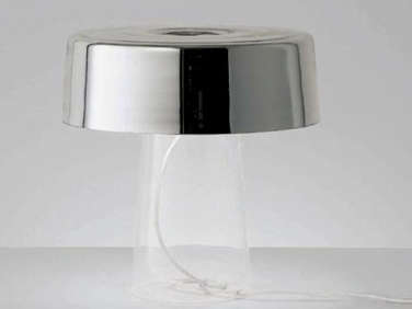
Above: The master bedroom features a bed from Capellini, a night stand from B&B Italia, and a Prandina Glam T1 Table Lamp.
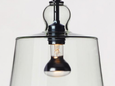
Above: In the master bathroom, a tiled wall is framed out (again, to accommodate plumbing). The shower features a low wall of more penny tiles, and the rest of the shower is paneled in enormous sheets of Corian. The pendant is the Acquatinta by Michele de Lucchi.

Above: In the living room, Raffone put in new sheetrock (left), took out a bit of the plasterwork to expose the original brick wall (center), and gave the rest of the plaster (right) the same gray stain used for the wooden dividers. "The plaster had been patched over the years, so it took the stain differently and created this nice mottled effect," he says.

Above: The brick warehouse in Soho.



Have a Question or Comment About This Post?
Join the conversation (0)