Sarah Sherman Samuel, designer, stylist, and creative director of Smitten Studio, leads a busy life in LA. So to escape it all, the Michigan native and her husband, Rupert, bought a midcentury cabin right on the shores of Lake Michigan. The location was breathtaking, but the cabin was not. So before they could settle in and relax, the enterprising couple rolled up their sleeves and executed a complete renovation. When it came to choosing colors for their retreat, the couple took their cues from the surrounding landscape, from the warm wooden floor to (our favorite) the bright green door.

Above: When they first purchased it, Sarah and Rupert’s cabin sported an exterior (below) of brick red with brown shingles, which competed with the surrounding woodland environs. The first thing they did was to add fiber cement siding to the exterior, which echoed classic mid-century designs with horizontal lines that hug the landscape. They then opted for a bold paint pairing of charcoal gray and moss green. Now the cabin appears as one with the landscape, just another moss-covered rock by the lake.

Above: The cabin “before”–even in fall, the jarring red/brown exterior clashes with the landscape.

Above: For the exterior colors, Sarah and Rupert paired Behr’s cracked pepper with an vivid accent of mossy green.

Above: Unlike her LA home, which is quite colorful, Sarah wanted her lakeside retreat to have a clean, zen feel. Thus her green door is the only vibrant hue. It shows Sarah’s playful side. (As does the vintage fox door knob.)

Above: Once inside, Sarah transformed the interior into a tranquil oasis of soft grays and warm woods, with an application of Dutch Boy‘s Whisper Gray (walls) and Gargoyle Shadow (door).

Above: Here you can see that the interior palette also takes its cue from the setting. The warm timbers evoke the surrounding woodlands, while the white creates an airy open feeling.
In the interior, the only thing that Sarah and Rupert kept from the previous owners were the couches and pendant over the dining room table. Everything else was gutted down to the studs. From there, the couple, with lots of help from Sarah’s parents, put in a new ceiling, laid a new wood floor, replaced the red kitchen with a pristine white one from Ikea, gutted the bathroom, and painted, wallpapered, and painted some more. By doing the work themselves, Sarah estimates they cut the cost of the project in half.

Above: Inside, the minimal palette allows the landscape to take center stage.

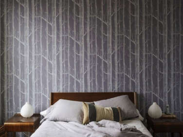
Above: Cole & Son’s Woods wallpaper in the new bedroom also has a woodsy feel.

Above: Opposite the master bed, a pair of bunks with moss-like evergreen velvet curtains.
You can see more of Sarah and Rupert’s complete gut renovation on Smitten Studio.
N.B. Get in the mood for summer relaxation and fun with more inspired cabins.


Have a Question or Comment About This Post?
Join the conversation (4)