Icon - Arrow LeftAn icon we use to indicate a rightwards action. Icon - Arrow RightAn icon we use to indicate a leftwards action. Icon - External LinkAn icon we use to indicate a button link is external. Icon - MessageThe icon we use to represent an email action. Icon - Down ChevronUsed to indicate a dropdown. Icon - CloseUsed to indicate a close action. Icon - Dropdown ArrowUsed to indicate a dropdown. Icon - Location PinUsed to showcase a location on a map. Icon - Zoom OutUsed to indicate a zoom out action on a map. Icon - Zoom InUsed to indicate a zoom in action on a map. Icon - SearchUsed to indicate a search action. Icon - EmailUsed to indicate an emai action. Icon - FacebookFacebooks brand mark for use in social sharing icons. flipboard Icon - InstagramInstagrams brand mark for use in social sharing icons. Icon - PinterestPinterests brand mark for use in social sharing icons. Icon - TwitterTwitters brand mark for use in social sharing icons. Icon - Check MarkA check mark for checkbox buttons.
You are reading

Multiplying Light and Space: A Compact Paris Apartment with a Vintage Quality

Search

Multiplying Light and Space: A Compact Paris Apartment with a Vintage Quality

February 16, 2024

Lately we’ve been charmed by the inimitable work of Paris-based Iranian architect Saba Ghorbanalinejad. Her latest project is the complete renovation of a 47-square-meter apartment adjacent to the Parc des Buttes Chaumont in the 19th arrondissement of Paris. Here, she took the space from a dated apartment full of enclosed spaces into a 1960s-inspired interior defined by rounded corners, reflected light in mirrors and glossy lacquer finishes, aluminum storage housing, and hand-finished Tadelakt. Here’s a look.

Photography by Mary Gaudin.

the windows are solid varnished oak. the chair is a vintage \1950s verner panto 17
Above: The windows are solid varnished oak. The chair is a vintage 1950s Verner Panton Bachelor Chair in chrome-plated steel and suede.

Located on the 3rd floor of a large, 1970s building, the former apartment, while only 47 square meters (a little over 500 square feet), was more enclosed with a total of eight doors throughout. The client found the living room too small and the entryway excessively large and useless in contrast to the rest of the apartment. Ghorbanalinejad set out to make the best use of every square meter, taking the eight interior doors down to just two.

a \1980s coffee table by niels gammelgaard and \100 year old persian rug anchor 18
Above: A 1980s coffee table by Niels Gammelgaard and 100-year-old Persian rug anchor the living room space.

Concrete above and below: Ghorbanalinejad revealed a concrete ceiling hidden beneath a white-painted suspended ceiling that was then meticulously refinished. The floors are waxed concrete.

a \1970s area table lamp by mario bellini for artemide set on a vintage stool.  19
Above: A 1970s Area Table Lamp by Mario Bellini for Artemide set on a vintage stool. Rounded corners throughout the apartment create a gentle, organic flow.
a view from the living room back into the hallway. the lacquered wall with roun 20
Above: A view from the living room back into the hallway. The lacquered wall with rounded corners encloses the bed and bathroom space separate from the open living and dining room and kitchen.
the client requested a functional kitchen within the confines of a small space. 21
Above: The client requested a functional kitchen within the confines of a small space. Ghorbanalinejad delivered an L-shaped kitchen designed with a stainless steel countertop and 1960s-inspired white lacquer kitchen cabinets.
two aluminum apollo pendant lamps by raphael kadid are strung across the ceilin 22
Above: Two aluminum Apollo Pendant Lamps by Raphael Kadid are strung across the ceiling illuminating each end of the kitchen.
a view looking back into the open living and dining area. the door to the left  23
Above: A view looking back into the open living and dining area. The door to the left enters into the bedroom. Note the stealth storage cabinet set flush into the wall.
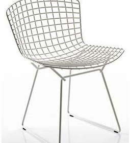
beyond the dining table and set of \1950s bertoia side chairs is an oak framed  24
Above: Beyond the dining table and set of 1950s Bertoia side chairs is an oak-framed sliding glass door onto the balcony.
the kitchen/hallway leads into a small bedroom. 25
Above: The kitchen/hallway leads into a small bedroom.
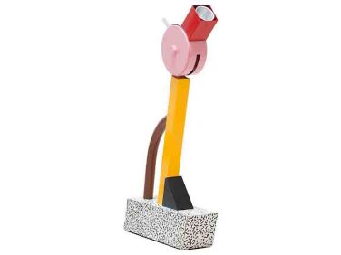
an ettore sottsass tahiti memphis milano table lamp situated on custom bookshel 26
Above: An Ettore Sottsass Tahiti Memphis Milano Table Lamp situated on custom bookshelves in the bedroom.
dividing the bedroom and bathroom is what ghorbanalinejad describes as a &# 27
Above: Dividing the bedroom and bathroom is what Ghorbanalinejad describes as a “central aluminum core.” The custom aluminum wall houses storage on one side and a bathtub niche on the opposite.
custom, frameless full height doors throughout the apartment maintain the visua 28
Above: Custom, frameless full-height doors throughout the apartment maintain the visual continuity of the concrete ceiling and the aluminum core.
a rounded ceiling and bathtub is designed in pale yellow tadelakt to bring lumi 29
Above: A rounded ceiling and bathtub is designed in pale yellow Tadelakt to bring luminosity and subtle color into the bathroom.
ghorbanalinejad was looking to multiply light and views with a play of mirrors  30
Above: Ghorbanalinejad was looking to multiply light and views with a play of mirrors in the bathroom vanity, bringing light into the windowless space. The paneled rounded mirror is inspired by the interiors of Maison Coco Chanel on Rue Cambon in Paris. The custom sink and counter is designed in Corian.
a major feature of the apartment is the lacquered wall dividing the bedroom and 31
Above: A major feature of the apartment is the lacquered wall dividing the bedroom and living spaces. Working with Atelier Mayeul Gauvin, Ghorbanalinejad created a bespoke lacquer finish with layers of nuanced greens and glassy texture. The deep green lacquer extends the exterior greenery of the garden into the interior of the apartment. “This wall is alive and changes under the different lights and seasons,” Ghorbanalinejad describes.
architectural plans show the apartment&#8\2\17;s transformation. 32
Above: Architectural plans show the apartment’s transformation.

For more from architect Saba Ghorbanalinejad, see our post A Considered Renovation in Old Versailles by Architect Saba Ghorbanalinejad.

For more projects photographed by Mary Gaudin, see our posts:

(Visited 13,576 times, 2 visits today)
You need to login or register to view and manage your bookmarks.

Frequently asked questions

Who is the architect of this compact Paris apartment renovation?

The architect of this compact Paris apartment renovation is Saba Ghorbanalinejad, a vintage 1960s architect.

What is the style of this apartment renovation?

The style of this apartment renovation is vintage 1960s.

Is this apartment designed for small spaces?

Yes, this apartment is designed specifically for small spaces.

What are some key features of this apartment renovation?

Some key features of this apartment renovation include clever storage solutions, multipurpose furniture, and a minimalist design aesthetic.

Does this apartment renovation incorporate any vintage elements?

Yes, this apartment renovation incorporates vintage elements, such as retro furniture and classic design accents.

Are there any unique design choices in this renovation?

Yes, this renovation features unique design choices, such as a statement-making blue kitchen and a hanging chair in the living area.

Is there a specific color scheme used in the apartment?

Yes, the apartment follows a predominantly neutral color scheme with pops of bold colors to create visual interest.

What is the size of this compact Paris apartment?

The exact size of this compact Paris apartment is not specified in the article.

Where can I find more information about this apartment renovation project?

You can find more information about this apartment renovation project on the Remodelista website at the following link: [insert link].

Product summary  

Have a Question or Comment About This Post?

Join the conversation

v5.0