A 1967 suburban horse stable gets a new lease on life as a work studio and guesthouse, courtesy of Shed Architecture & Design in Seattle. Located in the Bridle Trails neighborhood of Kirkland, Washington, which has many miles of equestrian trails, the structure had fallen into disuse. Thomas Schaer, cofounder and principal at Shed, walked us through the transformation.
Photography by Mark Woods, courtesy of Shed Architecture & Design.
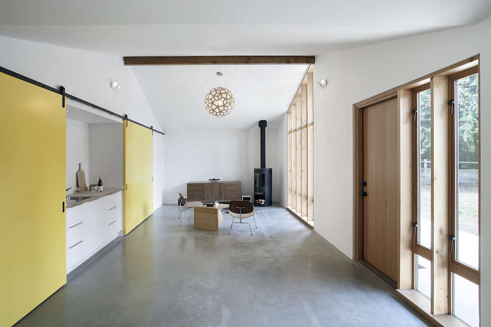
Above: The main room in the new studio is a long, open hall that was once divided into two horse stalls and a feed room. It now holds a casual living room at one end and a workspace at the other.
The envelope of the studio remained largely the same as that of the stable; the roofline was already defined, and the gabled roof forms are still visible from the interior. “The awkward collision of gables overhead was the main design problem,” says Schaer. “But this also helped us to create the order of the space, which is really a long hall.”
An exposed beam at the center of the ceiling is from the preexisting stables; behind it hangs a Coral Pendant by designer David Trubridge.
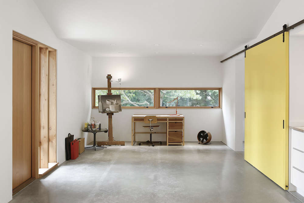
Above: The wife of the family is an amateur painter, “and she likes to get really messy,” says Schaer. “The family has kids, too, and they like to make a mess of things.”
Expert TipSince the program required “a space that could take a beating,” the architects used simple finishes—both for utility and for the uncomplicated look the client desired.
A strip of windows above the desk allows the occupant to passively watch the comings and goings of the house and driveway.

Above: Two sliding barn doors—painted in Benjamin Moore’s Yellow—can close off two of four distinct zones at any one time: a bedroom, utility sink, shelving closet, and mudroom. The barn door hardware is from Krownlab in Portland, Oregon.

Above: The studio makes use of radiant underfloor heating beneath basic concrete floors—unstained, but lightly ground and polished for greater stain resistance. “We did not fuss about the color,” said Schaer.
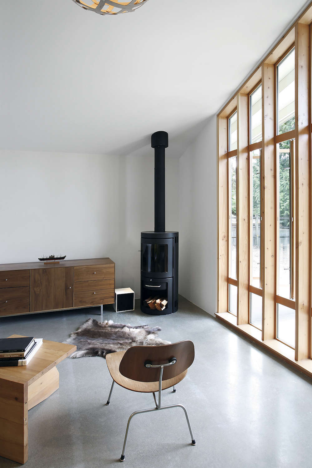
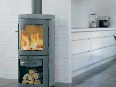
Above: A Monet woodstove from Danish brand HWAM warms the seating area, with Eames Molded Plywood Lounge Chairs from Herman Miller. The walls are painted in Benjamin Moore’s Atrium White.

Above: The family occasionally uses the converted stable as guest quarters for visiting family—partly the reason for the large shelving closet off the main hall. With kids, a dog, and a painter at work, said Schaer, “you can always just close off the storage closet when things get out of control.”
Above: “We’ve done a decent amount of work on midcentury buildings,” says Schaer, “and one thing we admire is how elemental a lot of the glazing is.” He describes a “classic midcentury move”—using vertical glazing next to the front door—and notes that the studio’s new windows “are sort of an homage to that.” (See an example of the midcentury glazing technique on the main house, below.)
All the window and door openings had to be newly cut. To achieve the look they wanted, the design team sourced fir windows from local manufacturer Lindal and mounted them to the surface of vertical studs near the main door. This reveals the depth of the framing, says Schaer. “When you install sheetrock and glom everything together, that elemental nature is lost.”
Above: The utility sink functions mainly as a clean-up zone for painting projects—it’s made from Ikea cabinets the homeowner installed himself.
Says Schaer of the studio’s simple materials: “This project is not low-budget for a garage, by any means,” he said. “But the character that we were aiming for was something that was not fussy, and that would be adaptable over time.”
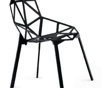
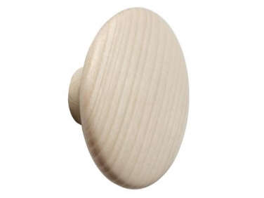
Above: The entryway closest to the house is through the mudroom, which features Muuto Dots wall hooks, a Ball Lamp from Modernica, and a Chair One with Stacking Base by Konstantin Grcic.
The yellow sliding barn doors can be used to close off the mudroom from the main hall, “signaling to visitors that the occupant is in privacy mode,” says Schaer.

Above: The bathroom walls are lined with Milestone—a cementitious plaster that’s resistant to cracking and made by a Portland, Oregon, company. Shed opts for the concrete look “when we don’t want the overwhelming geometry of tiles and grout lines, but want a softer, more ‘background’ space.”
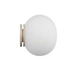
There’s no natural light in the bathroom—the team wanted a skylight, but the idea was nixed during cost-cutting. Instead, they used Glo-Ball Lights by Jasper Morrison for Flos.

Above: The two-car garage is largely unchanged, and the outbuilding still wears its original siding. “It’s kind of nice when you just let go of trying to do something flashy,” says Schaer. “This is serviceable—it’s what’s been here for 60 years, let’s just keep using it.”
One of two red doors—a specific request of the client’s, painted in Benjamin Moore’s Segovia Red—opens into the mudroom.
Above: The studio is painted in Benjamin Moore’s Kendall Charcoal, with eaves in Soft Chamois. The outside lights are Dioscuri Indoor/Outdoor Wall Sconces from Artemide.
The architects benefited from a good building orientation. “The big windows face a southward view with cedar trees in the distance, which made for a great site for the poured concrete patio,” said Schaer.
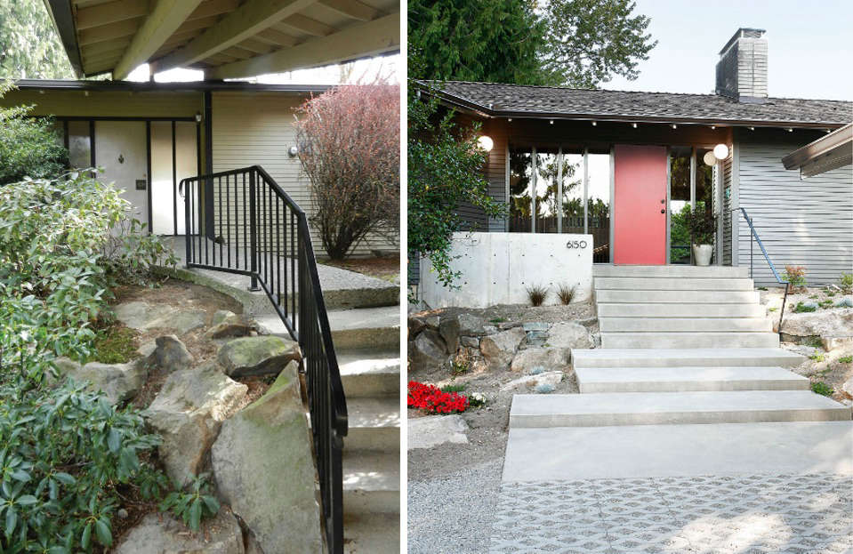
Above: For reference, the entryway of the main house: the original at left, Shed’s redesign at right. The original entry shows the “classic midcentury move” to which Schaer was referring—a series of vertical studs with simple sheets of glass and wood trim. “It’s super low-budget,” he says, “but super cool-looking.”

Above: The floor plan of the 1967 stables.
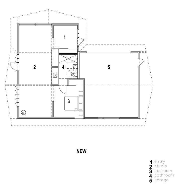
Above: The floor plan of the new work studio and guest quarters. In total, the new studio is 760 square feet.
Before
Above: The view from the now-mudroom to the now-painting area, which was then the stable feed room. The studio’s new yellow sliding barn doors are a nod to the original stable’s agricultural-style Dutch doors. Though different, “we thought the sliding door was still a nice connection back to the history of the building,” says Schaer.
Above: The view toward the current desk.
The original house and stable were created by the same builder at the same time, and the current owners smartly chose one architect to renovate both buildings at the same time—so the project benefits hugely from design continuity. “They are right next to each other,” said Schaer, “so consistency with the house was very important.”
Above: “We’re always trying to be respectful of the things that are working,” said Schaer, noting that the existing structure provided a nice usable volume. “With the cathedral ceilings, there is some verticality to the space without it being bulky,” he said.
Above: Where the red door now enters the mudroom, there was once a gap between the garage and the feed room. The corner post was used for tying up horses.
For more from the architects, see Steal This Look: Shed Built Bath in Seattle and Architect Visit: Shed Architects Whidbey Island Barn Conversion.















Have a Question or Comment About This Post?
Join the conversation (0)