Commissioned to overhaul an 1840s Brooklyn brownstone for a Swedish-American family of four, architects Solveig Fernlund (who also happens to be Swedish) and Neil Logan masterfully turned it into a house with dual citizenship. They tackled the five stories—each 24.5 feet wide, approximately 980 square feet, and largely devoid of period detail—by editing out the extraneous, walls included, and creating spaces that celebrate the austere grace of the structure while casting it in a magical Nordic light.
N.B.: The architects ran the firm Fernlund + Logan when they worked on the remodel in close collaboration with owners Jakob Trollbäck and Lisa Smith—it was their fourth residential project together. They have since opened their own offices: Solveig Fernlund Design and Neil Logan Architect.
Photography by Matthew Williams for Remodelista.
First Floor: Living/Dining/Kitchen
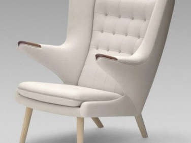
Above: Wanting to create a loftlike setup on the main floor, the architects took inspiration from Mies van der Rohe’s use of built-in storage cabinets as an alternative to walls. Shown here, a coat-closet partition of Douglas fir laminated onto birch multi-ply plywood in the entry. The armchair is Hans Wegner’s 1951 classic Papa Bear Chair.
Above: The closet sections off a casual parlor. The floor is newly installed oak, painted in Benjamin Moore Platinum Gray enamel. It has radiant heat and is made, the architects note, from best-grade wood to avoid warping from the heat.
The contractor loved the flooring so much, he didn’t want to paint it, but the combination of pale gray with white walls (Benjamin Moore Decorator’s White) and modernist wood furniture drives home the Scandi feel—as does the celebration of workmanship.

Above: Books furnish a room—and so does music.

Above: “Another double-sided cabinet placed perpendicular to the first divides the sitting area from the kitchen and dining room while accommodating uses for each,” explains Neil.

Above: The space opens to an expansive heart-of the-house kitchen—and the other side of the cabinet is the kitchen workhorse.
Above: Shallow shelves on the right half hold glassware, and on the left, within easy reach of the sink, deeper compartments conceal the fridge and freezer. The custom wood handles are solid Douglas fir.
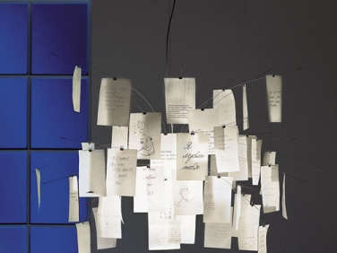
Above: “The nicest space in the house should be the one that’s most occupied,” says Fernlund. The kitchen revolves around a modernist picnic table and mobile-like Ingo Maurer light, a Zettel’z 5 Chandelier with clips that display drawings and notes.
For another indoor picnic table we’re coveting, see Architect David Chipperfield’s New Designs for e15.
Above: The table is used for kids’ art projects as well as for family meals and dinner parties. The bench seating is inset with shaggy seating cushions. It was purchased at ABC Carpet & Home in New York.
French doors open the kitchen to a terrace and ground-floor garden.
Above: Like the room’s other millwork, the cabinets are multi-ply birch plywood faced with Douglas fir and have an elegant, wafer-thin stainless steel counter. The sink is from Italian company Alpes Inox—see our post Race-Car-Style Appliances for Compact Kitchens—and the faucet is by Bulthaup.

Above: The range and hood are both Viking designs.

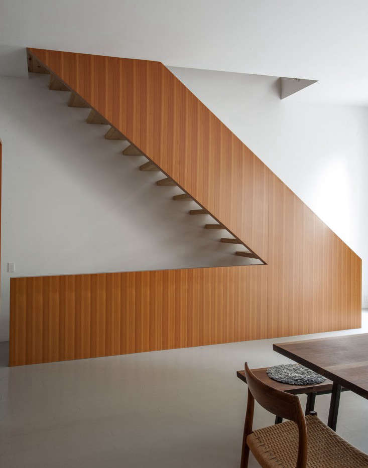
Above: Fernlund and Logan solved the trickiest riddle of the room—where to place the staircase—by turning tradition on its head and building an open-tread stair at the back end of the space.
The stair’s risers are made from old floor joists removed from the house and glued together to achieve the desired width. The open design allows the space to be light filled and oriented to the French doors in the back. The down staircase, meanwhile, connects the first floor with the garden level of the house.
Above: The stair has a V-shaped profile, and like so much of the project is at once low key and undeniably grand.
Above: The rail is wrapped in Spinneybeck leather that was stitched in place; the seam runs on the underside where fingers are placed. It took two tries for the fabricators to get the design right.
Second Floor: Master Bedroom and Bath

Above: Sliding wood doors in the living areas are in shades inspired by Le Corbusier’s paint palette, and serve as “fields of color that come and go,” says Fernlund. The satin stainless Flush Pull Handle is by D Line of Copenhagen.

Above: The quiet master bedroom has a George Nakashima bed, one of the family’s longstanding prized possessions. “We tried painting the far wall yellow, but it didn’t feel fresh enough, so we went back to white,” says Fernlund.

Above: The master bath adjoins a dressing area fitted with custom built-ins of Baltic birch—”and perfect joints,” notes Fernlund, “the woman that built these spent a month working on this closet.”
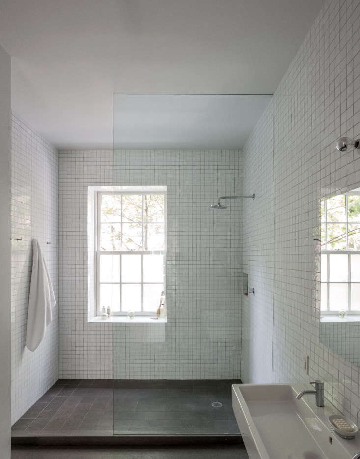
Above: To keep the room light and bright, the architects used a clear glass shower wall and milk glass tiles from Urban Archaeology. (A caveat:The tiles came with knife-sharp edges and required laborious sanding.) The Raindance Showerhead is by Hans Grohe.
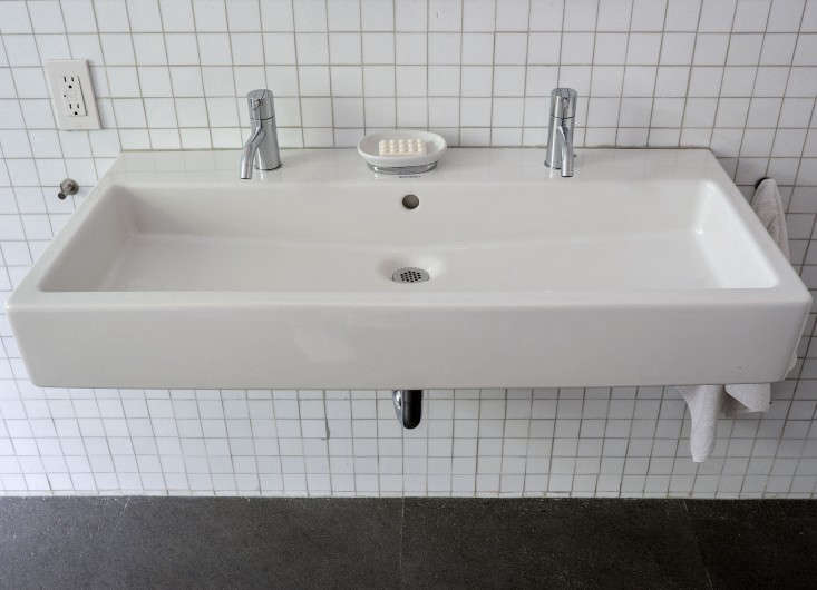
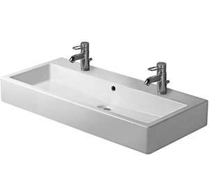
Above: The trough sink for two is Duravit’s Vero design and the faucets are Arne Jacobsen’s Vola HVI tap.
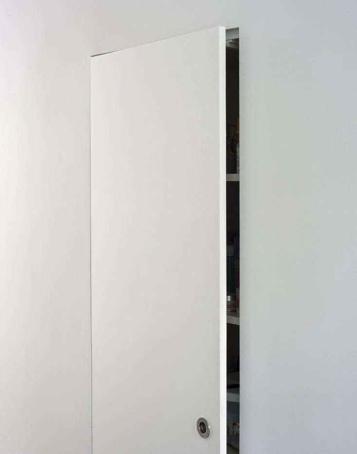
Above: In lieu of a medicine cabinet, a spacious—and barely noticeable—storage closet.
Attic: Guest Quarters
Above: The attic was transformed into guest quarters, including this bedroom under the eaves. “The attic originally had some paneling and after doing the necessary repairs, we decided to keep the look and add to it,” says Logan. “It makes the rooms feel intimate and warm, and also a bit like being on a boat.”
The bed frame is from Muji and the blanket is Jonathan Adler’s Nixon Alpaca Throw.
Above: The windows on the floor are original and were carefully preserved. Shown here, the guest bath with an enameled steel Kaldewei tub that stands on skeletal metal legs (the design is intended to be built-in; the architects noted its sculptural look and decided to use it freestanding).
Above: Duravit’s Happy D tank toilet and Vero wall-mounted sink were chosen for their clean geometry.

Above: A slatted teak shelf holds towels and antique prints.
Basement: Family Room and Garden
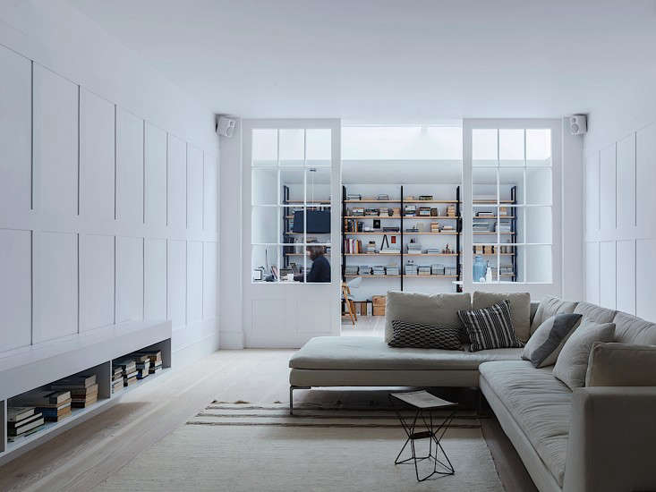
Above: The garden-level floor was divided into a media room, au pair quarters, and a recording studio, among other things. It has stone floors of brush-finished Basaltina, a volcanic basalt also used in the bathrooms—”and in Italian train stations,” notes Fernlund. “It has radiant heat and in places there are drilled holes for the air conditioning; we spent a lot of time making the AC disappear.”

Above: The media room occupies a one-story addition in the back connected to the newly landscaped garden by a wall of steel-framed glass windows—”all custom and welded in place.”
Balcony and Backyard

Above: The roof of the addition serves as the kitchen terrace.
Above: The long, weathered table is surrounded by French Tolix chairs.

Above: The back of the house, viewed from the two-tiered garden. Learn about pea gravel on Gardenista.
To see more of the attic bath, turn to pages 238-241 of the Remodelista book. Also check out another Fernlund + Logan project at Architect Visit: Fernlund + Logan in New York.
For more inspiration, browse our photo gallery of Scandinavian design, including Light and Shadow: Swedish Photographer Pia Ulin at Home in Brooklyn.









Have a Question or Comment About This Post?
Join the conversation (2)