Icon - Arrow LeftAn icon we use to indicate a rightwards action. Icon - Arrow RightAn icon we use to indicate a leftwards action. Icon - External LinkAn icon we use to indicate a button link is external. Icon - MessageThe icon we use to represent an email action. Icon - Down ChevronUsed to indicate a dropdown. Icon - CloseUsed to indicate a close action. Icon - Dropdown ArrowUsed to indicate a dropdown. Icon - Location PinUsed to showcase a location on a map. Icon - Zoom OutUsed to indicate a zoom out action on a map. Icon - Zoom InUsed to indicate a zoom in action on a map. Icon - SearchUsed to indicate a search action. Icon - EmailUsed to indicate an emai action. Icon - FacebookFacebooks brand mark for use in social sharing icons. flipboard Icon - InstagramInstagrams brand mark for use in social sharing icons. Icon - PinterestPinterests brand mark for use in social sharing icons. Icon - TwitterTwitters brand mark for use in social sharing icons. Icon - Check MarkA check mark for checkbox buttons.
You are reading

Brooklyn Makeover: A Homey Townhouse with a Modern Garret

Search

Brooklyn Makeover: A Homey Townhouse with a Modern Garret

March 5, 2018

When Rony Vardi and Dwight Weeks first toured their townhouse in Brooklyn’s Carroll Gardens, they were delighted by its sloping charm: “We said, all we have to do is add a dishwasher and straighten the stair,” Vardi tells us. “Well, it turns out crooked stairs are not a small fix—they mean the house is sinking.”

Wanting to stay in the neighborhood but to leave their tight rental behind, the couple—she’s the owner of the popular Williamsburg jewelry boutique Catbird, he’s an artist, and they have two kids—went ahead with what turned out to be a two-year gut renovation: The exterior of the house got shored up and the interior was entirely reenvisioned, open-plan living floor and garret addition included.

To get the job done, they hired husband-and-wife architects Anshu Bangia and William Agostinho of Bangia Agostinho, neighbors and fellow parents whose clean-lined designs and collaborative spirit felt just right: “We had very specific ideas about what we wanted, including that new stair,” says Vardi. “They guided us every step, but let us use our own voices.” As would be expected, what Vardi terms “major scope creep” defined the project—but without regrets: “We excavated the basement and built up: It was a case of us thinking, ‘Well, we already have to do this to shore up the structure, why not do that?'” Among the achievements: a house that’s not only built to last but to be fully lived in. Come see.

Photography by Pia Ulin, courtesy of Bangia Agostinho Architecture.
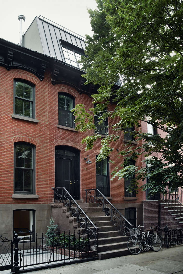
the \1905 row house has a preserved facade and its original stair and railings. 17
Above: The 1905 row house has a preserved facade and its original stair and railings. “The idea was to respect and restore the historic exterior,” says Bangia. “We repointed the bricks and installed thermally insulated windows by Marvin.”

The downstairs, previously a studio with a dirt crawlspace, is now a duplex rental apartment occupied by close friends of the family who have young kids of their own. The new top floor addition is clad in standing-seam metal and has angled steel windows: “It serves as an architectural material break from the brick, and provides a sense of this as a secluded attic for living,” says Bangia.

the lofty and bright parlor level is subtly textured with hand finished plaster 18
Above: The lofty and bright parlor level is subtly textured with hand-finished plaster walls, a steel stair, and whitewashed ceiling beams.

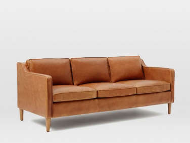
Vardi and Weeks took on the furnishing of the house themselves: “We wanted it be unfussy: not overly considered, just natural.” The Hamilton Leather Sofa is from West Elm (“They kindly held it for us for a year”), and the Moroccan Poof is from John Derian. “Pretty much everything else we already owned or found along the way at the Brooklyn Flea,” says Vardi, noting that layering vintage rugs is “so much more forgiving than picking one statement design.” The Audubon bird print to the left of the front door was a long ago purchase: “It’s what inspired the name Catbird for my store.” The stacked suitcases hold “the kids’ keeper art.”
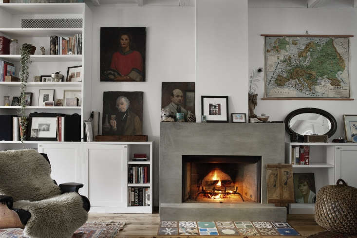
inspired by a friend&#8\2\17;s minimalist concrete mantel, the couple reque 19
Above: Inspired by a friend’s minimalist concrete mantel, the couple requested their own. It was fabricated by The Concrete Shop of Passaic, NJ, and paired with a hearth of encaustic Cement Tiles that Weeks found “in a crate under a table at Amethyst Artisan.”

The couples’ collection of thrift store portraits are joined by a vintage school map. (For similar botanical posters, see Nature Conservancy.) The draped Eames chair came out of Weeks’s childhood home.

built in storage runs along the length of the room: &#8\2\20;we wanted to b 20
Above: Built-in storage runs along the length of the room: “We wanted to be able to tuck things away, to have few furnishings and open space,” says Vardi.” The millwork was done by Janik Furniture Specialists and the general contracting by Showcase Construction, both frequent members of Bangia Agostinho’s team.
in the back of the space, the kitchen and dining area overlook the garden, newl 21
Above: In the back of the space, the kitchen and dining area overlook the garden, newly accessible through French Doors from Marvin that draw light into the whole room.

Set against a painted brick wall, the kitchen is composed of half-height Ikea cabinets with a combination of fronts from SemiHandmade (see Ikea Upgrade: The SemiHandmade Kitchen Remodel) and custom parts, especially on the work island. It’s painted in Old Navy from Benjamin Moore.

vardi planned her blue kitchen &#8\2\20;years before it became a thing& 22
Above: Vardi planned her blue kitchen “years before it became a thing” (see Trend Alert: The Cult of the Blue Kitchen). and says she’s never tired of it. She also had been set on marble counters, but Weeks pointed out that they’d “make the whole room feel like a kitchen.” Instead, they went with oak finished with food-safe Rubio Monocoat. “We were advised against wood counters and, in truth, they look good but have been hard to maintain: wood warps and stains. Butcher block might have been better, but we only used it in the corner.”

The Bottom-Freezer Refrigerator is a Viking; note the pots-and-pans pegboard on the side of its custom enclosure. The appliance next to it is a built-in microwave. The range is a Viking.

the french doors lead to a back porch with a grill and steps leading down to th 23
Above: The French doors lead to a back porch with a grill and steps leading down to the yard. The oak flooring with random lengths and widths was sourced from Carlisle.

Vardi’s mother is a kitchen designer and the porcelain farmhouse sink came out of her garage. The satin nickel Pullout Faucet is from Rohl.

a mix of old wooden office chairs surround a mango wood table assembled at from 24
Above: A mix of old wooden office chairs surround a mango wood table assembled at From the Source. The gilded glass pendant lights came from an antiques store on Atlantic Avenue: “They’re nice because they cast a golden light.” The couple bought the white porcelain cabinet knobs on eBay.
a steel   ledge exhibits a mix of art that weeks regularly switches out. air co 25
Above: A steel picture ledge exhibits a mix of art that Weeks regularly switches out. Air-conditioning vents with metal grills from Reggio Registers are incorporated into the top of the bookshelves.
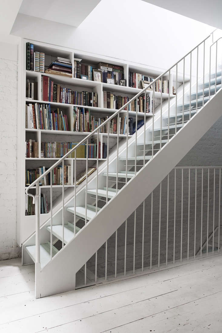
inspiration for the steel stair came from a utilitarian design that the couple  26
Above: Inspiration for the steel stair came from a utilitarian design that the couple spotted at the Fondation Henri Cartier-Bresson in Paris: “We liked how thin and unobtrusive it is and came home with photos.”

The white surfaces throughout the house are in Decorator’s White from Benjamin Moore. And stair treads, like the ones in Paris, are painted pale blue—Benjamin Moore Blue Haze—which Vardi points out “show dirt slightly less than if they were white.” On the bedroom floor shown here, the architects cleverly slotted a bookshelf into the stair wall.

to fit two bedrooms and baths, plus the stair to the new top floor, the family  27
Above: To fit two bedrooms and baths, plus the stair to the new top floor, the family had sacrifice size. The designers compensated by giving the master bedroom a six-foot-wide entry and a sliding barn door.

Here, the painted wide-plank flooring is the original pine subfloor, “salvaged during construction, planed and grooved on site, and reinstalled,” says Bangia. And, thanks to the extent of the interior teardown, they were able to install subfloor heating throughout.

the all white room has kerry cassill indian cotton bedding and a mushroom botan 28
Above: The all-white room has Kerry Cassill Indian cotton bedding and a mushroom botanical painting from John Derian. Vardi says she accidentally ordered only one pair of curtains from Anthropologie then ended up liking the look: “They do the trick and don’t overwhelm the space.”

the master bath&#8\2\17;s custom vanity (painted benjamin moore black iron) 29
Above: The master bath’s custom vanity (painted Benjamin Moore Black Iron) is topped with honed Carrara marble. The fittings are all unlacquered brass, including the Barber Wilsons & Co. wall-mounted Mixer Faucet. The tiles are Heritage Tile’s Subway Ceramics.
Vardi said they had trouble finding a simple, outsized mirror—and then discovered they could order one from their local framer. The preserved original brick and glass shower are reflected here.

the kids, ages \10 and \1\1, share a room with built in bunks each with its own 30
Above: The kids, ages 10 and 11, share a room with built-in bunks each with its own shelves and surrounding drawers.
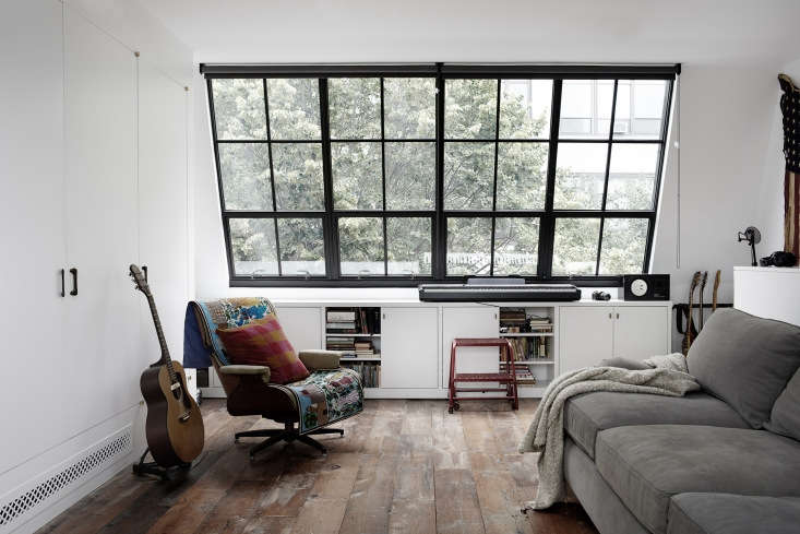
the built ins continue on the 440 square foot top floor, where the tv is concea 31
Above: The built-ins continue on the 440-square-foot top floor, where the TV is concealed behind flush cabinet doors. “We made a very conscious decision late in the process to have the TV here instead of in the living room,” says Vardi. “It’s been a great thing—it means the TV is never just playing in the background.”

The room was a complicated, late-stage splurge that’s in constant use—for practicing music, doing homework, making art, and more. The sofa doubles as the guest bed. The steel-framed window, another Paris inspiration, was made by Optimum Window.

 french doors open to a back balcony, where vardi does a lot of gardening& 32
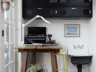
Above: French doors open to a back balcony, where Vardi does a lot of gardening—hence the all-purpose worktable and utility sink.
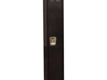
The family’s supplies, such as tools, batteries, and duct tape, are kept in classic metal school lockers found by Weeks; installed on their sides, they fit perfectly. (Find similar Black Lockers from Global Industrial.)

the north facing balcony is the sunniest spot in the house. the wood floor is m 33
Above: The north-facing balcony is the sunniest spot in the house. The wood floor is more of the house’s salvaged subfloor.
the family share their backyard with their downstairs tenants. the herringbone  34
Above: The family share their backyard with their downstairs tenants. The herringbone terrace—”made from bricks our contractor saved from another house demo”—overlooks an Astroturf lawn edged with Vardi’s garden.

Why fake grass? “Because it’s the greatest,” says Vardi. “Five kids play here, it drains well, we have fewer mosquitoes, and no one has to mow.” Read about the pros and cons of artificial turf in Hardscaping 101.

The tour continues: Here are three more of our favorite townhouse rehabs (the first is another by Bangia Agostinho):

(Visited 3,368 times, 1 visits today)
You need to login or register to view and manage your bookmarks.

Frequently asked questions

What is the project featured in this article?

The project featured in this article is the Brooklyn Townhouse Remodel by Rony Vardi.

Who is Rony Vardi?

Rony Vardi is a designer and owner of the retail store Catbird, known for her unique aesthetic sense and offbeat style.

Where is the townhouse located?

The townhouse is located in Brooklyn, New York.

What was the scope of the project?

The project involved a gut renovation of the townhouse's interior, including the kitchen, bathrooms, and bedrooms, to create a more open and cohesive living space.

What was the inspiration behind the design?

The design was inspired by the Scandinavian aesthetic, with a focus on simplicity, functionality, and understated elegance.

What materials were used in the renovation?

The renovation used natural materials, such as wood, stone, and concrete, along with a muted color palette to create a sense of warmth and calm.

What key elements stand out in the design?

The design features clean lines, minimalistic furnishings, and a mix of vintage and modern pieces, which give the space a timeless quality. The many plants lend life to the home, which has ample natural light.

What was the outcome of the project?

The townhouse was transformed into a modern, functional, and inviting space that seamlessly integrates the various living areas while retaining the historic charm of the original building.

Product summary  Item 6 178Item 7 179

Have a Question or Comment About This Post?

Join the conversation

v5.0