Icon - Arrow LeftAn icon we use to indicate a rightwards action. Icon - Arrow RightAn icon we use to indicate a leftwards action. Icon - External LinkAn icon we use to indicate a button link is external. Icon - MessageThe icon we use to represent an email action. Icon - Down ChevronUsed to indicate a dropdown. Icon - CloseUsed to indicate a close action. Icon - Dropdown ArrowUsed to indicate a dropdown. Icon - Location PinUsed to showcase a location on a map. Icon - Zoom OutUsed to indicate a zoom out action on a map. Icon - Zoom InUsed to indicate a zoom in action on a map. Icon - SearchUsed to indicate a search action. Icon - EmailUsed to indicate an emai action. Icon - FacebookFacebooks brand mark for use in social sharing icons. flipboard Icon - InstagramInstagrams brand mark for use in social sharing icons. Icon - PinterestPinterests brand mark for use in social sharing icons. Icon - TwitterTwitters brand mark for use in social sharing icons. Icon - Check MarkA check mark for checkbox buttons.
You are reading

Roma: An Artful Twentieth-Century House in Italy in an Of-the-Moment Palette

Search

Roma: An Artful Twentieth-Century House in Italy in an Of-the-Moment Palette

October 4, 2019

Since we first featured their Ping Pong House a year ago, I’ve been pulled again and again to the website of Studio Strato, the Rome-based firm of architects Vincenzo Tattolo and Martino Fraschetti. The duo have a way of making spaces feel playful but serene, artful and sculptural, even poetic, but wholly livable, and with masterful doses of color.

Recently I fell for their “Tuscan Red House”: a twentieth-century building in the Testaccio district of Rome that the firm renovated for a young couple—a freelancer and a creative—and their kids. The project was completed a few years back but—with its retro tiled kitchen floor, palette of rusts and blues, and unexpected uses of paint—feels completely Autumn 2019.

Join us for a look.

Photography by Serena Eller, courtesy of Mondadori and Studio Strato.
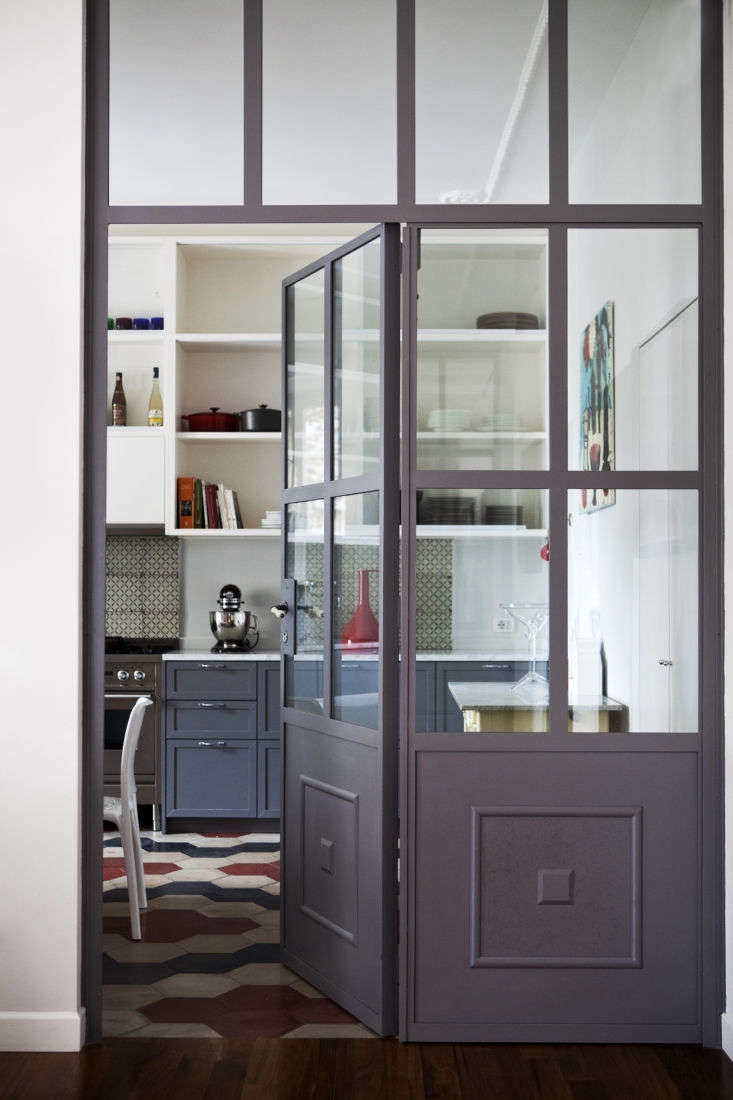
the clients, a young creative couple with kids, asked for a &#8\2\20;modern 17
Above: The clients, a young creative couple with kids, asked for a “modern and fresh” interior that still felt suitably Roman, the architects say. Tattolo and Fraschetti kept the layout mostly the same, demolishing only one wall in the process. Here, an iron and glass door, Studio Strato’s own design, connects the living areas to the kitchen.
in the kitchen, a reclaimed cement tile floor sets the stage for a motif of dus 18
Above: In the kitchen, a reclaimed cement-tile floor sets the stage for a motif of dusty reds and blues that appears throughout the house. “The colors are a reference to the Roman world, reinterpreted in a contemporary key,” the architects say. The open shelving is fronted by glass, and the red sconces on the walls were made at Lumbers on Vicolo del Cinque in the Trastevere district.
a bright turquoise pendant—the aggregato by artemide—hangs a 19
Above: A bright turquoise pendant—the Aggregato by Artemide—hangs above the breakfast table.
the kitchen opens onto the dining area, where a family heirloom table pairs wit 20
Above: The kitchen opens onto the dining area, where a family heirloom table pairs with blue Evoque by Miniforms chairs.
the sculptural living room is grounded by a massive hutch, the family& 21
Above: The sculptural living room is grounded by a massive hutch, the family’s own, filled with books. The white lamps are Issey Miyake for Artemide, and the rugs are artfully layered: a blue jute runner by Atipico atop a grey wool carpet by Kasthall.
the architects used paint in an unusual way throughout, like painting the insid 22
Above: The architects used paint in an unusual way throughout, like painting the insides of doorways in Tuscan Red and Gauze Dark, both by Little Greene. Looking down the hall, the doorways almost look like canvases hung on the walls.
the palette continues in the petite entryway. 23
Above: The palette continues in the petite entryway.
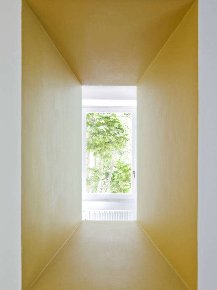
one yellow painted passageway looks through to a small desk area. 24
Above: One yellow-painted passageway looks through to a small desk area.
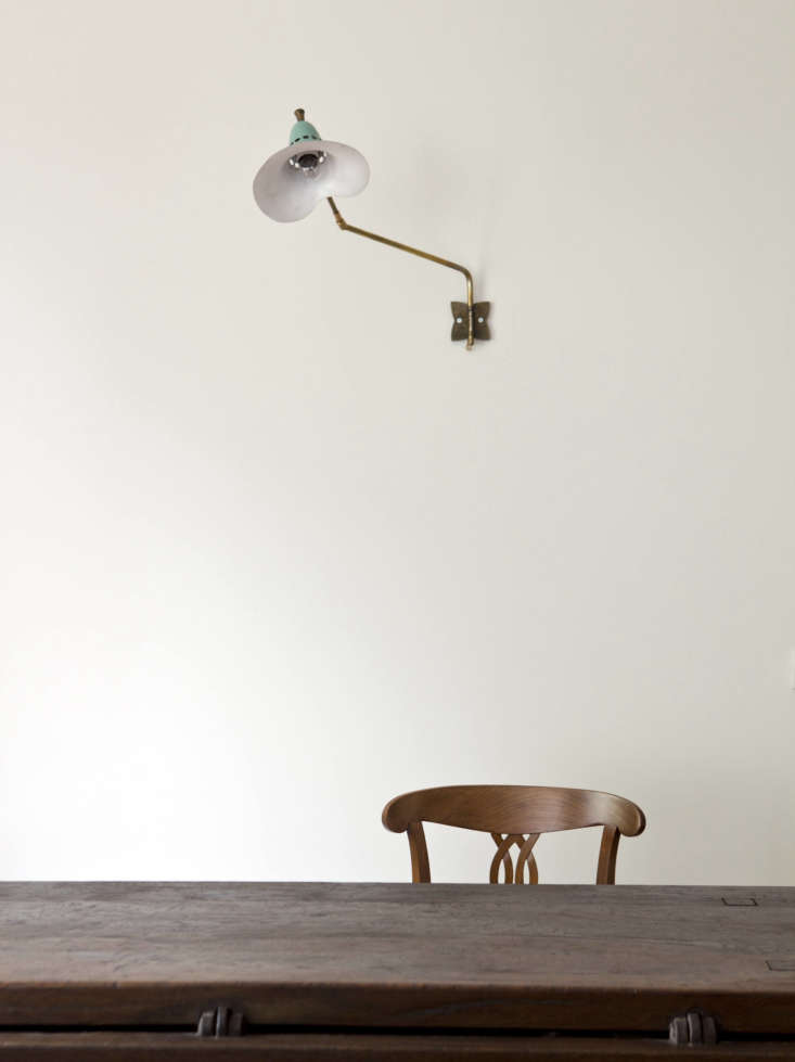
Above: Subtle doses of color, in a light fixture and a window.
in the bedroom, the architects integrated existing built in wardrobes with an a 27
Above: In the bedroom, the architects integrated existing built-in wardrobes with an added row of storage on top, painted also, strikingly, in Tuscan Red.
 the bed is outfitted in linens and blankets from society limonta. 28
Above: The bed is outfitted in linens and blankets from Society Limonta.
one of two bathrooms. hand glazed tiles appear throughout the house like steppi 29
Above: One of two bathrooms. Hand-glazed tiles appear throughout the house like stepping stones: “They come from the previous owners’ house: a way to carry around a piece of the past,” the architects say.

Take a look at a few more favorite projects in Rome:

(Visited 1,292 times, 1 visits today)
You need to login or register to view and manage your bookmarks.

Have a Question or Comment About This Post?

Join the conversation

v5.0