Icon - Arrow LeftAn icon we use to indicate a rightwards action. Icon - Arrow RightAn icon we use to indicate a leftwards action. Icon - External LinkAn icon we use to indicate a button link is external. Icon - MessageThe icon we use to represent an email action. Icon - Down ChevronUsed to indicate a dropdown. Icon - CloseUsed to indicate a close action. Icon - Dropdown ArrowUsed to indicate a dropdown. Icon - Location PinUsed to showcase a location on a map. Icon - Zoom OutUsed to indicate a zoom out action on a map. Icon - Zoom InUsed to indicate a zoom in action on a map. Icon - SearchUsed to indicate a search action. Icon - EmailUsed to indicate an emai action. Icon - FacebookFacebooks brand mark for use in social sharing icons. flipboard Icon - InstagramInstagrams brand mark for use in social sharing icons. Icon - PinterestPinterests brand mark for use in social sharing icons. Icon - TwitterTwitters brand mark for use in social sharing icons. Icon - Check MarkA check mark for checkbox buttons.
You are reading

Like a Well-Worn Coat: A Design Couple’s Snug, Earthy, Reclaimed House in the UK

Search

Like a Well-Worn Coat: A Design Couple’s Snug, Earthy, Reclaimed House in the UK

November 21, 2022

From time to time we run across a designer and quickly spend the rest of the week deep-diving through their entire portfolio. Such was the case with UK-based Ridge & Furrow, the project of husband and wife Elle Kemp and Martin Gane. “It’s the amalgamation of our various skills, plus the realization after we finished building our own home and garden that we’d like to do this for other people full time,” says Elle.

Fittingly, our first feature on Elle’s and Martin’s work is their own home in the Cotswolds, an old barn the couple bought in 2012 when Elle was seven months pregnant with their first child (their son Claude is now 9; Gilbert is 6). “It wasn’t love at first sight,” Elle says of the house. “Ours is not one of those barn conversions that you might typically imagine—no great theatrical open spaces of soaring scale, no grand timber frames sweeping to the ceiling. Its delights took longer to appreciate.”

Which is somewhat of an understatement. “The only things here when we bought the place were the brick and stone walls and the outer roof structure. There was no floor, only mud, and no upper story. But unusually for an agricultural building, it was designed by an architect, Benjamin Bucknell, in the Victorian era,” Elle says. “We discovered that the original plans are in the Gloucester archives.”

Martin did all of the building, adding stairs and free-standing timber frames, designed by the couple, to create room upstairs, and the two added reclaimed materials to divide up the downstairs and upgraded doors and windows to make the house livable and warm. “All of the original material of the building remains, but in some spaces it’s covered up in order to add insulation or to meet building regulations,” says Elle. “All the layers we’ve added are breathable, using natural materials such as cork, lime, and sheep’s wool and avoiding impermeable materials like plastic, plaster board, and standard insulation.”

“Living in a Victorian pigsty,” Elle self-deprecatingly describes on her Instagram, but the finished effect, though rustic, is layered, laid-back, and sophisticated. Join us for a look at their family’s snug, reclaimed house in pleasantly “muddy” hues.

Photography courtesy of Ridge & Furrow.

a garden path leads to the revived agrarian building. &#8\2\20;we did have  17
Above: A garden path leads to the revived agrarian building. “We did have to put in new doors and windows in order to be able to live comfortably,” says Elle, “though we kept all the beautiful old ones. All the doors and windows are double-glazed solid oak and were made bespoke to our designs. We wanted to be as sympathetic as we could, but we needed to replace them all as there was originally no glazing and the old structures were eaten away by years of animal and weather damage.”
an arched doorway leads into the kitchen. &#8\2\20;we didn’t want to 18
Above: An arched doorway leads into the kitchen. “We didn’t want to impose on the original building more than we had to,” Elle says.
the couple found an old, time worn stone sink for the dark painted kitchen. 19
Above: The couple found an old, time-worn stone sink for the dark-painted kitchen.
one wall of the kitchen is paneled in shiplap, painted glossy black; a reclaime 20
Above: One wall of the kitchen is paneled in shiplap, painted glossy black; a reclaimed bench creates a dining nook.
&#8\2\20;we found a source of reclaimed bead board that we used to create a 21
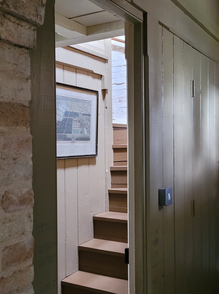
Above: “We found a source of reclaimed bead board that we used to create all our new room partitions,” says Elle. “This feature has become a prominent style throughout.” The partitions, like the one shown here, are painted in Farrow & Ball’s Drab.
another reclaimed partition leads into the snug. 22
Above: Another reclaimed partition leads into the snug.

As for the house’s palette: “We both love muddy tones,” Elle says. “We also looked through our reclaimed timbers to pick out any remains of old paint colors we could find for inspiration. When I was stuck, Martin said one day he’d like the place to feel like his battered old tweed jacket, so I turned to that for color inspiration, too. In a time when the world was still painting everything grey, we went for browns, tans, khaki, and black. We particularly liked Farrow and Ball’s Drab; both the color and its name spoke of what we wanted to achieve: unpretentious, low-key, austere, muddy, and relaxed.”

the snug is layered with antique rugs and filled with books. 23
Above: The snug is layered with antique rugs and filled with books.
&#8\2\20;we have phases of collecting particular things,&#8\2\2\1; says 24
Above: “We have phases of collecting particular things,” says Elle. “I might have a glut of vintage jam pans one week and threadbare old carpets the next. That’s how the layers build: through our various current obsessions and the need to then find somewhere to use them—if not for clients, then for ourselves.”
the snug&#8\2\17;s ceiling is painted in little greene&#8\2\17;s light  25
Above: The snug’s ceiling is painted in Little Greene’s Light Bronze Green.
an example of the couple&#8\2\17;s conscientious unearthing: the fireplace. 26
Above: An example of the couple’s conscientious unearthing: the fireplace. “There had originally been a fireplace in the location we have ours now—it had been used to make the pig food,” says Elle. “By the time we bought the place, it had been taken down, though happily this had been done carefully and all the original bricks were stacked in the yard. We could make out the original course of the chimney from the black residue on the wall, so we followed this course. Then we found the broken pieces of an old stone fire surround in the next door farmer’s shed, so we bought these from the farmer and pieced it back together.”
Above: The couple’s design ethos: “Sustainable, breathable, solid, natural, and reused materials; traditional detailing;” and creating spaces that feel as though they’ve always been there. “We respond to what’s appropriate for each house and its location, history, feeling, age, and the local vernacular,” says Elle. “Our aim is always to achieve a look in keeping with the sense of place rather than of a particular style.”
the couple&#8\2\17;s bedroom is a study in layers, including a hanging tape 29
Above: The couple’s bedroom is a study in layers, including a hanging tapestry—which adds intrigue and also extra insulation in old stone house. (For more, see our recent Trend Alert: Modern Wall Hangings in Wintery Shades of White.)
&#8\2\20;when we bid on the barn, we found a massive old tapestry in the lo 30
Above: “When we bid on the barn, we found a massive old tapestry in the local charity shop, but we didn’t have a wall big enough to hang it in our old house,” says Elle. “We said if we got the barn we’d go back for it. Then we got a taste for tapestries and bought the one that hangs above our bed.”
one bathroom has exposed copper pipes and stone floors. 31
Above: One bathroom has exposed copper pipes and stone floors.
another bath, this one in a palette of rich, warm reds. elle painted the motif  32
Above: Another bath, this one in a palette of rich, warm reds. Elle painted the motif on the eaves herself, inspired by antique painted ceilings and textile fragments. A clothes-drying rack hangs above the clawfoot bath—ideal for catching drips.

As of now, the family is looking for their next historic structure to repair—and putting the Cotswolds barn on the market. “Neither of us believe in ‘forever homes’ and are more inclined to throw ourselves out of our comfort zones and go where the wind takes us for the thrill of another project,” says Elle. “We both have a shared love for historic houses and, in particular, traditional domestic interior detailing. We don’t have anything lined up yet, but we’re actively on the hunt.”

For more thoughtfully rehabbed projects in the UK, see:

N.B.: This post is an update; the original story ran on January 28, 2022, and has been updated with new information and links.

(Visited 7,901 times, 4 visits today)
You need to login or register to view and manage your bookmarks.

Have a Question or Comment About This Post?

Join the conversation

v5.0