Not many New York designers dare to go dark, but Richard Ostell does. “I feel we’ve lost a sense of peacefulness in our lives, and our homes can be that place,” he says. In this West Village townhouse for a client with an aversion to clinical white rooms, Ostell turned to the Belgians for his palette: “natural colors like grays, taupes, and greiges channel a feeling of timelessness and complete tranquillity.”

Above: The turn-of-the-century brick townhouse had been chopped up into apartments. Its current owner, an entrepreneur with a young son, worked with an architect to restore the landmark to a single-family dwelling–which involved completely gutting and reinventing the interior. “Only the front and back wall are original,” says Ostell, who stepped in when construction was under way and was hired to fill in all the details. The front door and windows are painted in a Benjamin Moore bluish black, which he describes as “a really beautiful, odd color that works well with the bricks.”

Above: “My client wanted to be able to close the front door and be in his own relaxing, private space with his art collection. He didn’t want light and bright; he wanted a warm, cocooning feeling.” says Ostell. The living room, shown here, is painted in a Benjamin Moore soft gray called Upper West Side, trim and ceiling included. One of Ostell’s tips for making moody colors work is to avoid interrupting them with white or pale-painted trim–”that adds a formality that I try to avoid.” The sofa is from Dmitriy & Co. (see Belgium by Way of Manhattan) and the daybed is an Ostell design made by Dmitriy & Co. in the same Belgian gray linen as the sofa. The coffee table is a custom design by Ostell in “oak with a very, very dark stain–the owner likes dark woods.” The painting is by American abstract expressionist Ron Gorchov.

Above: An 18th-century English trestle table found on 1st Dibs serves as an anchor–and a place to perch a light–for a floating sofa. The ceramic lamp is a vintage Swedish design from Michael Del Piero, in Chicago. The stacked vase is by contemporary Austrian potter Matthias Kaiser, who Ostell represents in his small online shop and counts as one of his great discoveries. The rugs in the house were sourced from Double Knot, in NYC’s TriBeCa.
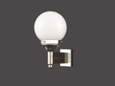
Above: Ostell’s choice of lighting in every room is worth noting. Carl Witzmann’s 1929 Wall Light with an Opaline Glass Ball, shown here, is from Woka, an Austrian company specializing in period reproductions. “The style of the house and its location dictated a lot of the choices. Everything also had to work with the art. The project was all about mixing periods and styles, high and low, to achieve a cohesive whole.”
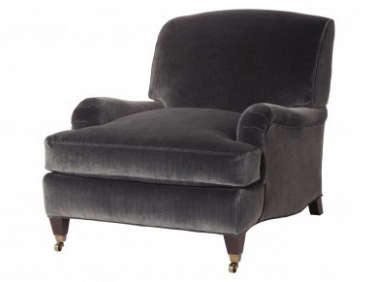
Above: A photograph of a blue rock face hangs next to the living room mantel–it and the Gorchov were designated for the room before Ostell got to work. The Morgan Chairs in charcoal velvet are from Jayson Home, in Chicago: “I wanted that traditional English look in a really elegant, simple shape with good legs. Nothing fussy,” says Ostell. “Other than at George Smith, they’re hard to find. Jayson Home’s are beautifully made.” The wide-board floors throughout are all new, but built from reclaimed wood that looks very much at home.

Above: Like the floors, all the architectural details had to be added. Ostell designed the living room’s classic walnut mantel–”the mandate was to come up with something simple and traditional that looks as if it’s always been there. First I sketched it, then I drew it to scale on kraft paper and taped it to the wall with painter’s tape. The owner was so happy with it, he almost didn’t feel the need to go ahead with the real thing.” The round mirror in is a 1960s design in black-and-white marble from Stellar Union, in Southampton. The tea bowls are by Matthias Kaiser.
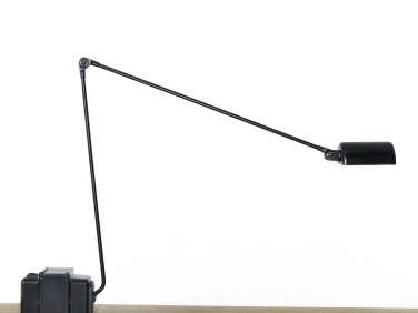
Above: One of Ostell’s specialties is his minimalist furniture designs, including this Cantilever Side Table, which holds his all-time favorite light, the halogen Lumina Daphine Tavolo, “designed in 1975 and in production ever since” (we have to mention that it’s a favorite of Vincent Van Duysen’s as well).

Above: Gorchov’s signature is the curved, shield-like canvas.

Above: Another Gorchov hangs in the office, where the wall color shifts ever so slightly to a Benjamin Moore taupe called Gothic Arch. The desk is an Edward Wormley rolltop from the 1950s and the credenza is a 1960s design, both found on 1st Dibs.
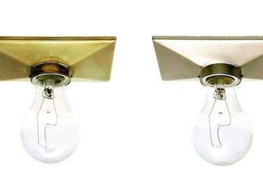
Above: Architect Annabelle Selldorf’s Escutcheon ceiling lights in patinated brass line the beamed ceiling of the kitchen on the ground floor, shown here with a glimpse of the stairs that lead down from the parlor floor.

Above: The fully custom kitchen is in an off-white and the subway tiles are a very pale green. Ostell introduced the counters, which are honed granite–”I like its silky, soapy feel”–and the antique French hanging lights. “My client loves to cook and entertain and wanted a communal feeling, and a lot of controllable light (so everything is on dimmers).” The oil-rubbed brass knobs and pulls are from Restoration Hardware.
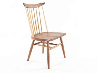
Above: The dining table, a piece the client already owned, is a Nakashima-style design that Ostell surrounded with Wakayama chairs from White on White. (For more ideas, see 10 Easy Pieces: The Windsor Chair Revisited.) The leather-topped stools are midcentury pieces.
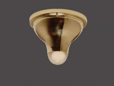
Above: A ribbon-like stair winds through the house. This second-floor door leads to a guest room. Like the walls, it’s painted the same Benjamin Moore gray as the parlor. The glowing brass ceiling light is a 1904 Koloman Moser design from Woka.

Above: A striped runner from Double Knot leads to the master bedroom, located on the top floor of the house, where the palette is the darkest: The walls and ceiling are painted a deep Benjamin Moore gray fittingly called Stormy Sky.

Above: An antique textile covers the four-poster bed. The bedside light is the Paris in brass with a silk cord from O’Lampia Studio on the Bowery, makers of custom lights.

Above: During the remodel, the third floor was opened to the attic and two rows of windows were introduced. They have electronic roller blinds (with solar shades and blackout shades) that disappear by day. Like all of the electronics in the house, they’re kept out of sight and are controlled at the touch of an iPad mini.
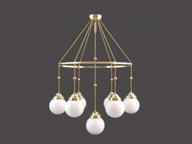
Above: Brioni, a drop-pendant chandelier designed by Koloman Moser in 1914, hangs over the master bathtub, positioned under a skylight “with a full view of the stars.” The walls are the same gray as the bedroom. A walnut ledge serves as a bath-side shelf.

Above: Another Koloman Moser chandelier (this one in a foyer); the Austrian architect created the lights for use in houses he designed.

Above: A mirror from Restoration Hardware leans against the slate-tiled shower.

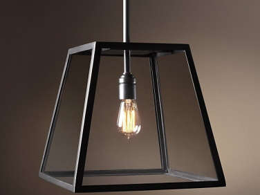
Above: The palette extends to the guest quarters: The walls in this guest room are painted Benjamin Moore Gallery Buff and framed with taupe velvet curtains. The brass bedside light is another O’Lampia design called Bubble. The lantern ceiling light–Ostell’s (and Restoration Hardware’s) salute to a Vincent Van Duysen design–is the Modern Filament Pendant.
We’re longtime devotees of Ostell’s work. For more of his design tips, read Expert Advice: How to Create a Low-Key Luxe Look. Learn about his online shop in our post Slow Design from Richard Ostell and go to Richard Ostell. Have a look at two of his own former residences in House Call: Richard Ostell in Westchester and A Brit in Milwaukee. And stay tuned for more.






Have a Question or Comment About This Post?
Join the conversation (11)