Mister Ice Cream in Vancouver offers the latest dessert craze—ice cream made to order using liquid nitrogen. (The technique has been popular in Asia for some time, say owners Michael Lai and Tommy Choi, and in San Francisco, Smitten Ice Cream is leading the charge.) Unlike readymade ice cream, which requires stabilizers such as eggs, the nitrogen technique mixes only fresh cream and milk with flavorings like sugar, salt, or chocolate. The ice cream, they report, is denser, smoother, and creamier.
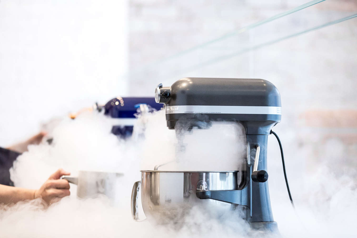
At Mister Ice Cream, the act of making is a show in itself; a row of KitchenAid mixers becomes enveloped in a chilly cloud of nitrogen, signaling to customers that newly minted ice cream is close at hand. The shop, designed by Vancouver-based Scott & Scott Architects, is oriented to show off the process.
Photography by Fahim Kassam, except where noted, courtesy of Scott & Scott Architects.
Above: Mister Ice Cream occupies a 480-square-foot elevated loading dock in a 1912 warehouse in Vancouver’s Yaletown neighborhood. Its designers, Scott & Scott, have designed some of our favorite restaurant spaces in Vancouver, including Kin Kao, Torafuku, and Bestie Currywurst. Photograph by Scott & Scott.
Above: Owners Michael Lai and Tommy Choi man the KitchenAid stations.
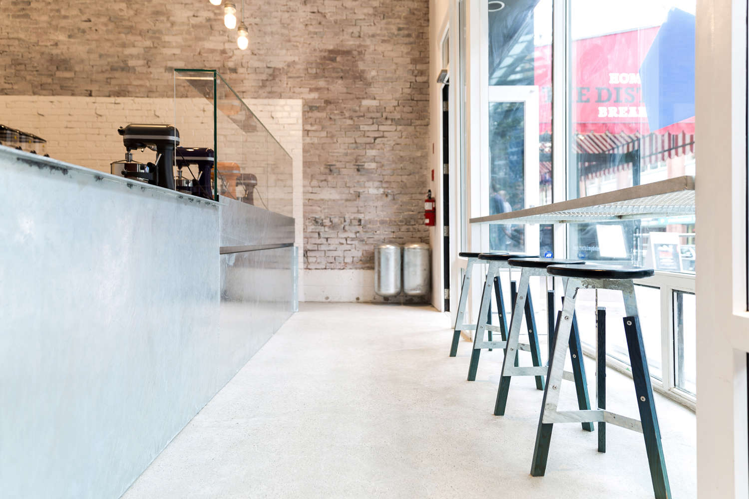
Above: The brick walls were whitewashed, and the ice cream-making zone was painted in high-gloss white. The original concrete floors were ground and left unpolished.

Above: At the back of the store, the architects installed a custom cabinet wall made of Douglas fir plywood, which the architects colored by applying dye with a spray mister in their studio.
Above: The working counter is soapstone sourced from Quebec. According to the architects, soapstone was traditionally used in laboratories, partly due to their resistance to thermal shock. (The liquid nitrogen is -196°C, or -320°F.) Photograph by Scott & Scott.

Above: Steel, wood, and molded leather counter stools of the architects’ design.
Above: Hanging above the production station are vapor lamps by Canadian industrial lighting manufacturer RAB. The sign announcing today’s flavors is made of dark blue Perspex acrylic.
Above: A wall of glossy white paint delineates the ice cream laboratory from the customer zone. Photograph by Scott & Scott.
Above: A self-serve customer station offers ice cream cups, napkins, and spoons. The shelves are made of production scraps from the steel stools, welded to standard concrete anchor bolts. Photograph by Scott & Scott.
Above: The soapstone countertop sits on a plate steel island that was dip-galvanized in one piece for strength. Say the architects, “We often associate the galvanized finish with memories of cold from childhood and that experience of sticking your tongue to the steel guard on a ski lift.”
Above: The action happens at each of the four brightly colored mixer stations.
Above: The architects wanted the finishes to showcase “the room’s foggy, churning ice cream atmosphere.”

Above: Ice cream to go.

Above: The vinyl shop banner sports logo and branding by Vancouver studio Brief.
Above: The floor plan of Mister Ice Cream, located at 1141 Mainland St. in Vancouver, Canada.
See more from the architects in Utility First: Torafuku Eatery by Scott & Scott Architects in Vancouver and A Midcentury Mountain House Artfully Updated, Whitewashed Wood Edition.







Have a Question or Comment About This Post?
Join the conversation (1)