We recently discovered the Mexican-influenced work of C. S. Valentin, the design mind behind Hotel Esencia in Tulum and furniture line Bogus Studio (his Bogus partner Alexander Díaz Andersson is behind Mexican furniture company Luteca). So when Julie heard about Valentin’s latest project, a complete revamp of LA’s iconic, three-decades-old Japanese restaurant, Chaya Venice, we were intrigued. Here’s a look at the landmark restaurant’s interiors, brought up to speed for 2017.
Photography by Sean Pierce, courtesy of Bogus Studio.

Chaya Venice has a long history: The Venice location has been around for nearly three decades, but the same family founded a teahouse near Kamakura, Japan, in the early 1600s (and it’s still in operation). “Chaya was an untouched 26-year-old institution, quite heteroclite,” Valentin says. The original style? “A French brasserie look with also an impressive collection of early 1980s art posters and artifacts on the wall, and some straightforward Japanese elements to it,” fussy white tablecloths included.
To start, Valentin updated the building’s exterior, sheathing the facade in cedar wood dowels. “The strip is very 1980s, so the idea was to stand out and bring back the Japanese roots of Chaya. The cedar dowels are a bit like Japanese bamboo fences and the cedar contemporary buildings of Venice.”
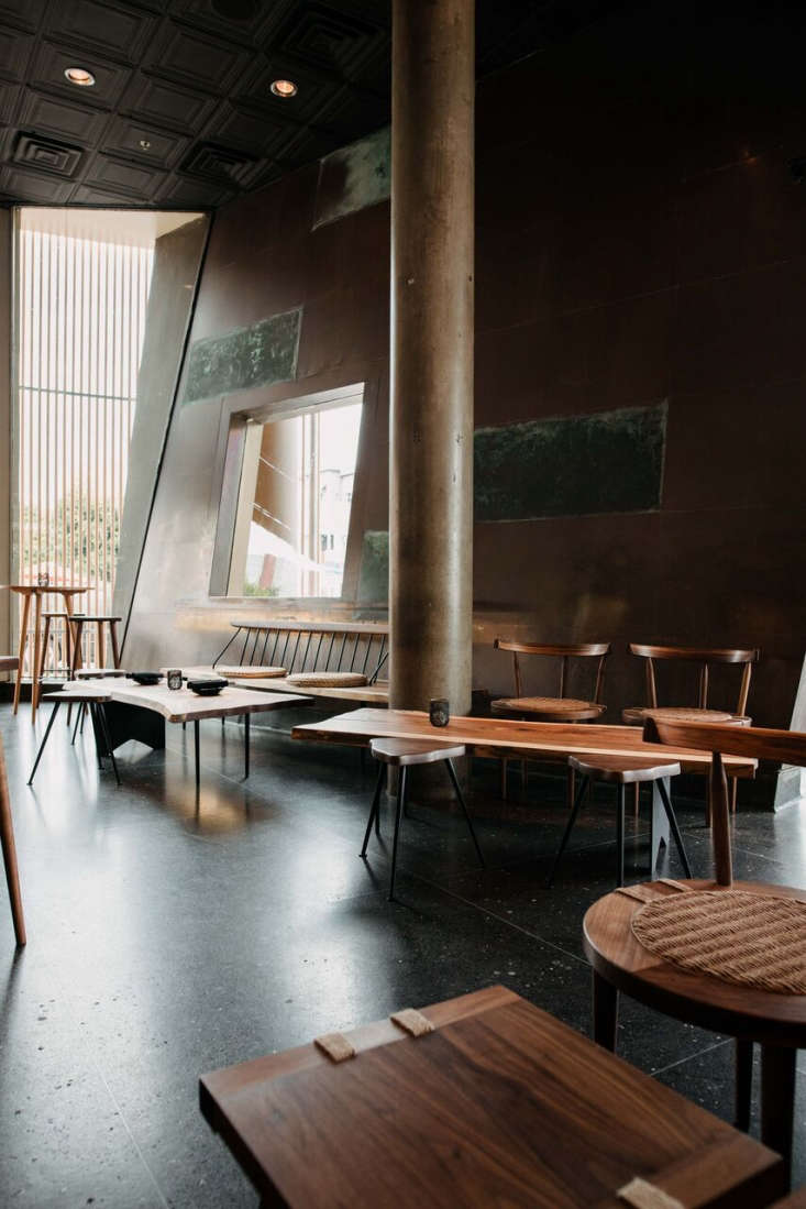
Valentin kept the main architecture of the restaurant intact, replacing some of the original terrazzo floors with dark wood floors and adding a private dining room by “building a massive freestanding structure out of cedar timber and shoji doors.”
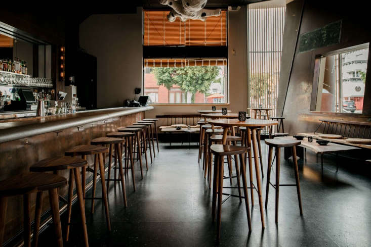
“I wanted the space to read more versatile than it used to be, with the formal uniformity of the French brasserie chairs and white tablecloths everywhere,” Valentin says.
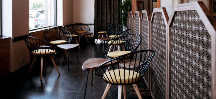
While the separate seating areas each have their own style, Valentin wanted them to feel of a piece. “The common language between the different spaces is the wood,” Valentin says. “It’s not motley but it’s definitely versatile.”
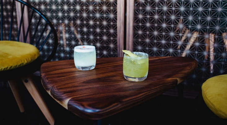
The Ingve Chair in yellow is a Bogus Studio design. Also forthcoming from the Chaya collection: the small barstools and green chairs, with different upholstery.

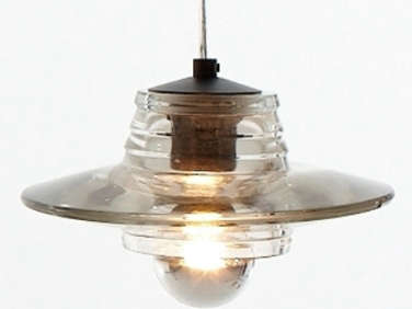
The lights above the bar (just out of frame to the right) are the Pressed Glass Pendants by Tom Dixon.

Behind a banquette reupholstered in neutral olive is the new private dining space, set apart by a cedar framework that evokes traditional Japanese doors.

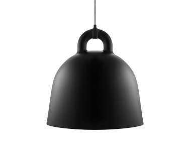
Red tables run down the center of the private dining room. “We designed them as a reference to one of the tangerine lacquered bars in the original Hikage Chaya,” Valentin says. “It’s a less formal room where you can sit at a bar and a Japanese hostess wearing kimono serves you sake or Japanese whisky and a light meal.” Above the tables are Bell Lamps from Normann Copenhagen. (“It looks like one of those giant cast iron bells you’ll find in Japanese temples,” Valentine notes.) The walls are covered in Japanese plaster.

For more of our favorite LA eateries, check out our posts:
- Destroyer: An Under-the-Radar Restaurant Serving Food from the Future
- Restaurant Visit: Concrete and Green at an Australian Cafe in LA
- Pine & Crane in Los Angeles



Have a Question or Comment About This Post?
Join the conversation (1)