For those of us who worship the home, the new year inspires us to reassess our living spaces (and in our case, to revisit the Remodelista Manifesto that we outline in Remodelista: A Manual for the Considered Home). This year we’re taking inspiration from Lea Korzeczek and Matthias Hiller of Studio Oink, whose work is like a breath of fresh air (their motto is “Throw away everything you don’t need in your daily life”).
Photography via Studio Oink, unless otherwise noted.
10 Rules We Live By
1. Classic and livable trumps trendy and transient.

Above: In a low-key living room designed by Studio Oink, a pleasing mix of midcentury pieces and vintage oil paintings makes for a calming (and timeless) environment.
2. Ikea mingles well with antiques: A mix of high and low animates a space–and allows room for all budgets.
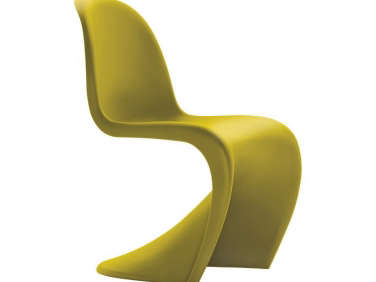
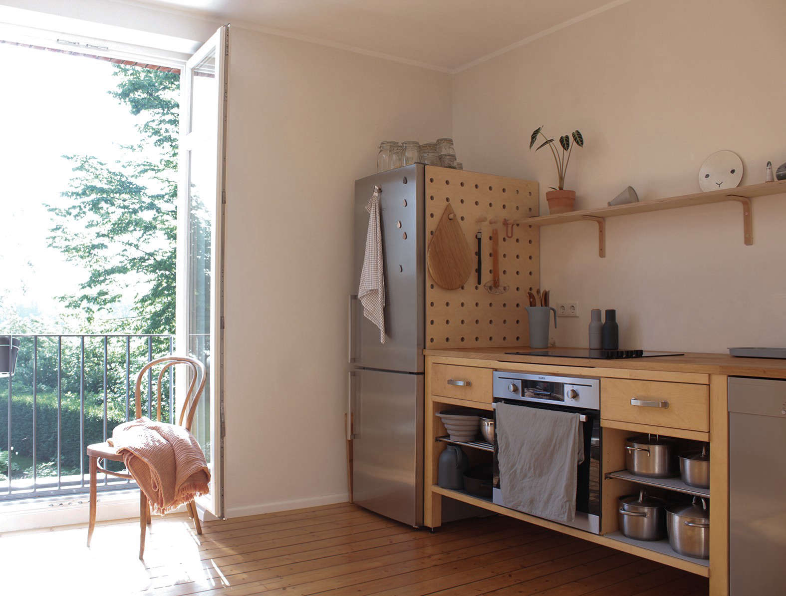
Above: In the couple’s own Wiesbaden kitchen, a midcentury Panton Molded Plastic Chair mingles with a vintage wood dining table, rough-and-ready plywood kitchen cabinets, and a free-standing vintage glass-fronted cabinet.
3. Clutter is the enemy. For a sense of well-being, edit out the extraneous.

Above: In the couple’s entry hall, potted greens (oxygenating powers included) beneath the wooden bench and a sheepskin throw set a tone of mixed textures that carries through rest of the apartment. Clutter is kept at bay with a three-part storage system in the entry hall that maximizes the available height.

Above L: Form and function: A window seat is created by cabinets that have been built to the same height as the window sill. Above R: The cabinets provide built-in storage as well as a surface for display.

Above: Built-in cabinets–valuable for their storage capacity–continue around the room at a lower height to provide more open wall space for artwork and shelving.
4. Thoughtfully designed and produced goods made with sustainable materials are a far better investment than big-box bargains. 
Above: Studio Oink sells a selection of one-of-a-kind new and vintage household accessories, including The Most Beautiful Oven Cloth in the World, made of 100 percent cotton with a leather strap; €12 ($14.32). “We love and respect old things, and we are trying to work in a sustainable and ecological way,” they say.
5. Ordinary utilitarian items, such as wastebaskets and scrub brushes, can–and should–be as pleasingly elegant as center-of-attention pieces.
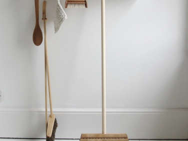
Above: Iris Hantverk brooms and brushes via Tea and Kate.
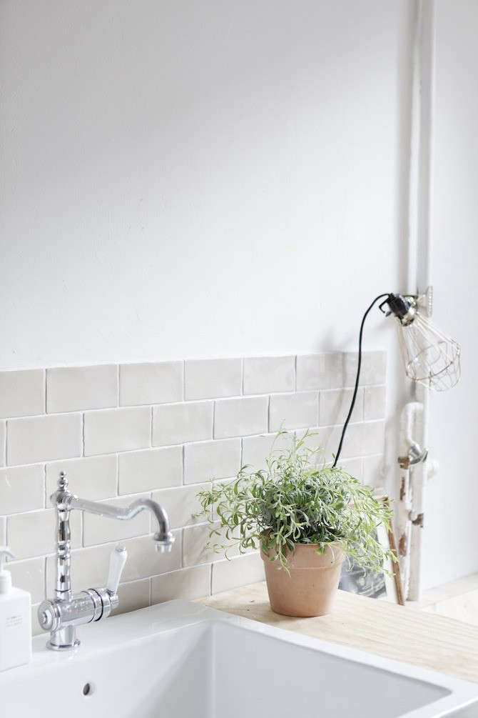
Above: A utilitarian light with a wire cage guard is clipped onto a pipe and provides task lighting with sculptural appeal.
6. A room full of neutrals needs a disciplined dose of color. Think throw pillows, textiles, ceramics, and artwork in vibrant shades.

Above: A tray with a Moroccan tile motif, dotted tea towel, and vase of tulips bring color and life to a corner of the couple’s kitchen.

Above: A collection of glass vases contained on a small shelf offers a dash of color in an otherwise neutral space.

Above: Well-loved and much-used crockery is on display as well as easily accessible.
7. Yin wants yang: Masculine and feminine elements mix well and benefit from each other. Add too much of one or the other and your space will feel unbalanced.
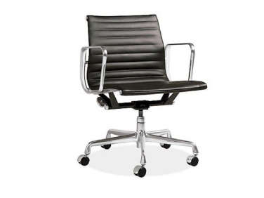
Above: A masculine black leather Eames Aluminum Group Desk Chair is paired with a curvaceous vintage weathered rocking chair in the couple’s home office.
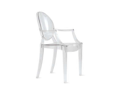
Above: A sheepskin throw adds softness and warmth to the Louis Ghost Chair by Philippe Starck, which contrasts with the minimal built-in cabinets.
8. Beauty needn’t come at the cost of comfort or utility. Steer clear of unwelcoming furniture and fixtures that don’t do their job.

Above: A platform plywood bed, built to the height of the window sill, turns into cabinets as it wraps around the room, maximizing space and avoiding the need for other furniture.

Above: Lighting and power are integrated into the headboard in the loft bed leaving the small area free of fixtures. (See 12 Architectural Built-Ins in the Bedroom for more tips.)

Above: Built-in bookshelves and cabinets keep the work area organized. The loft above the desk area includes a bed for guests.
9. A mix of textures makes a room interesting. Mohair throws, potted ferns, velvet upholstery, yes; stray dog hairs, no.

Above: Sheepskin throws, sheer, light-filtering curtains, and wooden case goods warm up this otherwise austere dining room designed by Studio Oink.
10. Stay true. Live with what you love.

Above: A grouping of silver candlesticks becomes a centerpiece in a well-edited, clutter-free space.
For more clutter-free inspiration, see:
- Inner Sanctum: Maximum Calm in a London Townhouse
- Clean Slate Living with Johannes Norlander
- African Modernism: Light and Shadow in Cape Town
- 14 Lessons in Minimalism from the Glass House
- In Greece, A House and Landscape with a Slow Reveal



Have a Question or Comment About This Post?
Join the conversation (3)