Below are the finalists for the Best Dining Space designed by professionals. To see all the photos for each project, scroll down within each box. You can vote once a day in each category now through July 15. Share images on Facebook, Twitter, Google+, and Pinterest using the sharing tools embedded beneath each image. Happy voting!
Local, LLP. Warmth in Walnut in a Family’s Kitchen/Dining. Brooklyn, NY. “The challenge was combining kitchen and dining room while making the spaces feel distinct. The strategy: the elegant and rich walnut of the built-ins plays against the neutral white of the kitchen. The island (walnut base, counter matching kitchen) ties them together. The lowered kitchen ceiling distinguishes the zones and hides a beam.”
Jeff King & Co. Rich in Blue with a Hidden Pass-Through. San Francisco, CA. “While reconfiguring this home’s entire floor plan, it was important to the homeowners to have connectedness between the kitchen and dining room. We installed a sliding panel between the two rooms for easy entertaining and privacy when needed. The family now enjoys a formal dining room with a contemporary twist.”
Rural Office for Architecture. Honest Beauty and Bare Materials in a Welsh Barn. Llandysul, Carmarthenshire, Wales. “The featured rooms come from a barn, divided into two spaces, built to provide temporary accommodation. A polished concrete floor, exposed conduit ducting, walls and ceilings internally lined with plaster boards and limed plywood, contrast with a mixture of traditional and modern furniture. Heating is provided by Dutch tile stoves.”
Sophisticated, Flexible Dining Perched in Manhattan. New York, NY. “A palette of cool gray tones emphasizes the open, airy architecture we designed for the apartment at The Laureate, while dark wood accents ground the soaring scale and reinforce the room as a sophisticated space for entertaining. The resulting well-balanced room perfectly accommodates both grand gatherings and intimate dinners.”
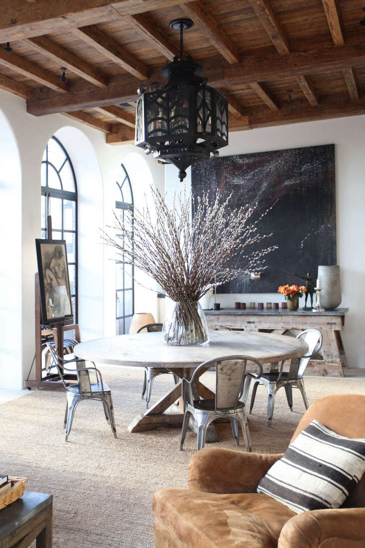
MNA (Michael Neumann Architecture). Manifold Textures in an Oversized Living/Dining. New York, NY. “The spacious living/dining area of this penthouse features open-grained, hand-waxed white oak paneling, tumbled French limestone floors, encaustic plaster walls, polished black lacquer cabinets, and a ceiling created with reclaimed vintage French timbers. Existing windows were replaced with arched, steel framed French doors that lead out to the landscaped terrace.”


Have a Question or Comment About This Post?
Join the conversation (5)