The winner of the Remodelista Considered Design Awards Best Professionally Designed Office Space is Egon Walesch of London.
The designer’s project was chosen as a finalist by Remodelista editor in chief Julie Carlson, who said, “I love a multitasking room and this one fits the bill: part library, work space, lounging area. I love the salvaged mantelpiece, and the contrast between the pale wood floors and the chalky blue walls.”
Take a look at the project below and read what Walesch has to say about the remodel, his favorite sources of inspiration, and a mid-project color swap.
N.B.: This is one of a series of posts spotlighting the winners of the Remodelista Considered Design Awards. We’ll be featuring one winning project each weekday for the next couple of weeks. Go to the 
Egon Walesch’s Design Statement: The project involved turning a little-used upstairs sitting room in an Edwardian house in southeast London into a stylish and practical home office and library.

Q: What were your practical goals for the project?
A: Previously, the space wasn’t a disaster but it lacked a clear purpose and wasn’t used very often. So the practical goals were to provide that clear purpose and focus, improve the layout and flow, install enough storage for a large collection of books and artwork, and create a comfortable and cozy area to read, relax, and entertain. At the same time, the room needed to house a desk/work space without compromising the relaxed vibe. And, of course, it had to reflect the personality of the homeowners.
Q: Who worked on the winning project?
A: I did. I do have a secret weapon, though–my partner, Richard, is an architect, and I can turn to him day and night for advice and support.

Q: What solutions did you find to your design problems?
A: Probably the biggest issue to address was the layout. Previously the space was effectively divided in two by a sofa in the center. In practice, that meant only half of the room was used. Somewhat counterintuitively, opening up the space has made it easier for its various functions to be realized. I had a hunch that would be the case, but the only way to know for sure was trying the furniture in different positions.
Q: Where did you get your design inspiration?
A: Everywhere! I like to take inspiration from nature and art, as well as from traditional interiors. Anything can be a starting point for a design. I like houses that reflect the different periods in which they have existed. This project is in an Edwardian house and it was important to preserve that feeling of a period home, while making it unmistakably contemporary. For me, that tension between the old and the new creates the most interesting interiors.

Q: What are your favorite features of the project?
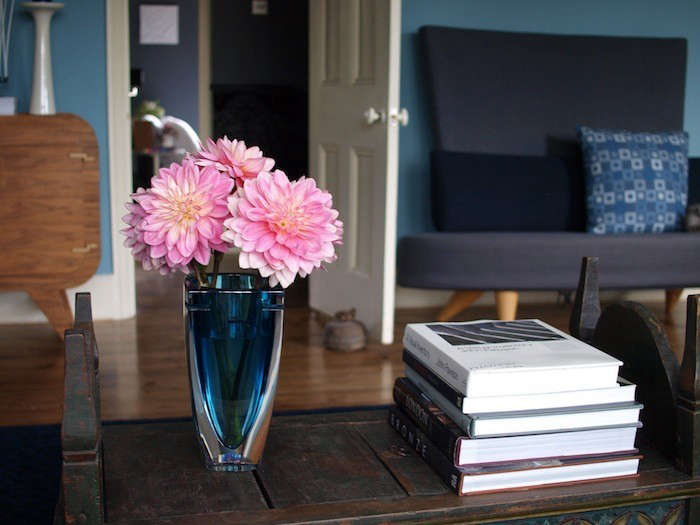
A: I love the color of the walls, Stone Blue by Farrow & Ball. That wasn’t the first choice, though. I had originally picked Cook’s Blue and painted two coats before realizing it just wasn’t right. Important lesson: If it’s wrong, it’s wrong. Take the hit and start again.
I also love the mantelpiece. It’s made from a piece of driftwood that Richard and I found beachcombing on the Thames at low tide a few years ago. Cleaned up and whitewashed with a pair of corbels, it creates a playful echo of the sort of fireplace the house would have had originally, but brought bang up to date.
Lastly, I really like the seating choices in the room: A Nick Munro–designed sofa is paired with a couple of original Ernest Race DA2 armchairs from the late 1940s. And there’s a one-off small sofa, an Ikea prototype that never went into production (on the wall near the desk).
Q: What advice do you have for anyone undertaking a similar project?
A: As with everything, follow your heart. Don’t rush. If you’re not sure about an element of the design, wait. Go to exhibitions. Visit country houses. Walk in the countryside. Wait for inspiration to strike.
Q: What were the hardest lessons you learned along the way?
A: Having to repaint all of the walls!
Q: What was your biggest splurge?
A: The project had a very tight budget, so there weren’t any huge splurges. It made sense for the budget to be allocated according to the main functions of the space. So the most expensive items were the bespoke cabinetry to house the books and the seating. The Ercol desk was quite pricey, but it is a potential heirloom piece.
Q: What does your firm specialize in?
A: Renovating and remodeling slightly tired homes in London, helping to unleash their potential. Commissions in other cities/countries are also considered.
Q: What is your best secret design source?
A: My favorite sources are where I can get secondhand items, whether it’s car boot sales, junk shops, or auction houses. I find interiors that only have new, unused objects are a bit sterile.
Q: What is your favorite local shop?
A: I can’t choose one! Columbia Road is a lovely street in London’s East End that has a great Sunday morning flower market. Flowers can really make an interior sing, and a trip there is a great Sunday morning excursion. The street has cool shops, too, and places to have brunch.
Q: Which architects or designers do you admire?
A: Innovators like Palladio, Mies van der Rohe, Peter Zumthor. I love the way David Hicks married tradition with innovation–his interiors were often a bit bonkers.
Q: If your room was a celebrity, who would it be?
A: Not sure she counts as a celebrity, but I think Virginia Woolf would find herself at home in a library and writing space like this. Her thesis that “a woman must have money and a room of her own if she is to write fiction” seems appropriate.
Congratulations to Egon Walesch! See all winners of the 2014 Remodelista Considered Design Awards here:

Have a Question or Comment About This Post?
Join the conversation (6)