I am not a timid painter; I’ve never painted a room white, but dark gray, blue, and green are all in my oeuvre. I like a navy that looks like a neutral blue in the day and an inky black come twilight. To come up with a tried-and-true moody palette, we turned to members of the Remodelista Architect/Designer Directory and asked each to single out a favorite room-defining shade or two–colors that are at once bold and easy to live with. If you’ve been tempted to try a dark paint color but haven’t had the gumption, these picks are the place to start.
Photography by Meredith Swinehart for Remodelista.

Above: Top row, left to right: Benjamin Moore’s Texas Leather; Farrow & Ball Studio Green; Farrow & Ball Pelt; Farrow & Ball Mole’s Breath; and Benjamin Moore Hale Navy. Bottom row: Benjamin Moore Sharkskin; Ralph Lauren Yacht Blue; Benjamin Moore Newburg Green; Benjamin Moore Lead Gray; and Farrow & Ball Lichen.

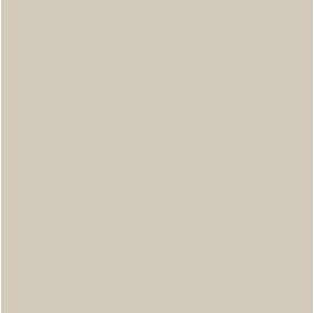
Above: Alison Davin of Jute interior design in Mill Valley, CA, likes Texas Leather from Benjamin Moore, a designer mainstay comprised of gray, brown, and green. Says Davin, “It’s the perfect non-color.”

Above: Bay Area designer Nicole Hollis is fond of Farrow & Ball’s Studio Green. It’s reminiscent of Benjamin Moore’s discontinued Black Forest Green, but a shade lighter.

Above: LA-based designer Rozalynn Woods suggests Farrow & Ball’s Pelt, a deep aubergine. After using it in a client’s room, she notes that “color is so rich, you’re compelled to touch the walls to feel it.” She added a finish with some sheen, which she recommends using with dark colors to give them dimension.

Above: Nicole Hollis is also fond of Farrow & Ball’s new 2013 color Mole’s Breath, a warm gray follow up to the line’s ever-popular Elephant’s Breath. (For a look at the new shade and the source of its inspiration, watch Farrow & Ball’s quick video.)

Above: I painted my own bedroom in Benjamin Moore’s Hale Navy, a hue that’s as moody as it gets. I love the way it shifts with the light, ending the day a deep inky blue.

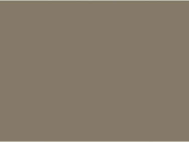
Above: Interior designer Larah Moravek of LVMinc is fond of Benjamin Moore’s Sharkskin, which she calls, “a complex and bold saturated neutral that exudes a sense of groundedness and timeless chic.”

Above: San Francisco interior designer Catherine Kwong recommends Ralph Lauren’s Yacht Blue, “a deep, rich navy blue, perfect as a backdrop for artwork or a set of beautiful sconces.” The hue is discontinued but can still be mixed on request at most paint stores.

Above: Kwong also suggested Benjamin Moore’s Newburg Green, which she called “very ‘Downton Abbey'” and “a cult classic, great for creating a cozy feeling for a library or den.”

Above: Larah Moravek also recommends Benjamin Moore’s Lead Gray. Says the designer, “It’s a daring, muted steel-blue gray that creates a dramatic ambience while also introducing a layer of warmth.”

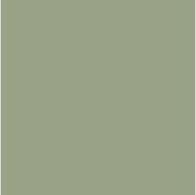
Above: Designer Rozalynn Woods just painted a room in Farrow & Ball’s Lichen, calling it “a gray earthy green with a wonderful balance of depth and richness.” She used a finish with a sheen, “so that as the light changes during the day the color’s depth and tone changes. At night it feels deep and serious, and during the day it feels rich and charismatic.”
Keep exploring our recommendations for interior paint, including 10 Happiness-Inducing Paint Colors and Architects’ White Paint Picks. And for even more possiblities, peruse our complete Palettes & Paints gallery.


Have a Question or Comment About This Post?
Join the conversation (2)