Icon - Arrow LeftAn icon we use to indicate a rightwards action. Icon - Arrow RightAn icon we use to indicate a leftwards action. Icon - External LinkAn icon we use to indicate a button link is external. Icon - MessageThe icon we use to represent an email action. Icon - Down ChevronUsed to indicate a dropdown. Icon - CloseUsed to indicate a close action. Icon - Dropdown ArrowUsed to indicate a dropdown. Icon - Location PinUsed to showcase a location on a map. Icon - Zoom OutUsed to indicate a zoom out action on a map. Icon - Zoom InUsed to indicate a zoom in action on a map. Icon - SearchUsed to indicate a search action. Icon - EmailUsed to indicate an emai action. Icon - FacebookFacebooks brand mark for use in social sharing icons. flipboard Icon - InstagramInstagrams brand mark for use in social sharing icons. Icon - PinterestPinterests brand mark for use in social sharing icons. Icon - TwitterTwitters brand mark for use in social sharing icons. Icon - Check MarkA check mark for checkbox buttons.
You are reading

Calm in the City: A Cramped Apartment Becomes a ‘A Warm and Cozy Home’ for a Couple with Young Kids

Search

Calm in the City: A Cramped Apartment Becomes a ‘A Warm and Cozy Home’ for a Couple with Young Kids

April 21, 2023

Conti, Cert., the Barcelona-based firm that garnered a spot on The Remodelista List: 20 Architects, Tastemakers, and Designers to Watch in 2023, recently reached out with a captivating new project they oversaw for friends-turned-clients. “They were in the process of buying this apartment, and wanted to redesign it completely. They were looking for more light, a smarter distribution, and a very warm and cozy home to bring up their children,” says Andrea Conti, who, along with Isa Cert, founded the studio with the goal of designing simple, elegant, and timeless homes.

In addition to reconfiguring the upper-floor, three-bedroom apartment to be more open and airy—”It was a really partitioned dwelling, with several dark rooms, low ceilings, and cramped corners,” says Andrea—they also sought to restore some of the home’s original architectural details (the flat is in a classic 1950s building). “Every time we find vaulted ceilings, which are called Catalan ‘volta’ here, or molded doors, we try to recover them. In this project, we tore down the low roofs aiming to find this ceiling. If we cannot restore or recover these features, we build them with new materials, always maintaining the original essence of the space,” explains Andrea.

Join us for a tour.

Photography by Claudia Mauriño, courtesy of Conti, Cert.

the aforementioned catalan volta in the spacious open concept living and dining 17
Above: The aforementioned Catalan volta in the spacious open-concept living and dining area, which features a wall of windows softened with fabric shades. A low wall-to-wall shelf, right under the windows, offers plenty of opportunity to display beloved objects.
the sofas, oak coffee table, wall shelf, and slatted wood panel (to cover the a 18
Above: The sofas, oak coffee table, wall shelf, and slatted wood panel (to cover the air conditioning unit) were all custom designed by Conti, Cert. “The small lamp on the small table [between the sofas] is by a new brand that we just fell in love with, Chamusquina.” [N.B.: We’re obsessed, too, with the lighting studio. See our post on the brand here.]
the window trim, painted a dark green (ncs colour&#8\2\17;s s 80\10 b90g),  19
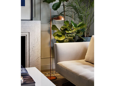
Above: The window trim, painted a dark green (NCS Colour’s S 8010-B90G), is a crisp counterpoint to the pale neutrals that dominate the interiors. The table lamp is by Santa & Cole.
french doors lead from the common area to the cozy kitchen. the lower cabinets  20
Above: French doors lead from the common area to the cozy kitchen. The lower cabinets on one wall are painted in the same dark green as the window trim in the living area. The refrigerator is by Liebherr, the oven and the stovetop are by Smeg.
&#8\2\20;we were unable to recover the existing hydraulic tiled floor,& 21
Above: “We were unable to recover the existing hydraulic tiled floor,” says Andrea, so new tiles were chosen to replicate the look of the original. The window with ridged glass conceals a view of the neighboring building.
open shelving breaks up the wall of custom cabinets on the left. task lighting  22
Above: Open shelving breaks up the wall of custom cabinets on the left. Task lighting is provided via a vintage clip-on light purchased at a flea market.
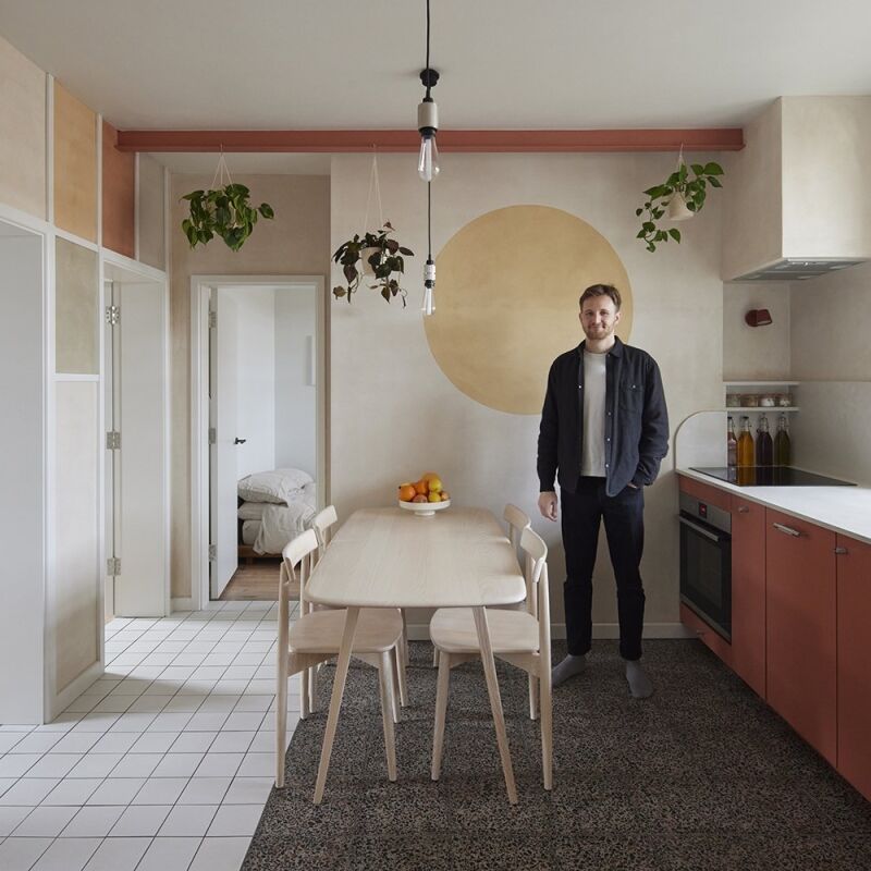
the view from the kitchen to the living/dining room. the pendant light is by sa 23
Above: The view from the kitchen to the living/dining room. The pendant light is by Santa & Cole.
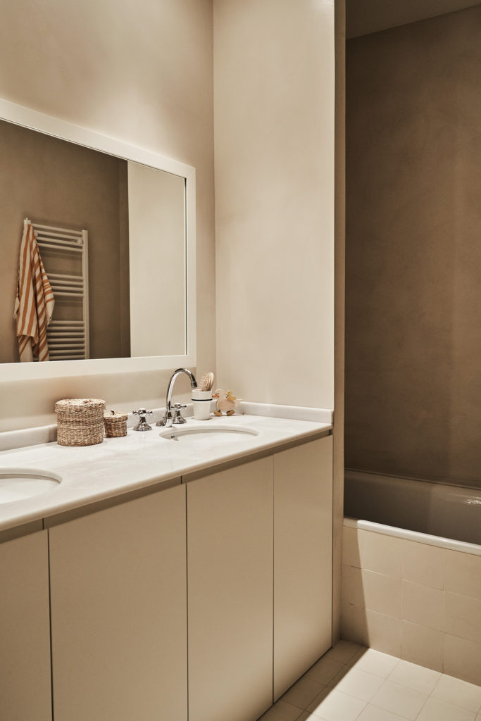
Above: The minimalist baths echo the materials palette of the kitchen.
the floor lamp is the funiculí by marset. the nightstand is vintage. the b 26
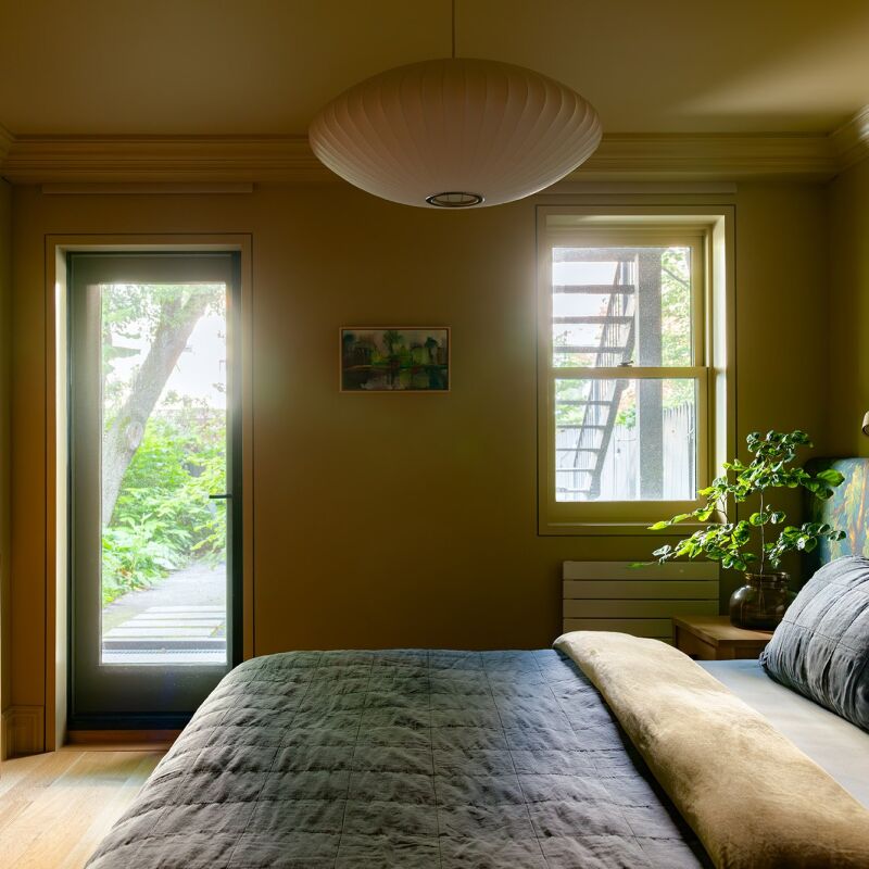
Above: The floor lamp is the Funiculí by Marset. The nightstand is vintage. The bed is made up of a headboard upholstered with Tensira fabric, pillows by Linge Particulier, and a blanket from Barcelona brand Apresski.
toe to toe—a sweet way to arrange twin beds for the couple&#8\2\17;s 27
Above: Toe to toe—a sweet way to arrange twin beds for the couple’s son and daughter, ages 3 and 5.

See also:

(Visited 5,727 times, 1 visits today)
You need to login or register to view and manage your bookmarks.

Product summary  

Have a Question or Comment About This Post?

Join the conversation

v5.0