Tucked into a corridor-like niche, the 9-by-12-foot kitchen in a Victorian house in Noe Valley, San Francisco, had no natural light. Tasked by her client with brightening the space and maximizing storage and seating, designer Alison Davin, founding principal of Jute, a member of the Remodelista Architect/Designer Directory, wanted to make the kitchen feel bigger and yet knew she couldn’t add any more square footage. Her game-changing move was to remove the wall between the living areas and the kitchen, enabling the opened-up kitchen to borrow and benefit from the natural daylight in those spaces. “The family of four did not want to take space away from their dining and living areas so we worked with what we had,” Davin says. “The redesign of the kitchen layout made the space more functional. Coupled with the natural light, the kitchen feels like it has grown in size.”
Photography by Drew Kelly.

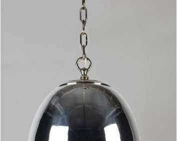
Above: The streamlined new kitchen is in a light-reflecting white palette. Having worked with Davin before, the client gave her and her team at Jute the freedom to work without an approval process because the project was under a tight deadline. Says Davin, “We started with the layout, followed with the custom-cabinetry drawings, figured out where the plugged-in appliances would go, and then added the decorative pieces: large aluminum lights, marble chevron backsplash, and accessories for the open shelving.”

Above: A kitchen cabinet next to the refrigerator reveals a hidden microwave. See 10 Strategies for Hiding the Microwave for more ideas about keeping the microwave tucked away.
Above: Davin created a U-shaped layout to maximize the efficiency and functionality of the small kitchen, and introduced cabinets and shelves on all three walls. Lighting is provided by a pair of Oskar Pendants in a satin aluminum and nickel finish. Get the lowdown on U-shaped kitchens and see 10 of our favorites in Remodeling 101: The U-Shaped Kitchen.

Above: Caesarstone counters are paired with custom marble tiles (Parramore in Thassos and Alba Chiara) from Waterworks. Closed overhead cabinets–painted in Horizon by Benjamin Moore–maximize storage and keep the open kitchen from looking busy. The Quincy Deck-Mounted Bridge Faucet with Lever Handles is by Kallista.

Above: The neutral palette provides a blank canvas for culinary color.
Before

Above L and R: These images show the wall between the living areas and kitchen that was removed in the remodel.

Above: The enclosures created a corridor-like kitchen (shown here looking toward the front hall).

Above: A view of the old kitchen looking toward the living area.

Above: The before and after plans illustrate the dramatic opening effect of removing the wall separating the kitchen and dining room.
For more kitchen success stories, peruse our Rehab Diaries, including An Artist’s NYC Kitchen Renovation and Cobble Hill Kitchen Makeover, Before and After. On Gardenista, have a look at our Recipe Roundup for the Perfect Picnic Menu.


Have a Question or Comment About This Post?
Join the conversation (25)