Newlyweds Isabel and George Blunden–she’s a travel editor, he’s in media–recently sunk their savings into an 1,100-square-foot Victorian railway cottage in southwest London. Yesterday, in Rehab Diary, Part 1, Isabel took us on a tour of the place and detailed their plans. Today, she chronicles the highs and lows of the construction process–and their big surprise along the way.
The Ground Floor
We were overflowing with excitement as the project got under way. In a matter of days, everything had been ripped out, walls had been smashed to rubble, and windows and doors replaced by big gaping openings. At this rate, we thought, the build would be finished in no time. Our optimism was soon brought to a crashing halt by the very wise words of a friend. “Please don’t get your hopes up too much,” she said. “Remember that it takes minutes to knock things down, and then it takes months to build them back up again.” How right she was.
Photography by Jonathan Gooch for Remodelista.

Above: At the back of the house where the kitchen is, we got our first glimpse of the amount of light that we were letting in. It was exhilarating. The garden became a place where we might spend time with our child, rather than just a spot to have an alfresco drink after work.
This was a big job, involving digging foundations, inserting steel joists, and taking down the back wall of the house and rebuilding it brick by brick (we were incredibly lucky to be able to reuse the lovely London stock), all while upsetting our neighbors on a daily basis with the relentless noise and mess. Structurally the design of the exterior had already been approved by the planning department. That part was rather a relief as it was determined. Nothing we were doing on the exterior was especially avant-garde or boundary pushing. The creativity had to come on the inside.

Above: Peeling back the layers in the kitchen.
The kitchen installation was the most stressful. It was a brutal lesson in budgeting and compromise. The idea was for the kitchen to look as un-kitcheny as possible, for the units to be tucked right round the corner and the appliances to be completely integrated, so that from the sitting room you could see little of the workings. We were also adamant that we didn’t want over-counter cupboards for fear they would crowd the room and make it feel too functional. This left us with very little cupboard space and a need to massively edit down our pots and pans, plates and mugs, and all those pieces of kit that you never use. There was definitely the sense that we were going for style over substance, but we were sticking with it. Then, midway into the construction, I found out that we were expecting our first child, so we were suddenly designing the place for three.
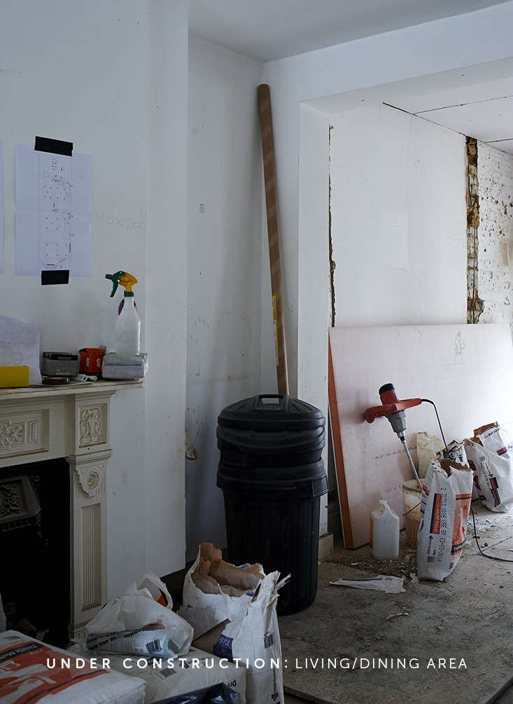
Above: Our open-plan approach felt even more fundamental with a baby in mind–to create a sense of space in our tight quarters and for us to be able keep an eye on things.

Above: The reshuffling of the downstairs loo to under the stairs was crucial (to avoid having to traipse up and down to the bathroom).
Most of the imperative and immovable decisions–the positioning of all wiring, the radiators, etc.–needed to be confirmed instantly when the electrician and the plumber joined the build. This was daunting because we were going it alone, without an architect or interior designer, so all eyes were on us. Now pregnant, I found myself completely incapable of choosing what to have for supper, let alone where to put the plug sockets and what height we wanted the electrical wires. How could we possibly know whether chrome wall lights would look dated in a few years time? Were pendants going to be annoying if we later moved the kitchen table? Did we want the front door light to come on by sensor or by switch? How about a five-amp circuit?

Above: Certain decisions, such as where to locate power sockets and other electricals, were especially stressful without an architect or interior designer to guide us.
I thought of my mother’s house, which is the most beautifully done up place I know (she is a master of fabric, colors, textures, and, above all, lighting.) She has always impressed on me the often-unappreciated importance of good lighting, that anywhere can be made to look lovely with proper lamps and soft lightbulbs. An associate in my office offered me her lighting designer’s number. But we couldn’t spend money on things like that, so we had to thrash it out ourselves.
In the kitchen, we were willing to work with basic cabinets and inexpensive appliances, but had our hearts set on a marble countertop and a Perrin & Rowe tap. These were my luxuries. Other things I had my heart set on had to be forgotten. Without a utility room in which to hide the boiler, washer/dryer, and one of those lovely Victorian hanging laundry racks, everything had to be crammed into the kitchen. The wide and deep drawers that I had put all over my Pinterest boards were simply not going to fit. The boiler was relegated to the garden, the washing machines hidden behind a wall of cabinets, and the Victorian laundry rack postponed to the next house.

Above: Our first artwork: the downstairs plan for the crew to consult.
The Second Floor
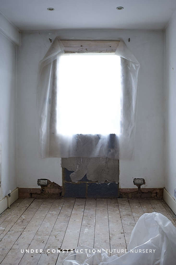
We had always considered this a long-term project, shaping the house into a family home for at least the next five years, but there was now a sense of urgency and direction. The bedroom plans turned into nursery ideas.

Above: I had to look at how the spaces would work with a small baby, and then a crawling, walking, inquisitive toddler.
Stay tuned tomorrow for the big reveal: The result of our months of construction.
For more Rehab Diaries, take a look at:
- A Spare Bedroom Turned Glam Master Bath
- The One-Month Makeover: Beth Kirby’s Star-Is-Born Kitchen
- Marrakech Modern: A Remodeled Riad for Rent

Have a Question or Comment About This Post?
Join the conversation (3)