Founder of the blog House Tweaking and mother of three, Dana Miller has a thing for renovating houses that she classifies as “underdogs.” With two hands-on renovations under her belt, the former pharmacist and her husband, Steve, an engineer and DIY expert, opted for a simpler life when they traded their 2,700-square-foot McMansion for a 1,600-square-foot dilapidated 1950s ranch house in Cincinnati. “It was the worst house on the street,” she says. “It’s not our dream house, but, rather, the house in which to pursue our dreams.”
Three years later the nearly completed project features a game-changing kitchen–Ikea cabinets included–that’s the Miller family hub and, no doubt, one of the nicest rooms in the neighborhood.
Photography by Dana Miller.

Above: When the couple bought the house, the kitchen was enclosed and the ceilings were only eight feet high (scroll down for Before shots). Doing much of the work themselves, they began by removing the walls that separated the kitchen from the dining and living rooms, and during the process part of the plaster ceiling came down. Staring at the underside of the roof, Dana and Steve came up with the idea of introducing a vaulted ceiling and installing skylights, completely transforming the look of the space.
Above: The new design is anchored by a nine-foot-long, walnut-topped island. Above it, Dana suspended a trio of clear Glass Globe Pendants from West Elm. “I wanted something that would punctuate the island but not impede the view of the kitchen from the adjoining living space,” she says. Backless stools also help keep sight lines uninterrupted. The vaulted ceiling is paneled with tongue-and-groove pine.

Above: Dana knew that she wanted a “tuxedo” kitchen: dark lower cabinets to ground the space and white upper shelves and cabinets to keep things light. A vintage rug adds a layer of coziness.

Above: The kitchen is in constant use–that’s Dana and her young daughter.

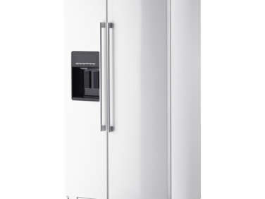
Above: The island’s walnut counter provides a warm contrast to the Kashmir white granite counters in the rest of the kitchen. “The island sees as much Play-Doh, crafting, and homework as it does meal prep, entertaining, and casual dining,” Dana says. “Guests always comment on the island and wood top, saying they feel like they’re at a bar. We take it as a compliment.” The appliances are all from Ikea; the fridge is Ikea’s Nutid model.

Above: “I really wanted the kitchen to feel like an extension of the living space instead of a kitchen thrown into a living room,” Dana says. “To achieve this, we continued the engineered hardwood flooring into the kitchen.”

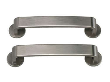
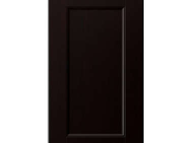
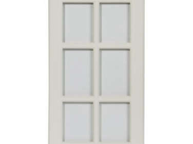
Above: The Ikea cabinetry is a mix of two styles: Ramsjö base cabinets and Lidingö solid and glass-fronted upper cabinets, both with Värde nickle-plated pulls. “We fell hard for the Ramsjö black-brown base cabinets, but were disappointed with the slightly pink tone of the coordinating white wall cabinets,” Dana says. “In the end, we used three different door styles. I was a little worried about the mix on paper, but in actuality I think it goes a long way toward helping the kitchen feel less generic.”

Above: One end of the kitchen serves as a home office. The base cabinets hold a printer, office supplies, and the kids’ crafting supplies. In the upper glass-fronted cabinets, Dana uses an assortment of baskets, bins, and boxes for storage.

Above: On the back wall, to keep the room from feeling crowded, Dana introduced open shelves instead of upper cabinets. A sleek range hood and minimal backsplash add to the open feel, while all the wood notes lend warmth to the design.

Above: French doors–added in place of a window–connect the kitchen to the backyard. Learn all about French doors in our recent Remodeling 101.

Above: Dana worked closely with the staff at her local Ikea in Cincinnati to design the kitchen. See House Tweaking: “Installing Our Ikea Kitchen” for more.

Above: The Millers’ 1958 ranch house. “In 2011 we ditched our McMansion in our desire to live more simply,” Dana says. “It’s one of the best decisions we ever made.”
Before

Above: The kitchen was originally walled off from the living and dining areas. The brown shag carpeting (with termite trails) was one of the first things to go.

Above: A view of the kitchen looking toward the front door. “If the cabinets had been in better shape, we might have tried to work with them,” Dana says.

Above: A view looking toward the dining area.

Above: “One thing we liked about the kitchen was the window above the sink that looks out onto the backyard,” says Dana. “We kept the sink in the same position.” Go to House Tweaking: “The Kitchen” to see more.
For more kitchen success stories, peruse our Rehab Diaries, including A Respectful Eichler Remodel in Marin. And if you’re envying Dana’s home office, see 10 Favorites: The Niche Workspace. Tuxedo kitchen admirers might want to try Gardenista’s Steal This Look: A Black and White Deck, Herb Garden Included.



Have a Question or Comment About This Post?
Join the conversation (19)