Earlier this week we toured Mollie Cohen and Andrew Berman’s Brooklyn duplex masterfully remodeled by Oliver Freundlich of Oliver Freundlich Design. Today, we’re investigating its rebuilt-from-scratch kitchen.
Photographs by Matthew Williams for Remodelista.

Above: Freundlich entirely reconceived the design, reorienting the kitchen away from the corner, lighting up the space via white cabinets and pale wood, and detailing it with a tight, visually pleasing geometry. “The first priority was to make the room feel much brighter,” says Freundlich. “Since the ground floor of the apartment is built over a slab, we were relegated to using the back wall of the kitchen for all of the major appliances and fixtures.” The island and cabinets are custom built of spray lacquered MDF (which also serves as camouflaging doors for the dishwasher and fridge positioned at either ends of the sink counter). “We chose white lacquer because it keeps the kitchen looking and feeling brand new,” says Mollie. The island measures 32 inches by 72 inches and is fronted by shallow storage cabinets that have touch latch openings so they look invisible.
Note to those wondering what happened to the removed kitchen elements: This was a gut remodel, but all of the parts were conscientiously put to new use. “None of the good-condition materials were thrown away,” explains Freundlich. “Some of the materials in the kitchen remained within the building and were used by the super for modifications and repairs to other kitchens, as well as for use in his own apartment. The items that could not be reused on site were donated to Build it Green, a local non-profit retail outlet in Brooklyn and Queens that salvages everything from appliances to countertops so they can be reused in other projects.

Above: The kitchen and dining area are now united in a compact but airy space in which everything has its place. The new floor is plain-sawn white oak, lightened with wood bleach and finished with Monocoat’s Natural Oil Finish in Cotton White. Freundlich introduced baseboards of rift-sawn white oak that have the same gold tones as the island’s butcher block top. The existing window and door (which leads to a small garden) were turned into dominant features; Freundlich had them trimmed and painted black; like all the windows in the apartment, this one is finished with a solid oak sill. The clock is the Fartech Retro Modern Calendar Auto Filp Desk Wall Clock, available in three sizes starting at $128 from Homeloo.com on eBay.
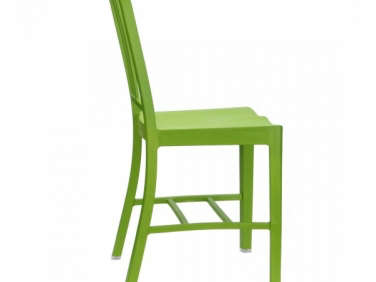
Above: Taking his cues from the couple’s fondness for flags, Freundlich stuck to a palette of white, black, and red throught the apartment, kitchen included. The dining table (bought by the couple several years ago at the Future Perfect) was repainted black and is surrounded by the 111 Navy Chair in Snow White, $280 each from Emeco. (The chair is so named because each is made from 111 recycled plastic Coke bottles.) The lights are reproductions of the Dunlop factory pendant from Trainspotters in the UK, and come suspended on chains with a choice of cord colors. The plates are Falcon Enamelware, a Remodelista favorite.

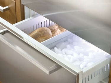
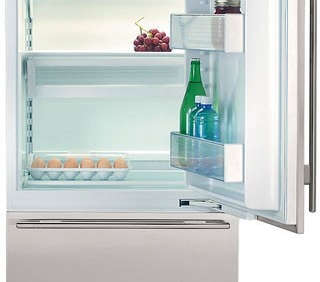
Above: The inside of the island is fitted with two stacking pull-out freezer drawers from Sub Zero. Tucking the freezer into the island enabled Freundlich to install a 27-inch-wide, two-drawer Sub Zero refrigerator in the narrow space next to the range. “Our only kitchen request were drawers–freezer drawers, fridge drawers, dishwasher drawers, and storage drawers,” says Mollie. “We prefer drawers because things get lost in the back of cabinets. We left the planning to Oliver. He actually itemized what goes into each drawer, and we haven’t deviated from his plan.”

Above: The fridge is playfully concealed behind a bulletin board made of Forbo Marmoleum Furniture Bulletin Board 2182 in light gray to match the backsplash tile grout. Andrew is the one who created the parade of tomato sauce cans on top of the fridge: “He always points out how much he likes the design when we’re at the market. Now we have a little collection,” says Mollie. “It’s the cheapest way to spice up the kitchen.”
The couple are new cooks–they swear by the recipes and ingredients delivered by Blue Apron–and like storing spices over the stove, even if the containers get a bit greasy. The stainless steel shelves were custom fabricated to continue the line of the upper cabinetry. The milk glass backsplash tiles are Freundlich’s homage to Pierre Chareau’s 1932 Maison de Verre in Paris. “The tile is unique because it has imperfect edges and a slightly rustic quality that offsets the otherwise pristine white kitchen,” he says. It’s finished with a contrasting gray industrial grout–”to match the Pierre Chareau inspiration.” (Scroll below for the tile source.)
Above: No dog bowls to trip over–Freundlich thoughtfully inserted a niche at the end of the island and painted it Christian Louboutin red, a nod to Mollie’s “shoe thing” (to replicate the shade, Freundlich suggests color matching a pair, or photo, of Louboutin pumps). For those interested in more of the kitchen’s specs, we’ve gone deep into the design details below.
Materials
PAINT: The kitchen walls and cabinets are painted Benjamin Moore Glacier White OC-37 (Above L).
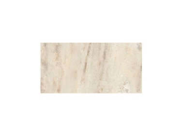
TILES: The backsplash is tiled with Italian white milk glass squares, Casa 3/4 Mosaico Blanco Vetro tiles (Above R), from United Tiles, purchased from Town & Country Flooring.
CABINETS: The island and cabinets are made of MR (moisture-resistant) MDF that’s spray lacquered. Of his choice, Freundlich explains, “MR board is totally flat and smooth, which makes for excellent spray finishing. Moisture resistance is important for avoiding damage when moisture from spills and splashes accidentally sits on the surface. Additionally, slightly rounding the edges of each door, instead of using sharp square edges, prevents damage and chipping.” A downside is that the finish is not as forgiving to touchups as a brushed finishes are; repairs to chips and scratches often require refinishing the whole door for an even look.
COUNTERTOP: The sink counter is indestructible Corian in Glacier White that’s 3/4-inch thick: “1 1/4-inch thick is standard; I went with 3/4-inch because it’s thin and light and complements the scale of the kitchen,” says Freundlich.
BUTCHER BLOCK: The island’s rock maple butcher block top was custom made by Matt Hogan of Reliquary Studio in Brooklyn (who also built the cabinets). Freundlich recommends products from John Boos, such as Hard Rock Maple Kitchen Counter Top, as a good readymade option.
Appliances and Hardware
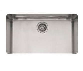
SINK AND FAUCET: A Franke KBX11028 stainless steel undermount sink, $821 from Faucet Direct, is paired with a KWC Suprimo faucet with black rubber pull-out spray (Above L), $763-$833 from eFaucets. Freundlich notes that there’s a minimum of 18 inches of clear counter space on either side of every fixture: “Less than that is impractical.”
STOVE: The 30-inch Wolf gas range and companion hood are the only elements from the original kitchen that were preserved.
REFRIGERATOR: The Sub Zero 700 TR is an an unusually narrow (27-inch-wide) fridge-only model with two drawers; it’s been discontinued, but is available from AJ Madison.
FREEZER: Sub Zero 700 BF(I) Freezer Drawers are a compact design that consists of two stacking drawers; like the fridge, this model has been discontinued, but is available from AJ Madison.
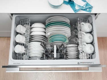
DISHWASHER: Fisher & Paykel’s Dish Drawer Tall Series is situated next to the sink and concealed behind moisture-resistant MDF panels that match the cabinets. “Mollie and Andrew wanted drawers,” says Freundlich,”and compositionally, they work well with the lower cabinet drawers.”
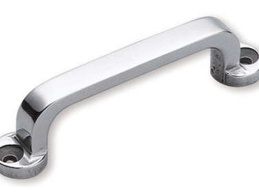
CABINET AND DRAWER HANDLES: Sagatsune FT Classic Style Small Pulls (Above R) are simple classics, available from a wide range of sources, including Lowe’s for $23.80 each. They’re combined with a slightly larger version of the pull on the appliances.
LIGHT SWITCHES: Lutron’s Ariadni/Toggle Dimmer in white metal with exposed screws–”elsewhere, we also used them in black; they keep our palette consistent and pepper the space with utilitarian touches,” says Freundlich.
If you like Mollie and Andrew’s kitchen, tour the rest of the apartment at Architectural Alchemy: A Cobble Hill Transformation. And don’t miss today’s roundup of Eat-In Kitchens, featuring Freundllich’s glamorous design for his sister-in-law, Julianne Moore. Thinking about doing away with your dining room in favor of an all-in-one kitchen? Read Michelle’s Gardenista Domestic Dispatch: The Death of the Dining Room.
Before






Have a Question or Comment About This Post?
Join the conversation (12)