I suppose you could describe us as optimists–or me, at least–because when my husband and I were crab-walking around in six inches of water in the low-ceilinged cellar of the “vintage” house we’d bought the previous week, I said, “I can’t wait to remodel.”
What he said was less obviously cheerful (“This reminds me of that scene in The Deer Hunter where the Viet Cong keep the prisoners in a dark pen underwater, then fish them up one at a time to play Russian roulette”), but then we found the switch to a pump thing that sucked out most of the water and he perked up a little.
It all seems like a long time ago now (thank God, by the way), but less than three years have passed since we bought the 1,500-square-foot, one-story stucco cottage in downtown Mill Valley, California. Between then and now, we sold our old house (which was two blocks away), moved to New York City (and rented out the cottage while we were gone), hired an architect, discovered dry rot, tried to renovate while living 2,500 miles away, hired a designer, discovered more dry rot, and finally moved back in a couple of months ago.
People ask if we would do it again. My husband says yes, if the other option is playing Russian roulette with hostile captors. I say: For this kitchen? Absolutely.
Photographs by Mimi Giboin for Remodelista.

Above: The original kitchen was, well, original. You walked in there and you thought, yep, here’s a house that was built in 1926. The archway was where the house ended; the sitting area beyond is an addition. We knocked down walls that subdivided the old kitchen into a pantry, a stairwell, a dining alcove, and a work area.
Over the years, I have collected vague ideas, from all the places where I’ve lived, about what sort of kitchen I would consider ideal–white marble countertops, a window over the sink, a big table to sit around–but it took the combined efforts of both an architect, Mark Fischbach, and a designer, my friend Stephanie Dorfman, to translate those inchoate wishes into a real room.
The Malayer rug (similar to these) is one I have had for years; Stephanie had the idea to use it to anchor the Flatiron Dining Table ($795 to $1,095, depending on length, from Restoration Hardware). Bonus points: The reclaimed elm tabletop comes pre-distressed with so many nicks, scraps, and imperfections that there is nothing your children can do to hurt it.
In the sitting area, our 15-year-old sectional got slip-covered and made cozier with a Moroccan Pom Pom Blanket draped over it.
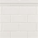
The house has 10.5-foot ceilings. To make the kitchen feel loftier, Stephanie suggested eliminating the upper cabinets on one wall, which we tiled floor-to-ceiling with Ann Sacks Ceramic Basics subway tile. For more information and pricing, see Ann Sacks.
I started stockpiling nice things–like the table and the sink and the pendant lights–long before construction started because I suspected (correctly, it turned out) that after the project got underway costs would spiral (see: dry rot) and I would no longer be able to buy any of the lovely but non-essential items that give the kitchen character. I found the Thomas O’Brien Garey Small Pendant Lights, for example, at an end-of-season lighting sale nearly a year before they finally were hung from the ceiling; they’re also available, for $525 apiece, from Circa Lighting.

What to do with a skinny cabinet next to the dishwasher? It’s a pullout drawer to hold cutting boards.
(N.B.: For my garden, see “DIY: Envy-Inducing Planters (Spray Paint is Involved).”
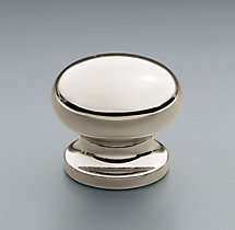
The Bistro Knobs are $13 apiece from Restoration Hardware.

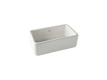
The Shaw’s Original Fire Clay Apron Front Sink is a Remodelista favorite; for more information see 10 Easy Pieces: White Farmhouse Sinks. The Rohl Bridge Kitchen Faucet is from the Perrin & Rowe series; it’s $1,375.50 to $1,719 depending on finish from Faucet Direct.

By the time we finally got to the stage of the project where the nice finishes were being installed, we no longer really cared, of course; we were too beaten down by threatened delays, threatened cost overruns and a generally threatening, gloomy feeling. I think this is called “a normal renovation.”
I wonder if things would have felt less out-of-control if I knew more about the mechanics: How exactly do you build a house? What holds up the walls? How many of those wall-support-things do you need per room? Etc. Years ago, I read House by Tracy Kidder ($10.85 from Amazon) and remember being impressed because the homeowner profiled strapped on a tool belt and worked alongside the construction crew to build her own bathroom vanity. If I ever renovate another house, I will try this.

I am on the other hand a firm believer in disruptive change as a positive force – otherwise why would I have moved back and forth across the country and bought and sold houses and switched jobs (twice) in less than three years? I think you reach an age where you can easily start to get complacent–not you specifically, of course, but people in general–and when that happens there’s a danger you’ll stop questioning the way you see the world or quit trying new things or say you don’t care if you ever see Istanbul. When you tear up your life, it forces you to embrace the idea of that you can become someone better than who you used to be.
Above: Julie gave me the idea to use a vase to hold long-handled brushes; a similar Astier de Villatte Sobre Small Vase is $140 at Sue Fisher King.
Have you ever noticed that when people renovate their kitchens they get obsessed by the countertops? What material should we use? What will be most impervious to stains, burns, and other kitchen maladies? What will “last” the “longest?” I think these questions are sort of irrelevant. The answer is nothing will last the longest. Every material in a kitchen eventually will stain, chip, fray, discolor, fade, and look like …. it’s in a kitchen. This is a good thing, actually, because it’s an indication that people are baking and slicing and rolling out pie crusts and drinking red wine.
For me, it was never a question: white carrara marble. All day long.

Above: The biggest surprise was how well the new, bigger kitchen complements the old, smaller rooms of the original house. You can see, through the doorway, a glimpse of the dining room and, beyond that, the living room. Matching the trim detail and existing oak floors unified the space.
Above: A wall of cabinets and drawers holds our dishes, small appliances, cookbooks, and large stockpots. The seedy glass (for a selection of Clear Seedy Glass, see Lincoln Glass) works kind of like Vaseline on a camera lens; it smooths away the rough edges and takes ten years off the blender’s age.

The microwave oven lives in the pantry. A top priority when designing the kitchen was to hide the microwave; I would hate for it to take up counter space. We also keep my husband’s precious collection of Ro-Tel tomatoes in here. “I love this house and I always have,” he says.
What does my garden look like? For a glimpse, see DIY: Envy-Inducing Planters (Spray Paint is Involved).
Finally, get more ideas on how to improve your kitchen storage and organization in our Remodeling 101 Guide: Kitchen Storage & Organization.







Have a Question or Comment About This Post?
Join the conversation