Ever since I finished architecture school, I have been actively committed to painting everything white; both in my life and in those of anyone who sought my opinion, clients included.
Fed on a diet of pure and sacred, white flowing modern space at a school where the influences of modern legends Walter Gropius and Jose Luis Sert were architectural truth, I reinforced the doctrine after graduation and went to work for the architect Richard Meier, whose impressive body of work is the ultimate manifesto on White Space.
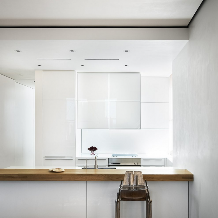
Above: Richard Meier’s mastery of white space is evident in this New York kitchen. Image via Architizer.
A few years later, I started my own practice and rented desk space from an architecture firm’s Soho loft space (painted in Benjamin Moore Atrium White, if I recall correctly) in New York. Whenever things were a little stressful, one of the partners would pull out a can of white paint that lived permanently under his desk and walk around the office, painting over any egregious fingerprints or scuff marks. Brainwashed and unquestioning, this to me seemed like completely normal behavior.
A move to London and two children later, my husband and I bought a house. On a modest budget and a tight schedule, the first thing I did to exorcise previous decorating sins was to paint the entire house white, from top to bottom. It then became the fail-safe solution to every remodeling decision I made thereafter as I fell into a habit, which delivered consistent, reliable and often breathtaking results. And a couple of years ago, when we bought a summer house in Connecticut, we used the same strategy. Short on time and money, as well as having to make our decisions remotely, we fell back on what we knew would work by painting everything white.
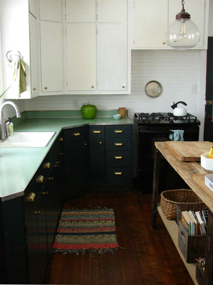
Above: My Connecticut kitchen, after a coat of white paint. (For the full story, see The Architect Is In: Minimal Moves for Maximum Impact in Christine’s Connecticut Home.)

Above: Our kitchen in Connecticut, before we pulled out our cans of white paint.
And now, ten years on since purchasing our house in London, it was time for an update, and I found myself wondering whatever happened to the girl who used to dream about stepping into Gauguin’s Tahitian paintings? Was she still there? Could she ever make her dreams a reality? Instead of rereading my dog-eared Remodelista post 10 Easy Pieces: Architect’s White Paint Picks, I decided it was time to explore our Palette & Paints posts, starting with 5 Favorites: The Power of Pink, written by our resident color expert Eve Ashcraft. Could color really change my mood, as she claims? Perhaps, but the classic modernist in me would find it difficult to commit to color (what if I tired of my chosen shade?) or live in a house with different colored rooms.
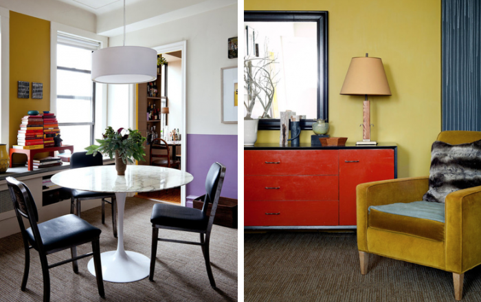
Above: Eve Ashcraft’s home in the East Village of New York.
In my personal observations, I have always felt that space flows more freely in a series of rooms when they are all painted white. Was it the white, however, or just the fact that it was monochrome? I was able test my musings out in Marianna Kennedy’s 17th century Huguenot house in Spitalfields, London. Her environmentally friendly linseed oil Lichen walls provided a neutral and softly tinted background that flows throughout her history-imbued, character-filled space. While I was drawn to the softness, I was worried that my modern house, with its much lower ceilings, would seem gloomy and gray if I took this approach.

Above: Marianna’s artistic use of color involves strong bursts of color placed against a neutral background. See A Visit with Marianna Kennedy, London’s Sorceress of Color for more.
Soon after visiting Marianna’s house, I dreamt I was in a painting again; only this time I found myself in the middle of a Ben Nicholson, one of Britain’s leading midcentury artists. Narrow tones of grays and browns to suit the English sky, this dream was more muted and nuanced. Gauguin it wasn’t, but nor was it white. I envisioned walking through shifting tonal planes where space continues to flow freely like I was walking through layers of Nicholson’s painting of St. Ives, Cornwall. My modern house was the perfect testing ground.

Above: “St. Ives, Cornwall” by Ben Nicholson; 1943–1945.
And now, instead of a Gauguin painting, I hope to soon be living in my own three-dimensional version of Ben Nicholson. Specifying the paint colors this time was an altogether new experience. Instead of falling back on my standard Dulux Brilliant White, I arranged and rearranged Farrow & Ball swatches all over the house under different light conditions. Empowered by Nicholson (it was like having a gold seal of approval), it wasn’t as stressful as I had predicted.
A few of the walls have been painted already—and do you know what? Eve Ashcraft is right, the different colors do change my mood and for this I am grateful. I can’t wait to see and show you the final result.
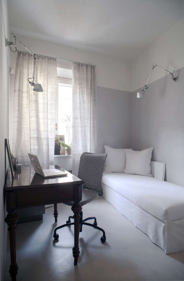
Above: The gray walls of this apartment in Prato, Italy, by b-arch appear as a continuation of the floor and stop 3/4 quarters of the way up the walls before becoming white; heightening the effect of shifting planes and flowing space that I am trying to achieve.
What is your position on the color spectrum? Are there any artists who have inspired your interiors’ palette? Let us know your color experiences in the comments below.
Did you know you can search our Gallery of rooms and spaces by color? My particular favorites are Pink and Green.
Sponsored by Intercap Lending, experts and leaders in 203K loans: Any house buyer knows what it’s like – a great looking house, a lovely neighborhood only to discover a myriad of hidden repair costs. The 203K loan: two loans in one package: Money to buy the house and more for the renovations. Renovators and house flippers, a renovation loan for you.




Have a Question or Comment About This Post?
Join the conversation (11)