Icon - Arrow LeftAn icon we use to indicate a rightwards action. Icon - Arrow RightAn icon we use to indicate a leftwards action. Icon - External LinkAn icon we use to indicate a button link is external. Icon - MessageThe icon we use to represent an email action. Icon - Down ChevronUsed to indicate a dropdown. Icon - CloseUsed to indicate a close action. Icon - Dropdown ArrowUsed to indicate a dropdown. Icon - Location PinUsed to showcase a location on a map. Icon - Zoom OutUsed to indicate a zoom out action on a map. Icon - Zoom InUsed to indicate a zoom in action on a map. Icon - SearchUsed to indicate a search action. Icon - EmailUsed to indicate an emai action. Icon - FacebookFacebooks brand mark for use in social sharing icons. flipboard Icon - InstagramInstagrams brand mark for use in social sharing icons. Icon - PinterestPinterests brand mark for use in social sharing icons. Icon - TwitterTwitters brand mark for use in social sharing icons. Icon - Check MarkA check mark for checkbox buttons.
You are reading

Industrial Revolution: A New Red Hook Condo In Tune with the Neighborhood’s History

Search

Industrial Revolution: A New Red Hook Condo In Tune with the Neighborhood’s History

April 17, 2023

Ground Architecture’s Eli Fernald—the developer, architect, and general contractor behind 96 King Street in Red Hook, Brooklyn—is telling me about a recent encounter with passersby outside his building: “We’re pretty close to the cruise ship terminals, and lots of tourists get off and walk around the neighborhood. One day, I see an older Russian couple, standing on the corner and arguing. They keep talking and looking up at the building. And, finally, the guy looks to me and asks, ‘Is this building new?’ ”

The apartment building is, indeed, entirely new construction—but Eli can understand the couple’s confusion. He designed the three-unit, brick-fronted structure to look at home in the historical waterfront neighborhood, which is known for its industrial warehouses and 19th century brick and clapboard homes. “I wanted to design the building in a way that feels right for the context and constraints.” he explains. “It felt disingenuous to do something hard modern here.”

Instead, he wanted both the inside and outside to be in “the same language and scale” as the neighborhood’s modest architecture, opting to leverage traditional methods and materials (think lime plaster, terra-cotta, salvaged pine wood) to translate the new build into a timeless work.

The raw finishes channel a “noble industrialism” that, in Unit #2 (currently listed for $2.95 million), is offset by modern-earthy interiors by real estate stagers and Remodelista favorites Hollister and Porter Hovey. “Eli designs with passion and a personal vision that you don’t usually see with new developments. It’s just so refreshing to find something that feels completely bespoke,” says Porter.

Below, Eli and the Hovey sisters give us a tour of Unit #2.

Photography by Hollister Hovey.

&#8\2\20;with the lime plaster walls and arches, there’s a softness  17
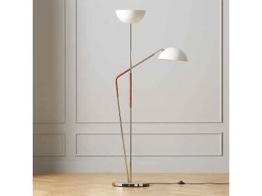
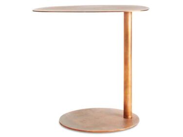
Above: “With the lime plaster walls and arches, there’s a softness to the space that caters to a lot of organic textures, [but] it felt necessary to bring in some geometry and hardness to the mix, as well,” says Hollister. The floor lamp is from CB2, the copper side table is from Blu Dot, the slate coffee table is vintage. The sisters like to mix in “some basics from big box stores to make the space feel accessible and comfy to buyers.”
the open concept space is light filled thanks to a wall of oversized windows. a 18
Above: The open-concept space is light-filled thanks to a wall of oversized windows. All the walls in the condo are lime plastered—giving them “subtle imperfection and depth,” says Eli—except for the interior closets and bathrooms. “We normally go very heavy on art, but those lime plaster walls are like art in themselves, so there was no way we were going near them with a hammer or drill,” says Porter. The painting in the living area is fastened to a rivet with fishing line.
cutting through the core of the home is the building&#8\2\17;s stairwell, w 19
Above: Cutting through the core of the home is the building’s stairwell, which in each unit manifests as a concrete wall. Hovering over the dining table is the Hive light, in yellow, by Verner Panton and surrounding it are 1960s Italian rosewood chairs. Just beyond this room is the kitchen.
terra cotta bricks have better energy and sound performance, says eli, and lend 20
Above: Terra-cotta bricks have better energy and sound performance, says Eli, and lends the space a warm glow. The vase on the table is designed by Farrah Sit and available from Light and Ladder. “We used many of Farrah Sit’s incredible lamps, vessels, and vases. They really help complete the space and play off the light so beautifully,” says Hollister.
the floors are salvaged heart pine; all the doors and trim are douglas fir. &am 21
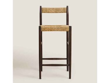
Above: The floors are salvaged heart pine; all the doors and trim are Douglas fir. “In keeping with the idea that this is a late-1800s noble industrial building, it felt right to use softwoods,” explains Eli. The cabinets, though, are fabricated from quarter-sawn oak, a hardwood. Yellow Flowerpot lights by &Tradition echo the pendant light over the dining table. The bar stools are from Zara.
a wood burning brick fireplace with firewood storage below. the bowl is by farr 22
Above: A wood-burning brick fireplace with firewood storage below. The bowl is by Farrah Sit.
essential grey marble extends to the window sills in the kitchen. 23
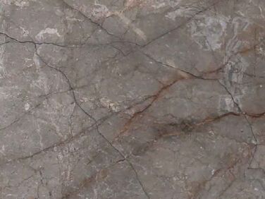
Above: Essential Grey marble extends to the window sills in the kitchen.
the apartment &#8\2\20;felt so spanish—like teleporting to the balea 24
Above: The apartment “felt so Spanish—like teleporting to the Balearic Islands,” says Hollister. To that end, they worked in a “melding of Latin American pieces, with a touch of Scandinavia and Japan.” The woven chair is by Txt.Ure for Luteca. Txt.ure is a collaborative design project committed to revisiting classic techniques from Mexican folk tradition.
the apartment has three bedrooms. the primary bedroom has a sitting area (out o 25
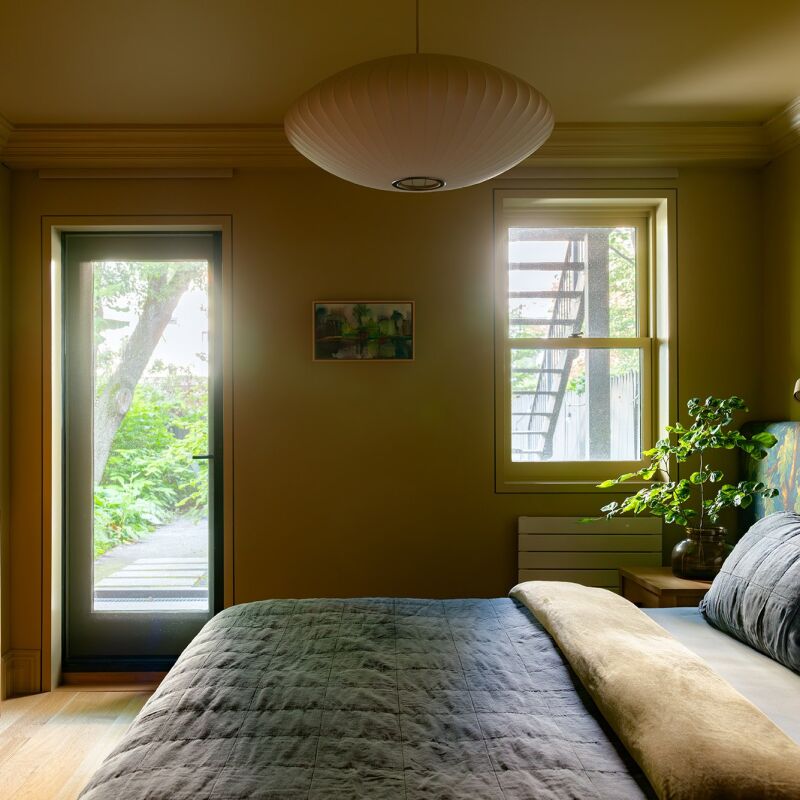
Above: The apartment has three bedrooms. The primary bedroom has a sitting area (out of frame) that leads to a terrace as well as an ensuite bath.
the terrazzo sink and tiled floors are from huguet mallorca. the tub is from wa 26
Above: The terrazzo sink and tiled floors are from Huguet Mallorca. The tub is from Water Monopoly.
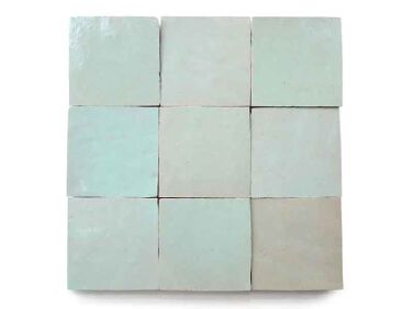
the zellige tiles, in absinthe, lining the shower stall are from zia tile. 27
Above: The zellige tiles, in Absinthe, lining the shower stall are from Zia Tile.
a smaller bedroom styled for kids. the astronaut backpack is from the kennedy s 28
Above: A smaller bedroom styled for kids. The astronaut backpack is from the Kennedy Space Center Shop. The vintage Maruni Mokko Rope Chair is from Japan.
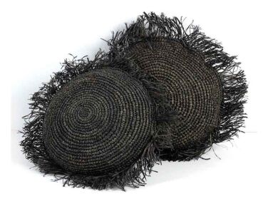
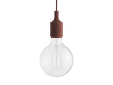
in the sleep alcove, a pair of twin beds, each dressed up with a liewood comfor 29
Above: In the sleep alcove, a pair of twin beds, each dressed up with a Liewood comforter from Smallable and raffia pillows from Burke Decor. The pendant light is from Muuto.
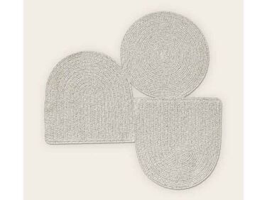
the wall in the kids&#8\2\17; bathroom is lined with cement tiles in mint f 30
Above: The wall in the kids’ bathroom is lined with cement tiles in Mint from Zia Tile. The tub is from Signature Hardware. The artful rug is actually a wall hanging from Cicil Home. The striped towel is by Dusen & Dusen.

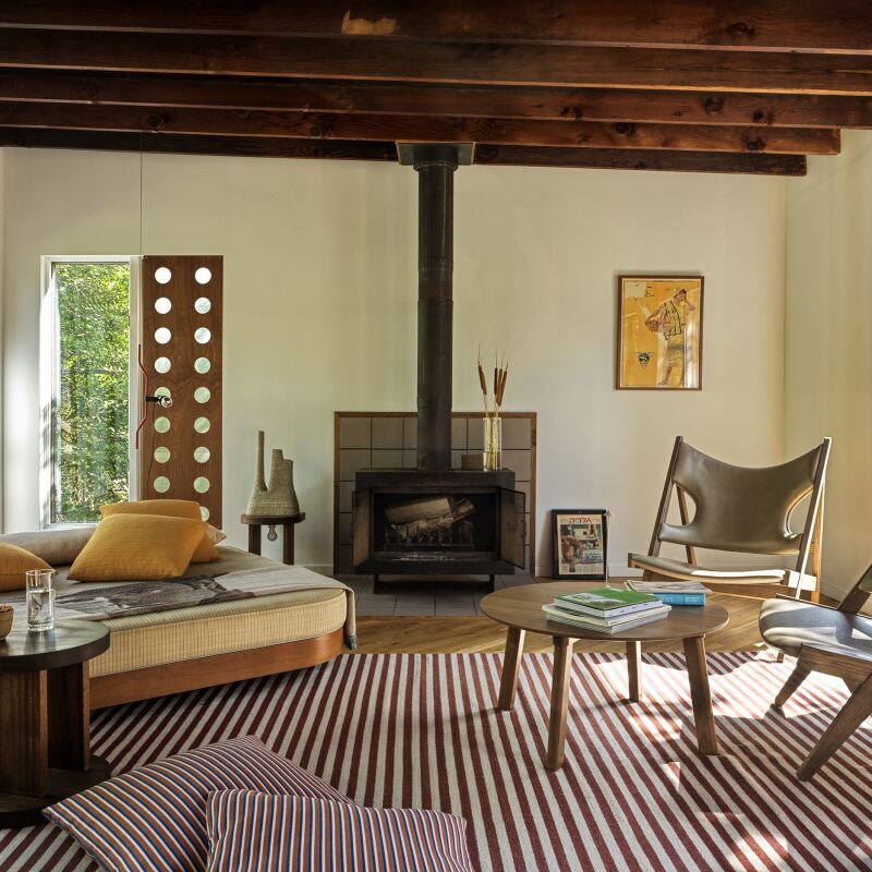
Here’s another project the Hoveys worked on, this one for architecture firm Fabr, of which Eli was a founding a member:

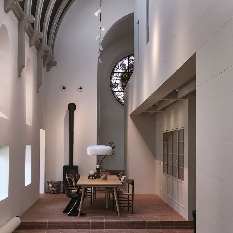
Fabr broke off into Eli’s Ground Architecture and TBo. Here’s a project that Studio Hovey collaborated on with TBo:

See also:
(Visited 3,739 times, 1 visits today)
You need to login or register to view and manage your bookmarks.

Product summary  Item 6 165Item 7 166

Industrial Revolution A New Red Hook Condo In Tune with the Neighborhoods History portrait 10
Ceramic Tile & Porcelain Tile

Absinthe 4×4

$811.32 USD from Zia Tile

Have a Question or Comment About This Post?

Join the conversation

v5.0