Icon - Arrow LeftAn icon we use to indicate a rightwards action. Icon - Arrow RightAn icon we use to indicate a leftwards action. Icon - External LinkAn icon we use to indicate a button link is external. Icon - MessageThe icon we use to represent an email action. Icon - Down ChevronUsed to indicate a dropdown. Icon - CloseUsed to indicate a close action. Icon - Dropdown ArrowUsed to indicate a dropdown. Icon - Location PinUsed to showcase a location on a map. Icon - Zoom OutUsed to indicate a zoom out action on a map. Icon - Zoom InUsed to indicate a zoom in action on a map. Icon - SearchUsed to indicate a search action. Icon - EmailUsed to indicate an emai action. Icon - FacebookFacebooks brand mark for use in social sharing icons. flipboard Icon - InstagramInstagrams brand mark for use in social sharing icons. Icon - PinterestPinterests brand mark for use in social sharing icons. Icon - TwitterTwitters brand mark for use in social sharing icons. Icon - Check MarkA check mark for checkbox buttons.
You are reading

Reader Rehab: A Boston Kitchen Embraces the Light

Search

Reader Rehab: A Boston Kitchen Embraces the Light

April 26, 2017

For two young Boston professionals (and avid Remodelista readers), long hours at work mean that home is a bit of a sanctuary, a personal “private space to unwind and, sort of, get away from everything.” So when they were looking to buy their first home, the two sought a fixer-upper that they could customize to suit their design sensibilities and minimal lifestyles. A 1920s Craftsman bungalow with great bones and a hopelessly outdated kitchen was exactly what they were looking for.

Photography by Justine Hand for Remodelista.

to encourage more interaction between the kitchen and dining/lounge area, the c 17
Above: To encourage more interaction between the kitchen and dining/lounge area, the couple eliminated the walls separating the two rooms, replacing it with an open counter.

The home’s original design featured three cramped, dark spaces on the ground floor. The couple, who prefer “clean, unfussy design” and “white, open spaces bathed in natural light,” sought a more open, fluid layout. With the help of Remodelista, the two sketched out a rough design, which they later refined with architects, Dan Hisel and Katie Flynn, as well as their contractor, Michel Beaudry.

bleached oak floors as well as benjamin moore super white paint (matte fin 18
Above: Bleached oak floors as well as Benjamin Moore Super White Paint (matte finish) reflect light from the generous windows.
The architect’s design involved a complete reorientation of the kitchen, which now centers around a light-filled door to the backyard. Several more floor-to-ceiling windows and doors throughout the downstairs add even more light, which is then reflected back by the white surfaces. The effect is a serene, cloudlike feel.

discovered via remodelista, ceramic bowls by studio arhoj are paired with  19
Above: Discovered via Remodelista, ceramic bowls by Studio Arhoj are paired with Ferm Living’s Asymmetric Cutting Boards; €20 ($21.87) and €40 ($43.75).

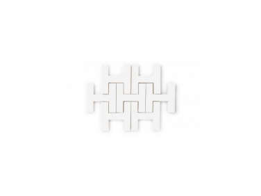
For warmth, the two relied on organic materials—wood, ceramics, and stone—and textured patterns, such as the backsplash made with Chaine Homme White Tiles from Fireclay Tiles; $50 per foot.

to complement their recessed sink, the couple selected kohler&#8\2\17;s pur 20
Above: To complement their recessed sink, the couple selected Kohler’s Purist Faucet; $710.
As yoga practitioners, the two “believe in a minimalist, low-consumption” lifestyle, which is reflected in the simplicity of their design.

creating a kitchen to fit their tastes and budget involved a mix of high/low, s 21
Above: Creating a kitchen to fit their tastes and budget involved a mix of high/low, such as the Ikea Veddinge cabinets topped with Arabescato Marble Countertops.
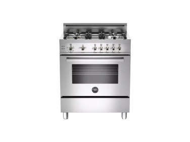
splurges included a bertazzoni pro series 30 inch gas range; \$3,350. disg 22
Above: Splurges included a Bertazzoni Pro-Series 30-Inch Gas Range; $3,350. Disguising another Bertazzoni hood, the contractor built a custom box of simple plywood. Painted the same white as the walls, it blends seamlessly into the space.
subtle splashes of color saved the crisp, clean space from becoming too stark. 23
Above: Subtle splashes of color saved the crisp, clean space from becoming too stark.

By replacing the original wall and overhead cabinets with a second counter, the couple was able to not only open up the space but also create more working counter space, all while maintaining ample storage.

in another clever high/low mix, the two introduced more color and pattern& 24
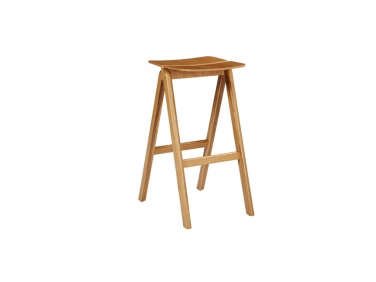
Above: In another clever high/low mix, the two introduced more color and pattern with pairing of Hay’s CPH Bar Stools in soap-washed beech topped with lively Ikea cushions.
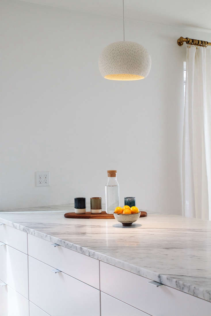
 lightexture&#8\2\17;s ceramic \15 inch claylight pendant illumin 25
Above: Lightexture’s ceramic 15-Inch Claylight Pendant illuminates a bowl of Meyer lemons; $844.

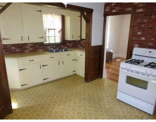
the before view shows the original orientation of the kitchen. the stove and wa 26
Above: The Before view shows the original orientation of the kitchen. The stove and wall occupy the space where the open counter now stands.

Get inspired by more miraculous Remodelista reader transformations:

(Visited 960 times, 1 visits today)
You need to login or register to view and manage your bookmarks.

Product summary  Item 6 157Item 7 158

Have a Question or Comment About This Post?

Join the conversation

v5.0