If you had a long and narrow side garden instead of a front one, and the opportunity arose to turn it into an L-shaped garden by purchasing a perpendicular vacant lot; would you do it if even if it still meant no front garden?
Evolving urban fabric to suit one's needs often requires the creative knitting together of leftover pieces; a perfect challenge for landscape architect Sophie Robitaille and her architect husband Andrew Curtis, founders of their eponymous firm Robitaille Curtis when they were commissioned by the owner of a 19th-century townhouse in Center City, Philadelphia, that rather uniquely did not front out onto the street.
The original intent was to remodel the kitchen, but when the rare opportunity to purchase the vacant perpendicular lot arose, the designers realized that a much more ambitious remodel was required to fully exploit the relationship between interior and exterior spaces that the new garden offered. The solution? The ground floor and exterior spaces were entirely reconfigured and a new large eat-in kitchen was added to anchor the L-shaped garden.
Photographs by Catherine Tighe.

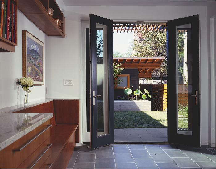
Above: Looking out on the garden that was previously a vacant lot from the new kitchen addition. The kitchen addition's bluestone floors continue out to the exterior paving to enhance the relationship between inside and out.

Above: The fountain in front of the garden shed is board-formed cast-in-place concrete and contains lotus flowers and lilies.

Above: The view of the garden shed, whose western red cedar siding has been stained black, from the street.

Above: The garden shed creates an entry to the new garden and kitchen addition with a glimpse of the roof deck above. The new side entry garden was formalized into three distinct tiers that create outdoor rooms for entertaining.

Above: A 'Before" image of the narrow vacant lot before Robitaille and Curtis transformed it.

Above: Because of the L-shaped garden, the two legs of the garden offer two points of access.

Above L: The view of the original garden from the original point of access. Above R: The garden now has a destination in the form of the kitchen addition and roof garden at the end. As one walks toward the addition, one passes the enlarged bay and window of the formal dining room.

Above: The new kitchen addition acts as an anchor for the two legs of the L-shaped garden, while the new garden begins to reveal itself around the corner.

Above: Large areas of new windows and glass doors bring daylight into the home and visually connect the interior of the house to the expanded and remodeled gardens.

Above: "To heighten the interior/exterior relationship of our interventions, we carefully considered how the interior material palette relates to that of the exterior," Curtis says. "As a result, we used some of the same materials inside and out and we were careful to select complimentary colors and hues for the interior and exterior."

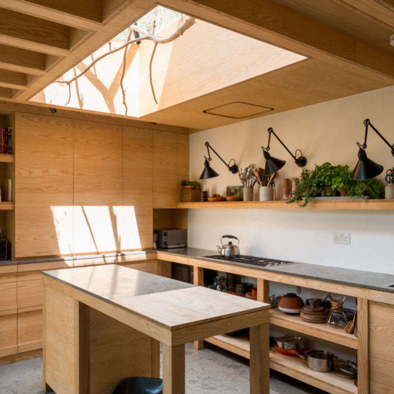
Above: "For the kitchen, we chose a warm palette of durable materials that would patina over time," Curtis says. "The new kitchen includes custom American cherry cabinets, honed Pennsylvania bluestone, stainless steel, and a cream colored tile backsplash from Ann Sacks." A skylight brings additional light into the primary work zone.

Above: "The existing kitchen was small and had little access to the adjacent garden or daylight," Curtis says.
The interconnectedness between interior and exterior space is a concept from traditional Japanese architecture. Explore more with 1,659 images of Indoor Outdoor in our Gallery of rooms and spaces.


Have a Question or Comment About This Post?
Join the conversation (13)