Icon - Arrow LeftAn icon we use to indicate a rightwards action. Icon - Arrow RightAn icon we use to indicate a leftwards action. Icon - External LinkAn icon we use to indicate a button link is external. Icon - MessageThe icon we use to represent an email action. Icon - Down ChevronUsed to indicate a dropdown. Icon - CloseUsed to indicate a close action. Icon - Dropdown ArrowUsed to indicate a dropdown. Icon - Location PinUsed to showcase a location on a map. Icon - Zoom OutUsed to indicate a zoom out action on a map. Icon - Zoom InUsed to indicate a zoom in action on a map. Icon - SearchUsed to indicate a search action. Icon - EmailUsed to indicate an emai action. Icon - FacebookFacebooks brand mark for use in social sharing icons. flipboard Icon - InstagramInstagrams brand mark for use in social sharing icons. Icon - PinterestPinterests brand mark for use in social sharing icons. Icon - TwitterTwitters brand mark for use in social sharing icons. Icon - Check MarkA check mark for checkbox buttons.
You are reading

Making History: A Primrose Hill House Brought Back—and Forward—in Time By Mark Lewis Interior Design

Search

Making History: A Primrose Hill House Brought Back—and Forward—in Time By Mark Lewis Interior Design

April 25, 2022

The Victorian townhouse in London’s Primrose Hill had been “nailed by contractors,” says project manager Emily Girling. This was not intended as a compliment. Girling is a member of the small team at Mark Lewis Interior Design, and grand resuscitations with a historic bent are Lewis’s specialty: see, for instance, A “Modern Victorian Loft” in Hoxton Square and Mark Lewis’s Inspired Reinvention of His Family’s North London Row House.

This four-floor renovation for a couple with kids and dogs (he’s the CEO of an advertising agency) became the firm’s pandemic project. “Very few original details remained, so it was a case of reinstating features, such as fireplaces, cornices, and parquet floor,” continued Girling. And of rethinking the layout: “The lower floor was a rabbit warren of rooms. We built a small extension at the rear and opened up the space into a huge open-plan kitchen-living area.”

To see the house now is to go back in time to an era of brick hearths and generous Aga stoves—and forward to our own century’s sunny, free-flowing interiors and “American-size” refrigerators. Scroll to the end to see Before and After floor plans.

Photography courtesy of Mark Lewis Interior Design.

Garden Level Kitchen

the garden level of the house was &#8\2\20;completely opened up&#8\2\2\ 17
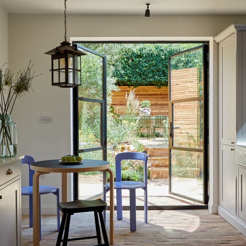
Above: The garden level of the house was “completely opened up” says Mark, of the new extension with Crittal windows and a raised ceiling. The owners asked the firm to add details that feel original to the house, and to create a sense of “calm, comfort, and organization.”

The French oak parquet floor was sourced from UK salvage specialists Lassco. The white paint used throughout is Linen Wash from Little Green (emulsion on the walls, eggshell on the woodwork). The new back stair has a painted runner (Dead Salmon from Farrow & Ball) and tongue-and-groove-paneled under-the-stair storage plus a WC.

the large island was requested by the clients. it&#8\2\17;s not the usual m 18
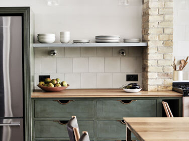
Above: The large island was requested by the clients. It’s not the usual Mark Lewis kitchen feature, but it incorporates his signature design details, such as ventilated produce drawers inspired by apple crates (each drawer is three slats deep). The cabinets are a new finish that the firm developed for the project: it’s hand-painted wood with an aged-waxed finish. The countertops are oak and Carrara marble.
the blush pink er7 series \100 aga is electric with a gas &#8\2\20;hob modu 19
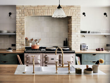
Above: The blush pink ER7 series 100 Aga is electric with a gas “hob module” on the side. The surrounding hearth was built from salvaged “white Suffolk brick,” which reappears in several other rooms. The Encaustic Tiles used as the backsplash are from Milagros, a London store that sells handmade Mexican products.
brass faucets from ashton matthews are paired with a shaws edgworth double sink 20
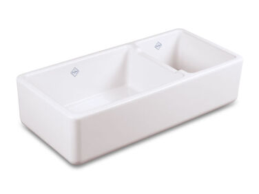
Above: Brass faucets from Ashton Matthews are paired with a Shaws Edgworth double sink. The sink-side ceramic pots are from the Mark Lewis Home Store, a collection of hard-to-find design details that Lewis has started manufacturing and offering  via his website.
above: the waxed finish on the wood cabinets looks like patinated metal. the ca 21
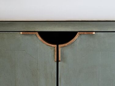
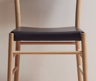
Above: The waxed finish on the wood cabinets looks like patinated metal. The cast-bronze Moray Cupboard Pull Handles were designed for the kitchen and are a new addition to the Mark Lewis Home Store. The island’s Avery Bar Stools are from Pinch in leather from Howe.
the moray dishwasher pull is another new cast bronze design created for the hou 22
Above: The Moray Dishwasher Pull is another new cast-bronze design created for the house.

Garden-Level Living-Dining Room

the kitchen flows into a dining living area. the pine table was the clients& 23
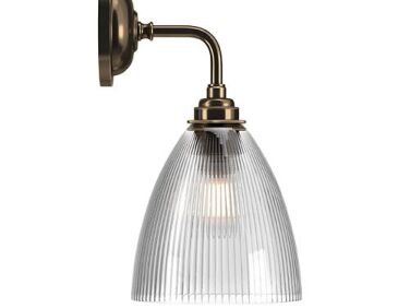
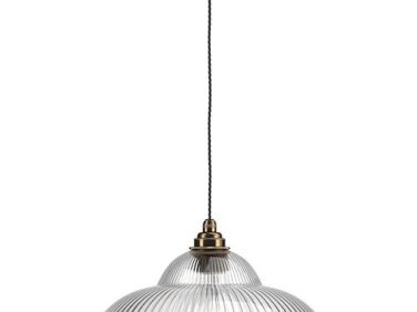
Above: The kitchen flows into a dining-living area. The pine table was the clients’ own: “we just sanded and refinished it with a clear oil finish,” says Girling. The Avery Dining Chairs by Pinch are a companion design to the bar stools. The Ledbury Skinny Ribbed Glass Contemporary Wall Lights, used here and in just about every other room, are by Fritz Fryer. The pendants are Fritz Fryer’s Skinny Wye Valley Railroad Lights.
the room&#8\2\17;s re created fireplace has a surround of reclaimed suffolk 24
Above: The room’s re-created fireplace has a surround of reclaimed Suffolk brick, a hearth of reclaimed York stone, and a Charnwood stove. “Ceilings in the lower ground floor didn’t allow space for a cornice, so the floor-to-ceiling paneling adds a touch of grandeur,” notes Girling. (There’s a television tucked behind the double doors).
the delft style hearth tiles, in green rather than the traditional blue, are th 25
Above: The Delft-style hearth tiles, in green rather than the traditional blue, are the work of The Douglas Watson Studio and include portraits of the family’s two dogs: Gimble, shown here, is a Brussels Griffin.
a window seat is upholstered in a robert kime velvet. 26
Above: A window seat is upholstered in a Robert Kime velvet.

Parlor Floor

the design team reconfigured the floor to create one long entrance hall, so the 27
Above: The design team reconfigured the floor to create one long entrance hall, so there’s a view from the front door to the back garden. The marbled encaustic tiles came out of a palace in Seville; they were sourced, Lewis tells us, from “a super cool guy called Chris who runs Mailtland & Poate,” a London company specializing in antique cement tiles.

The stair has a new Victorian-style hand rail made of sapele, a hardwood that resembles mahogany. The jute runner is from Tim Page Carpets.

a newly painted antique bench by the front door provides a place to take off sh 28
Above: A newly painted antique bench by the front door provides a place to take off shoes and store them. For more ideas, see 10 Easy Pieces: Storage Benches.
the combination living room/study is more formal than the downstairs living spa 29
Above: The combination living room/study is more formal than the downstairs living space. The velvet sofa is a George Smith.
the living room is divided from the study by a semi glazed partition with a doo 30
Above: The living room is divided from the study by a semi-glazed partition with a door,
a built in bookshelf and hearth for storing firewood in the study. 31
Above: A built-in bookshelf and hearth for storing firewood in the study.

Main Bedroom

the second floor is the parents&#8\2\17; quarters and the kids&#8\2\17; 32
Above: The second floor is the parents’ quarters and the kids’ rooms are on the top floor. The velvet headboard is a custom design with a border of bronze studs. “The floor,” notes Girling, “is one of the only finishes in the house that we didn’t install ourselves.”
the new fireplace is composed of old brick and salvaged encaustic tile. 33
Above: The new fireplace is composed of old brick and salvaged encaustic tile.
the custom cabinet, in farrow & ball&#8\2\17;s de nimes blue, houses a  34
Above: The custom cabinet, in Farrow & Ball’s De Nimes blue, houses a TV. The slipper chair is a side-of-the-road rescue reupholstered in a Kate Forman “duck egg” velvet.  The curtains are made of Robert Kime’s, Avebury linen, a pattern inspired by a 19th century French scarf.

Main Bath

a chimney breast was opened up to fit the double sink from aston matthews, uk s 35
Above: A chimney breast was opened up to fit the double sink from Aston Matthews, UK specialists in classic bathroom fittings.
reclaimed spanish tiles cover the shower area from floor to ceiling. 36
Above: Reclaimed Spanish tiles cover the shower area from floor to ceiling.
a paneled divider sets off a clawfoot bathtub from drummonds, another uk compan 37
Above: A paneled divider sets off a clawfoot bathtub from Drummonds, another UK company that sells traditional bathroom designs (Drummonds has an NYC showroom). Read about wood paneling in Remodeling 101: The Ultimate Guide to Shiplap, Beadboard, and V-Groove Paneling.
the shower has a carrara marble step and shelves. the brass shower fixture is f 38
Above: The shower has a Carrara marble step and shelves. The brass shower fixture is from Aston Matthews.
mark lewis is a stickler for details. 39
Above: Mark Lewis is a stickler for details.
a brass hot water towel warmer from aston matthews. 40
Above: A brass Hot-Water Towel Warmer from Aston Matthews.

Before and After Floor Plans

the lower ground floor —the garden level of the house—had been di 41
Above: The lower-ground floor —the garden level of the house—had been divided into small rooms. The design team inserted a structural steel column that enabled the creation of a combination living area and kitchen; the latter is located where the “TV snug” once was. Note the new yoga room extension with a view of the garden.
the ground floor was reconfigured &#8\2\20;so you can see right to the end  42
Above: The ground floor was reconfigured “so you can see right to the end of the house from the front door,” says Lewis. These sight lines were made possible by new windows and the glazed partition that divides the study from the living room.
the main bedroom has a reinstated fireplace. the walk in closet was reduced to  43
Above: The main bedroom has a reinstated fireplace. The walk-in closet was reduced to make room for the new bathroom with walk-in shower and bathtub.
the children&#8\2\17;s quarters on the top floor were redecorated but other 44
Above: The children’s quarters on the top floor were redecorated but otherwise largely preserved as was.

More Mark Lewis designs:

(Visited 10,299 times, 1 visits today)
You need to login or register to view and manage your bookmarks.

Product summary  Item 6 170Item 7 171

Have a Question or Comment About This Post?

Join the conversation

v5.0